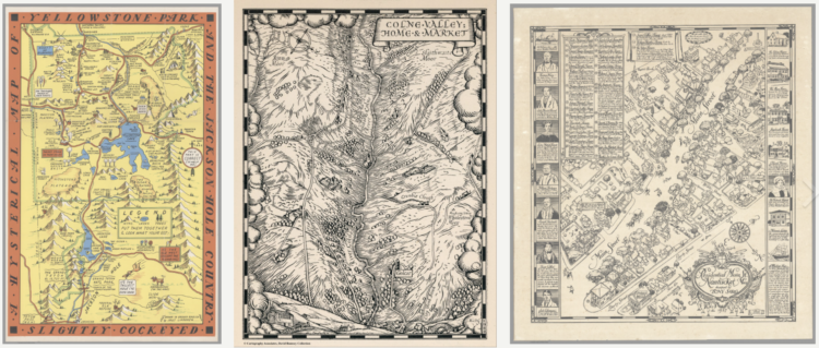
Steven Bernard for Financial Times, in a report by Claire Bushey and Steff Chavez, mapped net inflows (paywalled), based on property searches on home listing site Redfin. This shows a slightly different angle from NYT’s analysis, which showed less change year-over-year.
-
This past year has seen a rising interest in long-lost hobbies due to shelter-in-place, social distancing, and lockdown orders. Google Trends and Polygraph charted the hobbies that saw the biggest spikes each day of the year.
I’m surprised that sourdough or bread-making is on there, but maybe they didn’t fall under the hobby definition they used.
-
With the restrictions of the pandemic, you might expect an unusually big wave of people leaving cities for more open space. Using USPS’s change of address data, Jed Kolko, Emily Badger and Quoctrung Bui, for NYT’s The Upshot, show that this was not quite the case.
This surprised me, because I live in a suburban area that saw a flux of home buyers, which made prices approach ridiculous ranges. I wonder what in- and out-migration look like separately, on relative and absolute scales.
-
Researchers from NVIDIA and Cornell University made GANcraft:
GANcraft aims at solving the world-to-world translation problem. Given a semantically labeled block world such as those from the popular game Minecraft, GANcraft is able to convert it to a new world which shares the same layout but with added photorealism. The new world can then be rendered from arbitrary viewpoints to produce images and videos that are both view-consistent and photorealistic.
This is impressive, but what amazes me more is that Minecraft is still very much a thing after all these years.
-
Danielle Ivory, Lauren Leatherby and Robert Gebeloff for The New York looked at voting from the 2020 election and vaccination rates at the state and county levels. The strength of correlation is surprising. The existence of the correlation is not.
-
The CDC says it’s safe to travel now if you’re vaccinated, so you may or may not want to see this, but The New York Times shows how air particles circulate through an airplane.
-
Mel Dollison and Liza Daly made a fun interactive that lets you upload an image, and it spits out a vintage-looking color analysis a la Vanderpoel:
This generator is based on the works of Emily Noyes Vanderpoel (1842-1939), who hoped her original color analyses would inspire others to study “whatever originals may be at hand in books, shops, private houses, or museums.” We hope you are similarly inspired by her abstract, modernist style employed in the context of everyday objects and photos.
Originally conceived as a Twitter bot, you can find the Python code behind the project on GitHub.
-
Quoctrung Bui and Sarah Kliff for NYT’s The Upshot used difference charts to show how current airfare prices are approaching 2019 prices, based on data from travel app Hopper. This seems to indicate that people are getting ready to travel again.
Because airfare is typically purchased weeks or months in advance, it can be a barometer of how the public is feeling about the pace of recovery. The prices in the Hopper data, which includes fares displayed over three years of searches (representing billions of flight queries), now suggest a travel recovery that could be in full effect as early as this summer.
The red shade between each line shows the difference between prices year-over-year. Usually the area color in difference charts reflects the metric that is greater, but in these, the area reflects the metric that is less. That confused me for a second. But I’m curious if you’re not familiar with difference charts, do you just see the pattern correctly right away?
-
Members Only
-
For Politico, Beatrice Jin provides an illustrated guide on stopping a pandemic before it starts. Some scientists suggest going to the source, which often is from interacting with animals, and as you’d expect, cutting off the livelihood of millions around the world would be a complex process.
-
Harry Stevens, Tara Bahrampour and Ted Mellnik for The Washington Post look at how the upcoming Census count affects representation in the House. Montana and Rhode Island are projected to gain and lose a seat, respectively, which switches their positions in terms of seats per population.
The explanation of how counts and representation work, with a progression from abstract concept to specific cases, is on point.
-
As the Johnson & Johnson vaccine pauses in the United States, Philip Bump for The Washington Post offers a quick visualization that shows 100 vaccinations per second. A red one appears if there’s a side effect. But because the side effect is rare, currently at 1 in 1.1 million, the red dot on the visualization likely never appears as you watch. The blue dots are potential lives saved if the J&J vaccine continues.
I’m reminded of David Spiegelhalter’s video on understanding risk from over a decade ago. So many everyday activities carry risk. The only way we get through the day is not to avoid all risk, which is impossible, but to figure out what risk we’re willing to take.
-
How many times have you made a plot in R and thought, “I wish I could send this as a postcard to my best friend.” Probably a million times, right? Wish no more. The ggirl package (that’s gg-in real life for short) by Jacqueline Nolis lets you send a plot over the internets to a postcard API, which sends a physical card to an address you specify.
-
The Washington Post (paywall) shows the recent rise in domestic terrorism incidents in the United States, based on data compiled by the Center for Strategic and International Studies.
In the initial view, each circle in the unit chart represents an incident, where yellow represents far-right violence, and dark gray represents far-left. As you scroll, the units are sorted into more specific categories.
-
Amelia Wattenberger wrote a guide on how you can use the JavaScript library React with D3.js. I know next to nothing about the former, but probably should, so this was useful.
-
For Wired, Craig Mod writes about how he uses code as a way to find order during less coherent times:
Break the problem into pieces. Put them into a to-do app (I use and love Things). This is how a creative universe is made. Each day, I’d brush aside the general collapse of society that seemed to be happening outside of the frame of my life, and dive into search work, picking off a to-do. Covid was large; my to-do list was reasonable.
The real joy of this project wasn’t just in getting the search working but the refinement, the polish, the edge bits. Getting lost for hours in a world of my own construction. Even though I couldn’t control the looming pandemic, I could control this tiny cluster of bits.
A couple of years ago, I spoke about how FlowingData is a personal journal in disguise. I find myself turning to data and charts, because those things feel familiar and can be a source of comfort.
So while reading Mod’s essay, it was easy to substitute in data and nod my head in agreement.
-
Vox explains efficacy rates and why the best vaccine is the one you get now:
[arve url=”https://www.youtube.com/watch?v=K3odScka55A” loop=”no” muted=”no” /]
-
Members Only
-
Calculating how much money a kid gets after exchanging all twenty baby teeth.
-
The New York Times collected, categorized, and linked to reports of anti-Asian hate crimes over the past year. The levels of ignorance, cowardice, and stupidity is off the charts.