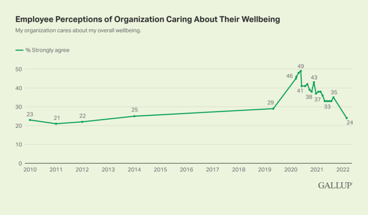
• Membership
  • Newsletter
  • Projects
  • Learning
  • About
  • Member Login
  • Family safety app sells location data to third parties

    December 7, 2021

    Topic

    Data Sharing  /  Life360, privacy, The Markup

    Life360 is a service that lets families keep track of where members are based on phone location data. For The Markup, Jon Keegan and Alfred Ng report on how Life360 then sells that data to third parties for millions of dollars:

    Through interviews with two former employees of the company, along with two individuals who formerly worked at location data brokers Cuebiq and X-Mode, The Markup discovered that the app acts as a firehose of data for a controversial industry that has operated in the shadows with few safeguards to prevent the misuse of this sensitive information. The former employees spoke with The Markup on the condition that we not use their names, as they are all still employed in the data industry. They said they agreed to talk because of concerns with the location data industry’s security and privacy and a desire to shed more light on the opaque location data economy. All of them described Life360 as one of the largest sources of data for the industry.

    You kind of expect this from a free app, but Life360 is a paid service that collects children’s location data. Seems questionable.

  • AI-powered artwork app

    December 6, 2021

    Topic

    Data Art  /  AI, Wombo

    Wombo Dream is a fun app that lets you enter some words to output a related AI-powered artwork in various styles. You can get the app, or you can play with it in your browser. I entered my dissertation title.

  • Shrinking the Mercator projection to equal area

    December 6, 2021

    Topic

    Maps  /  Mercator, Neil Kaye, projections

    It’s been a while since we got our regular reminder that the Mercator projection is better for navigation on the tradeoff for distorted area at the poles. Neil Kaye provides an animation:

    Animating the mercator projection so countries and territories are correct size and shape in relation to each other.#dataviz #30Daymapchallenge #worldisnotflat #day28 pic.twitter.com/968GSBepA1

    — Neil Kaye (@neilrkaye) November 28, 2021

    See also the Mercator projection with the poles shifted to where you live and this physical demo of how all maps have their distortions.

  • Bees use social distancing

    December 3, 2021

    Topic

    Infographics  /  bees, Economist, social distancing

    Research by M. Pusceddu et al. shows that honeybees use social distancing when a parasite is introduced to the hive. In a parasite-free hive, activities are spread throughout the hive, whereas clusters form when parasites are detected. The Economist illustrated the difference with a grids of dot densities.

  • Emissions and energy usage from Ethereum network

    December 3, 2021

    Topic

    Statistical Visualization  /  cryptocurrency, emissions, Ethereum, Kyle McDonald

    It seems clear that Ethereum (and other cryptocurrencies) in its current state is bad for the environment, but it’s hard to say how bad it really is. Kyle McDonald estimated emissions and energy usage to try to understand better: “Ethereum is comparable to keeping 2-3 coal power plant running.”

    See McDonald’s real-time estimates here.

  • FlowingData Shop is Open

    December 2, 2021

    Topic

    Site News

    I’m opening the print shop for a few days. Get your order in, and I’ll try my best to get it to you before Christmas.

  • Members Only

    Visualization Tools and Resources, November 2021 Roundup

    December 2, 2021

    Topic

    The Process  /  roundup

    Here’s the good stuff for November.

  • Rapidly growing African cities

    December 2, 2021

    Topic

    Statistical Visualization  /  Africa, population, Washington Post

    In a multi-faceted piece, The Washington Post described the rapidly growing cities in Africa that are projected to be the most populated cities in the world:

    In three projections by the University of Toronto’s Global Cities Institute, Africa accounted for at least 10 of the world’s 20 most populous cities in 2100. Even in the institute’s middle-of-the-road development scenario, cities that many Americans may seldom read about, such as Niamey, Niger, and Lusaka, Zambia, eclipse New York City in growth.

    Many U.S. cities such as Atlanta, Houston, and Washington, D.C. are projected to fall out of the top 100 by 2100.

  • Bird power rankings

    December 1, 2021

    Topic

    Statistics  /  birds, ranking, Washington Post

    Using data from Project FeederWatch, which is a community tracking project to count birds around feeders, Miller et al. estimated the pecking order among 200 species. This was in 2017. For The Washington Post, Andrew Van Dam and Alyssa Fowers worked with the researchers for an updated ranking using a more comprehensive dataset. The result is bird power rankings 2021 edition.

  • Thanksgiving Ravine

    November 30, 2021

    Topic

    Chart Everything  /  email, Thanksgiving

    I scraped my inbox when I got a bunch of emails on Cyber Monday. It seemed like a lot, but I wondered by how much. It was about five times more than usual, which is a bigger shock to the system when volume a few days before on Thanksgiving was nearly zero.

  • Simpson’s Paradox in vaccination data

    November 30, 2021

    Topic

    Mistaken Data  /  coronavirus, Simpson's Paradox, vaccination

    This chart, made by someone who is against vaccinations, shows a higher mortality rate for those who are vaccinated versus those who are not. Strange. It shows real data from the Office of National Statistics in the UK. As explained by Stuart McDonald, Simpson’s Paradox is at play:

    [W]ithin the 10-59 age band, the average unvaccinated person is much younger than the average vaccinated person, and therefore has a lower death rate. Any benefit from the vaccines is swamped by the increase in all-cause mortality rates with age.

    If you’re unfamiliar, Simpson’s Paradox is when a trend appears in separate groups but then disappears or reverses when you combine the groups. In this case, the confounding factors of age and vaccine uptake makes the above chart useless.

  • Inflation in the context of age generations

    November 29, 2021

    Topic

    Statistical Visualization  /  generations, inflation, New York Times

    When you compare the price of things today against prices one year ago, almost everything increased in cost at a rapid rate. While out of the ordinary, it’s definitely not the first time this happened. The New York Times zoomed out to show year-over-year price change since 1960, framing the timeline in the context of age generations.

    Zoom into the data super close, and every blip can seem like a mountain. Zoom out for a better sense of scale.

  • Map made of candy corn to show corn production

    November 29, 2021

    Topic

    Maps  /  candy, corn, Jill Hubley, physical

    With candy corn as her medium, Jill Hubley mapped corn production in the United States, based on data from the USDA. With just three hues of yellow, orange, and white and three heights to match, Hubley was able to clearly show the geographical patterns.

    For reference, here is the USDA corn map:

    Finally, I have a use for my kids’ leftover Halloween candy.

  • All the provisions in the Build Back Better bill

    November 26, 2021

    Topic

    Statistical Visualization  /  government, spending, Upshot

    For NYT’s The Upshot, Alicia Parlapiano and Quoctrung Bui outlined all of the provisions of Biden’s Build Back Better bill and where the $2 trillion over 10 years will come from. A treemap provides an overview that sticks to the top of the page as you scroll through the table of line items.

  • Calculating where you should live

    November 24, 2021

    Topic

    Statistics  /  calculator, housing, live, New York Times

    Choosing a place to live is always full of trade-offs, but it’d be nice if there was a way to minimize those trade-offs. For NYT Opinion, Gus Wezerek and Yaryna Serkez, made a calculator that lets you weight your priorities to find the city that fits best with how you want to live:

    Places can score zero to 10 points for each metric. To calculate each place’s match percentage, we add up its scores across metrics that a reader has selected and divide by the total number of possible points. If a reader selects the checkboxes for trees and mountains, a place with a score of 6 for trees and 8 for mountains will be a 70 percent match.

    Places with no data for a metric receive zero points. For starred metrics, we double the number of points scored and available to make them count twice as much toward the match percentage.

    Read more on their methodology here. The interactive is based on data from the Census Bureau, Realtor.com, AccuWeather, and Yelp.

    After checking the boxes that are important to you, you get a list of cities that best fit the criteria, based on an aggregated match percentage.

    I found this is also an excellent way to feel less sure about your current residence and to wonder why areas that you thought would strongly dislike appear at the top of the list.

  • Data Underload  /  time use

    Most Common Daily Routines

    We all have our routines, but from person-to-person, the daily schedule changes a lot depending on your responsibilities.

    Read More
  • Euler diagram to illustrate base rate fallacy

    November 22, 2021

    Topic

    Infographics  /  baseline, coronavirus, vaccination

    Some people point out that vaccinated people are still hospitalized as a defense against getting vaccinated. But they ignore the inverse which compares the number of those who are not hospitalized. Marc Rummy made this Euler diagram to illustrate the inverse. (Update: Rummy provides an updated version of the diagram here.)

    It’s about making a fair comparison. People who wear seat belts can still die in a car collision. People who use condoms can still get STIs. People who eat healthy can still have high cholesterol. But we know these things reduce the chances of dying in a car crash, of getting an STI, and having high cholesterol, so we adjust our choices.

    [via @visualisingdata]

  • Communicating effectiveness of boosters

    November 22, 2021

    Topic

    Statistics  /  booster, coronavirus, Guardian, risk, vaccination

    Statisticians David Spiegelhalter and Anthony Masters for The Guardian on reframing risk estimates:

    An earlier UKHSA study estimated two Pfizer/BioNTech doses gave around 99.7% (97.6% to near-100%) protection against Delta-infected hospitalisation, but after 20 weeks that effectiveness waned to 92.7% (90.3% to 94.6%). This estimated decline for people over 16 may not sound much, but if we look at it in terms of “lack of protection”, their estimated vulnerability relative to being unvaccinated went from 0.3% to 7.3%. That is a major, although uncertain, increase in risk.

    Such “negative framing” can change impressions: “90% fat-free” sounds rather different than “10% fat”.

  • 3-D modeling the french fry universe

    November 19, 2021

    Topic

    Infographics  /  3-d, Chris Williams, french fries

    What is the best french fry shape? Curly of course. But Chris Williams took it a step further and used 3-D models of various fried potato forms to find out. It’s all about the ratio between crispy exterior and fluffy interior.

  • Members Only

    Connecting Data to Practicality – The Process 166

    November 18, 2021

    Topic

    The Process  /  audience, reality

    It’s a shift from answering “What is this data?” to “So what?”

  • Page 71 of 392
  • <
  • 1
  • ...
  • 68
  • 69
  • 70
  • 71
  • 72
  • 73
  • ...
  • 392
  • >

Analyze, visualize, and communicate data usefully, beyond the defaults.

Become a member →

Recently for Members

May 15, 2025
Step Chart, Enhanced

May 8, 2025
When the data is not what it seems

May 1, 2025
Finding the Right Charts

April 24, 2025
Visualization Tools, Datasets, and Resources – April 2025 Roundup

April 17, 2025
Breaking Out of Chart Software Defaults

Browse by Chart Type See All →

Histogram Scatter Plot Spike Map Density Plot Stacked Area Chart Pie Chart Gantt Chart Difference Chart Alluvial Diagram Small Multiples

Browse By Topic

  • Visualization

    Seeing data

  • Maps

    Seeing geographic data

  • Infographics

    Explaining data

  • Networks

    Connecting data

  • Statistics

    Analyzing data

  • Software

    Working with data

  • Sources

    Getting data

  • Design

    Making data readable

Get the Book

Visualize This: The FlowingData Guide to Design, Visualization, and Statistics

Available now.

Order: Amazon / Bookshop

Made by FlowingData

  • The Process

  • Data Underload

  • Chart Everything

  • Guides

  • Books

  • Shop

  • About
  • Contact
  • Newsletter
  • LinkedIn
  • Instagram
  • Bluesky
  • RSS
Copyright © 2007-Present FlowingData. All rights reserved.