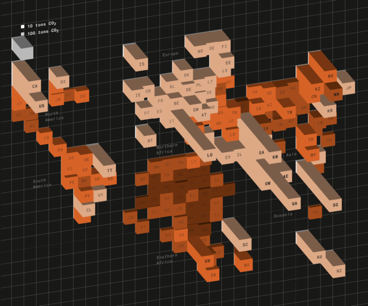
Based on estimates from the World Inequality Lab, Bloomberg shows how wealthier individuals’ habits — not just countries’ activities — contribute more to overall carbon emissions.
There’s a 3-D grid map with a square for each country. It transitions from the usual way of looking at national carbon emissions to carbon emissions from the wealthy who live everywhere. You can always count on Bloomberg to keep their graphics spicy.

 Visualize This: The FlowingData Guide to Design, Visualization, and Statistics (2nd Edition)