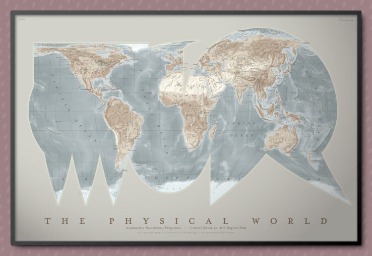
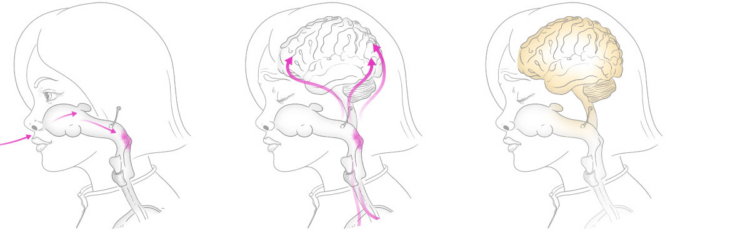
• Membership
  • Newsletter
  • Projects
  • Learning
  • About
  • Member Login
  • FiveThirtyEight is shutting down completely

    March 5, 2025

    Topic

    News  /  data journalism, FiveThirtyEight

    Disney is cutting news jobs, and FiveThirtyEight, which was absorbed by ABC News and owned by Disney, is going with them. FiveThirtyEight employees were laid off this morning. It’s unclear what will happen to past projects and the brand itself, but I imagine those won’t stick around either.

    From G. Elliott Morris, who took over after Nate Silver left:

    As reported, the entire staff of 538 was laid off this morning. This is a severe blow to political data journalism, and I feel for my colleagues. Readers note: As we were instructed not to publish any new content, all planned updates to polls data and averages are canceled indefinitely. Huge loss :(

    After the layoffs a couple years ago and the shift from the dot com address to an abcnews address, it seemed like this was where FiveThirtyEight was headed, but still. It’s sad for those who make data things.

    At its peak, FiveThirtyEight got normal people interested in data and statistics, which is not an easy thing to do. Beyond politics, they provided a lens, a sometimes quirky one I especially enjoyed, that made it easier to understand how data played a role in the everyday.

    So tonight, we pour one out for Fivey Fox.

  • Creativity and optimization

    March 5, 2025

    Topic

    Statistics  /  Alessio Figalli, creativity, New York Times, optimization

    For The New York Times, Siobhan Roberts talked to mathematician and Fields Medal winner Alessio Figalli, who is known for his work in optimal transport. On creativity:

    Suppose you’re doing very good research in an area; your optimization scheme would have you stay there. But it’s better to take risks. Failure and frustration are key. Big breakthroughs, big changes, always come because at some moment you are taking yourself out of your comfort zone, and this will never be an optimization process. Optimizing everything results in missing opportunities sometimes. I think it’s important to really value and be careful with what you optimize.

  • Optimizing basketball, too much

    March 5, 2025

    Topic

    Statistics  /  basketball, Bloomberg, optimization, sports

    For Bloomberg, Ira Boudway reports on NBA basketball going too far with the optimizations. First it’s fun and games, but then the product suffers:

    The NBA has fallen into an efficiency trap: Teams pursuing the optimal strategy for winning are doing damage to the quality of the product. The situation will be familiar to baseball fans. During the Moneyball revolution, front offices became obsessed with home runs, walks and strikeouts, the so-called three true outcomes. Games became stagnant without the bang-bang action of line drives, bunts and steals.

    The good news for the NBA is baseball also provides a road map out of such doldrums. In 2023, Major League Baseball introduced a set of rule changes, including pitch clocks, bigger bases and a ban on a defensive strategy known as the infield shift, intended to inject excitement back into the game. So far, it’s helped, leading to shorter games, more steals and increased attendance. The rollout of these changes should serve as a model for the NBA.

    I’m a Golden State Warriors fan, so three-point highlight reels are a source of joy. Stephen Curry and company were winning, by a lot. Other teams followed the strategy, naturally.

    Now the NBA has to adjust, because watching four guys, and sometimes all five, hang out on the perimeter every possession is sitting at the bottom of the trough. They have to optimize for entertainment now.

  • Ambiguity in what counts as American-made vehicles

    March 4, 2025

    Topic

    Infographics  /  New York Times, tariff, vehicles

    Speaking of imported vehicle parts, June Kim and Neal Boudette, for The New York Times, highlight how some vehicles are technically American-made but use mostly imported parts and others are technically imports but use mostly American-made parts.

    A vehicle like the Toyota RAV4, assembled in Canada with 70% American parts, would technically have to pay a 25% tariff. What counts as American-made?

  • Imported parts on a Chevrolet Silverado

    March 4, 2025

    Topic

    Infographics  /  Financial Times, manufacturing, tariff, truck

    To demonstrate how tariffs can impact American products, Financial Times focuses on the parts and manufacturing of a Chevrolet Silverado pick-up truck (paywalled). Over half of the 673,000 Silverados produced last year were built in Mexico and Canada.

  • Survey answers and framing the question

    March 4, 2025

    Topic

    Statistics  /  New York Times, question, surveying, tariff

    When you see surveys that supposedly ask the same question, you might wonder why the results vary over a wide range. Christine Zhang and Ruth Igielnik, for The New York Times, show how pollsters frame their questions can have that effect, in the context of tariff approval.

    A generic question about tariffs showed favorability ratings below half of respondents, whereas polls that mentioned China produced higher favorability.

    So if policymakers use poll results in their decision-making, this should emphasize the importance of good sampling, or at least skepticism about who’s asking the questions.

  • Products affected by tariffs in the U.S.

    March 4, 2025

    Topic

    Statistical Visualization  /  spending, tariff, Washington Post

    Luis Melgar and Rachel Lerman, for the Washington Post, highlight the value of goods from Mexico, Canada, and China. While it’s hard to say how much tariffs will affect consumers directly, it seems like inflated grocery prices aren’t going away any time soon:

    One of the first places shoppers may feel the impact of increased tariffs is in the grocery aisle. The United States imported $9.9 billion worth of vegetables and more than $11 billion worth of fruit and frozen juices from Mexico in 2023.

    “The proposed tariffs would have a significant impact on food prices,” David Ortega, a food economist and professor at Michigan State University, said before the tariffs were officially enacted. Price hikes would come after years of high inflation in grocery aisles, a top concern for Americans in the last election.

    The trade data is from USA Trade, maintained by the Census Bureau.

  • Imports that could be taxed

    March 4, 2025

    Topic

    Statistical Visualization  /  Reuters, tariff, trading

    We’ve mostly heard about tariffs as they apply further down the supply chain and onto the shelves of your local retailer. For Reuters, Sarah Slobin and Howard Schneider show how tariffs can apply to much more.

    It isn’t just consumer goods like those Mexican avocados or French wines or Bangladeshi T-shirts that are imported. U.S. industries also import vast amounts of equipment, parts and machinery from abroad to power their own factories. Canada, meanwhile, is a major source of energy and raw materials like lumber for homebuilding and potash for agriculture.

  • House colors as an indicator for gentrification

    March 3, 2025

    Topic

    Infographics  /  color, gentrification, paint, Washington Post

    It appears that gray and neutral tones on houses are a sign of gentrification in cities. To demonstrate, for the Washington Post, Marissa Lang and John Harden analyzed D.C. house images from Google Street View for color usage. Tim Meko visualized the main colors:

    Take this as you like. I live in an area with all neutral colors, and the HOA would have a hissy fit for anything otherwise, but I like my neighborhood. Mainly, I am into Meko’s paint swatch aesthetic to match the topic.

  • Reality of organ transplant waiting lists

    March 3, 2025

    Topic

    Infographics  /  healthcare, New York Times, organ transplant, queuing

    One might hope that people on a waiting list for an organ transplant were treated from top to bottom, individual by individual. It’s not that simple though. For The New York Times, Brian M. Rosenthal, Mark Hansen, and Jeremy White illustrate the complex reality of the queue.

    The Times analyzed more than 500,000 transplants performed since 2004 and found that procurement organizations regularly ignore waiting lists even when distributing higher-quality organs. Last year, 37 percent of the kidneys allocated outside the normal process were scored as above-average. Other organs are not scored in the same way, but donor age is often used as a proxy for quality, and data shows there is little difference in the age of organs allocated normally compared with those that are not.

    And while many people in the transplant community believe ignoring lists is reducing organ wastage, there is no evidence that is true, according to an unreleased report by a group of doctors and researchers asked by the transplant system last year to study the practice.

    The animated transitions through an illustrated line of organ recipients drive the point home. Sometimes recipients are passed up because of risk factors, and sometimes the reasons seem less than ideal.

  • Network of statistical distributions

    February 28, 2025

    Topic

    Network Visualization  /  distributions

    The network of 76 probability distributions show how they are connected:

    Solid lines represent special cases and transformations from one distribution to another.

    Dashed arrows are used for asymptotic relationships, typically as the limit as one or more parameters approach the boundary of the parameter space.

    Dotted arrows represent Bayesian relationships.

    Well, I guess that clears things up.

  • USDA sued for removing climate data

    February 28, 2025

    Topic

    Data Sharing  /  climate, government, takedown, USDA

    Farming and environmental groups are suing the U.S. Department of Agriculture for removing publicly available climate data from the web:

    All farmers in the U.S. are facing extreme and changing weather patterns. Climate information is critical to help them make the best choices and access resources to mitigate harm to their livelihoods. Many farmers are also moving to climate-smart practices because it’s good for business; studies show that people often prefer and will pay more for climate-smart foods. Denying farmers access to information on developing markets and federal funding hurts their profits.

    “USDA’s irrational climate change purge doesn’t just hurt farmers, researchers, and advocates. It also violates federal law several times over,” said Jeffrey Stein, Earthjustice associate attorney. “USDA should be working to protect our food system from droughts, wildfires, and extreme weather, not denying the public access to critical resources.”

  • Members Only

    Visualization Tools, Datasets, and Resources — February 2025 Roundup

    February 27, 2025

    Topic

    The Process  /  roundup

    Here are tools you can use, data to play with, and resources to learn from that bubbled up in February.

  • Wikipedia as a walkable, virtual museum

    February 27, 2025

    Topic

    Data Art  /  game, Maya Claire, museum, VR, Wikipedia

    Imagine everything on Wikipedia in an infinite museum of galleries. That’s what Maya Claire did, and you can walk through the museum via your desktop computer or in virtual reality.
    Read More

  • Disconnect between generated and real beauty expectations

    February 27, 2025

    Topic

    Artificial Intelligence  /  beauty, style, Washington Post

    Generative AI is readily accessible these days, which has led to an influx of nice-looking, but impractical beauty inspiration for many. For the Washington Post, Tatum Hunter on what that influx looks like for the stylists tasked with the impossible:

    Rita Contreras, a hairstylist in Brooklyn, said that in the past six months, the number of clients walking in with AI images has ballooned. While the fake photos often fool her clients, Contreras can spot an AI image a mile away, she said; the details are too flawless, the hair too glossy.

    “I have to just say, ‘This is not a real person. This is not real hair,’” Contreras said. She spends time before each appointment talking clients through the differences between AI hair (immune to bad lighting and weather) and real hair (vulnerable to both).

    This reminds me of when my dad, a civil engineer, would come home from work and comment how someone came in with unrealistic building sketches. The plans might look nice, but in reality, the supposed buildings would crumble in an earthquake, if they were able to stand at all.

  • Visualizing all the books in the world

    February 26, 2025

    Topic

    Infographics  /  books, catalog, phiresky

    To show a catalog of almost 100 million books in one view, phiresky mapped them based on International Standard Book Numbers, or ISBNs, with an interactive visualization.
    Read More

  • Rail transit and population density

    February 26, 2025

    Topic

    Maps  /  population, transit

    In some cities, a large percentage of the population has access to public transit, whereas in others, access is limited. Aniket Kali and Jeff Allen mapped rail transit on population density and then ranked cities based on the percentages:

    Good public transit connects people to places. Ideally, this is done efficiently and sustainably, with transit routes and stations serving and connecting the most amount of people possible. But in reality, there’s a lot of variation within and between cities in how effectively this is done.

    To look at this, we’ve created maps of major rail transit lines and stations (rapid transit, regional rail, LRT) overlaid onto population density for 250 of the most populated urban regions around the globe.

    By the percentage of population within one kilometer of rail transit, Hong, Osaka, and Madrid ranked highest.

  • Perceptron algorithm from the 1950s and its ties to LLMs

    February 25, 2025

    Topic

    Artificial Intelligence  /  ChatGPT, Frank Rosenblatt, perceptron, Welch Labs

    Welch Labs explains how the perceptron, an algorithm developed by Frank Rosenblatt in 1950s, is a foundation for current large language models that power chatbots like ChatGPT. You just have to link 100 million or so perceptrons in a single network.
    Read More

  • Estimating the ‘laziness’ of federal workers

    February 25, 2025

    Topic

    Statistical Visualization  /  effort, federal, Washington Post, work

    Some might have you believe that federal employees don’t put in the work. For the Washington Post’s Department of Data, Andrew Van Dam shows data that suggests otherwise.

    In case you’re unfamiliar with the WP column, Van Dam (usually) attempts to answer a question each week using data. I like how he takes the reader through the exploratory process of trying to figure things out. Most of the time, you can’t answer data questions directly, because there isn’t a direct metric for say, worker efforts. So you analyze the data that is available, build related insights, and see if that gets you to where you need to go.

  • Growing gender gap in ideology

    February 24, 2025

    Topic

    Statistical Visualization  /  Financial Times, gender, politics

    For Financial Times, John Burn-Murdoch shows the gap between men and women in political ideology with a set of difference charts (paywalled). It was typical for people in the same age cohort to follow similar politics, regardless of sex, because they lived similar experiences. But a split appears over the past decade with women leaning more liberal and men leaning more conservative.

    I wonder if this internet thing had anything to do with the change.

  • Page 7 of 392
  • <
  • 1
  • ...
  • 4
  • 5
  • 6
  • 7
  • 8
  • 9
  • ...
  • 392
  • >

Analyze, visualize, and communicate data usefully, beyond the defaults.

Become a member →

Recently for Members

May 15, 2025
Step Chart, Enhanced

May 8, 2025
When the data is not what it seems

May 1, 2025
Finding the Right Charts

April 24, 2025
Visualization Tools, Datasets, and Resources – April 2025 Roundup

April 17, 2025
Breaking Out of Chart Software Defaults

Browse by Chart Type See All →

Spiral Chart Parallel Coordinates Difference Chart Network Graph Table Dot Map Calendar Mosaic Plot Parallel Sets Ternary Plot

Browse By Topic

  • Visualization

    Seeing data

  • Maps

    Seeing geographic data

  • Infographics

    Explaining data

  • Networks

    Connecting data

  • Statistics

    Analyzing data

  • Software

    Working with data

  • Sources

    Getting data

  • Design

    Making data readable

Get the Book

Visualize This: The FlowingData Guide to Design, Visualization, and Statistics

Available now.

Order: Amazon / Bookshop

Made by FlowingData

  • The Process

  • Data Underload

  • Chart Everything

  • Guides

  • Books

  • Shop

  • About
  • Contact
  • Newsletter
  • LinkedIn
  • Instagram
  • Bluesky
  • RSS
Copyright © 2007-Present FlowingData. All rights reserved.