NYC subway map updated with a diagrammatic style
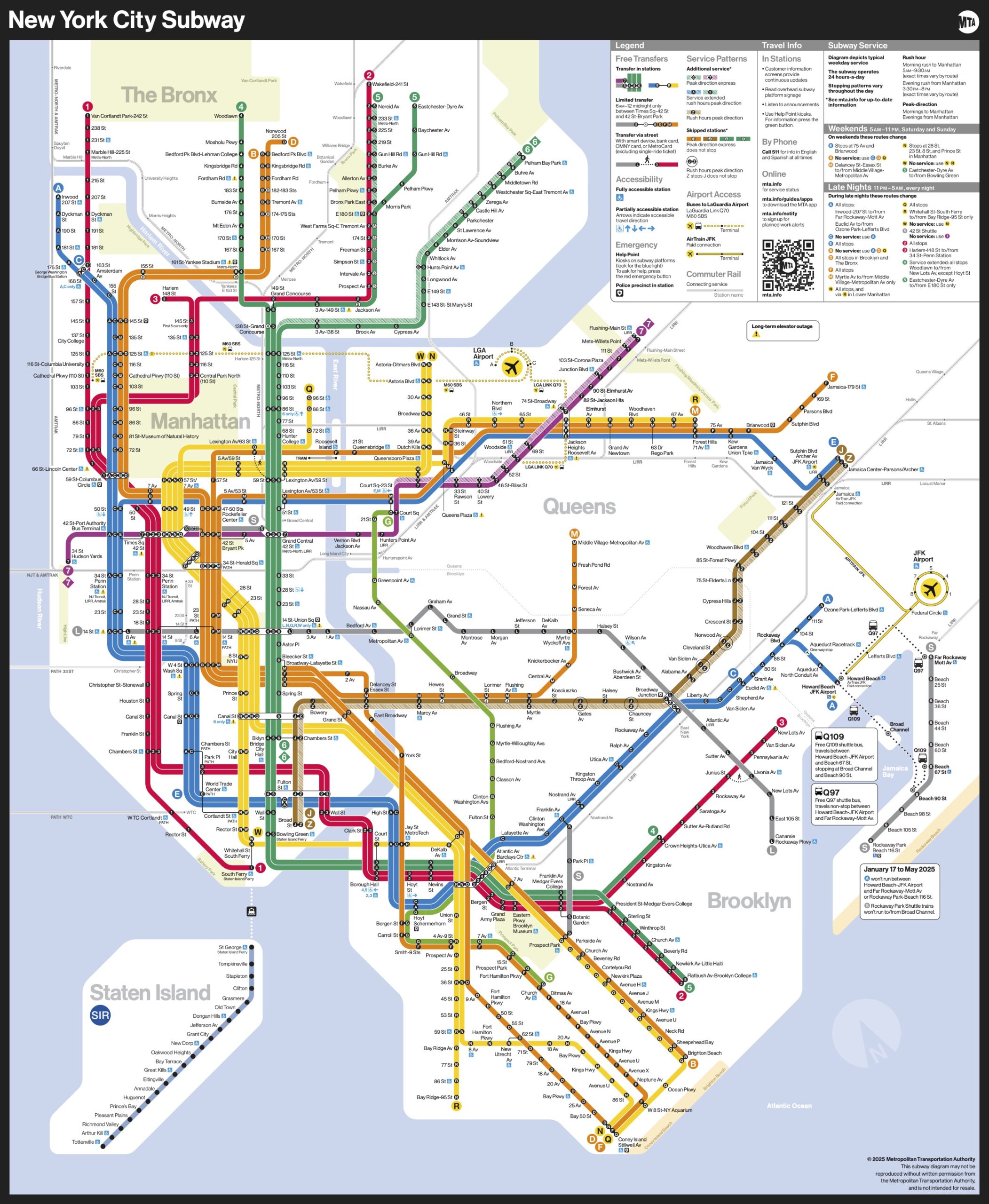
The Metropolitan Transportation Authority in New York is rolling out an updated subway map that trades geographic accuracy for readability and ease of use.
The new map was designed by the MTA’s Creative Services Mapping Department and, like many major subway systems around the world, utilizes a diagrammatic style, employing bold, straight lines making it much easier for the eye to follow and more suitable for digital users. The white background, bold colors, horizontal writing and use of black dots make the map more ADA-friendly and easier for people with low-vision or cognitive disabilities to read.
Designers also focused on text legibility, keeping text on one line wherever possible and making better use of open space to alleviate crowding and using a black subway bullet with a white character to provide maximum contrast for easier reading.
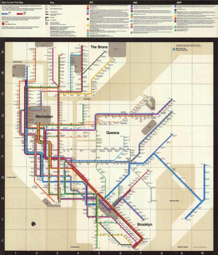
This is the first major update in 50 years. It’s inspired by the short-lived 1972 map designed by Massimo Vignelli:
The current version that is being replaced is more geographically accurate:
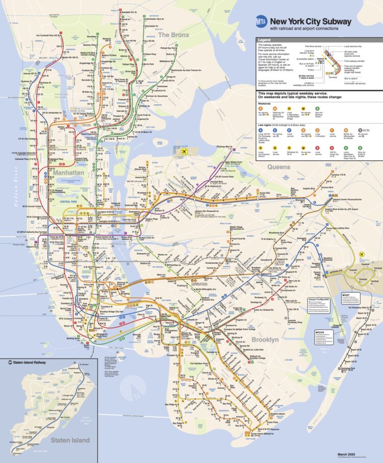
This works well as a representation of the area and perhaps as a point of reference while walking. However, when you’re on a train underground, the updated diagrammatic style works well to travel from one station to the next. You just want to know at what station to exit.
Become a member. Support an independent site. Get extra visualization goodness.
See What You Get