Learn more about your data and have more to visualize.
Learn more about your data and have more to visualize.

Color and contrast choices often are a product of personal preferences, but you can of course go deeper with it. Nate Baldwin provides an interactive guide on the perception of color and ties it to how it matters in the design of user interfaces:
This website is for designers to learn about color, contrast, and how it can affect experiences of a user interface. It provides quick access to relevant information at any point in the design process.
The content is thorough, but concise, and provides contextual insight to assist you in making educated decisions about color and contrast.
If you’re looking to switch or just want to expand your skills, this starter guide by Stephanie Lo provides some translations:
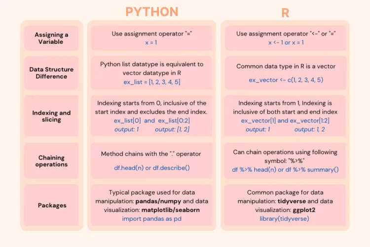
Are you curious about delving into the world of R programming? While Python remains the dominant choice amongst the data science community, with approximately 60% of developers using it in 2022, there are instances where R may pop up now and again. That’s because R is optimized for statistics and data. If you, like me, have a foundation in Python but now encounter job listings and internal company tasks that demand R skills, this article aims to break that down. We will explore the fundamental distinctions between Python and R and wrap the project into a data cleaning and visualization tutorial to ensure a smooth transition to R.
I mostly use R, but have always found it helpful to know some Python, especially when there’s some fun library to try.
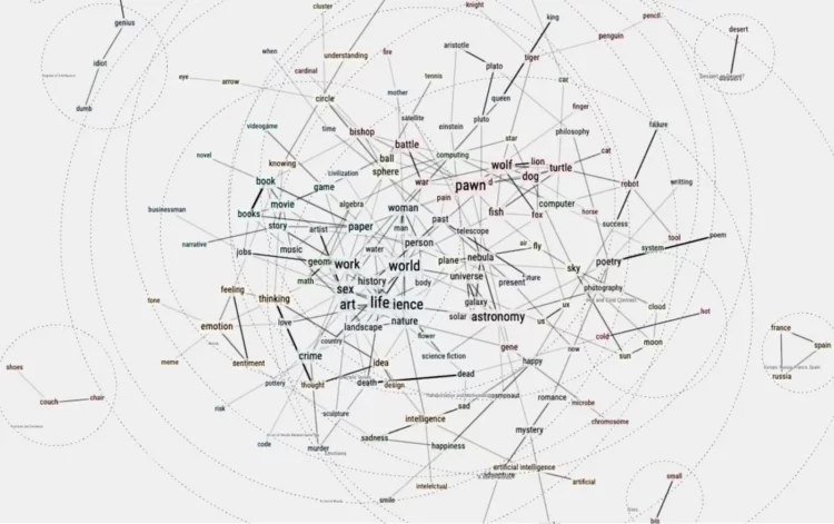
Philippe Vandenbroeck and Santiago Ortiz were curious about a system that incorporated knowledge from a real person and ChatGPT, which is good for smushing text together in a coherent format. So they embedded text from Vandenbroeck into the ChatGPT model so that he could chat with himself. Ortiz describes the technical aspects of the system here.
See also the AI chatbot modeled on texts from a fiancee who passed. Looking back on our lives in a few decades is going to be weird.
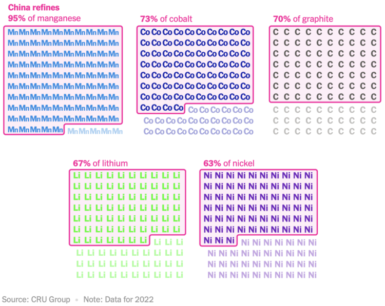
For The New York Times, Agnes Chang and Keith Bradsher ask if it’s possible for the world to make EV batteries without China. Going over manufacturing and the materials involved, it looks like probably not:
Experts say it is next to impossible for any other country to become self-reliant in the battery supply chain, no matter if it has cheaper labor or finds other global partners. Companies anywhere in the world will look to form partnerships with Chinese manufacturers to enter or expand in the industry.
I appreciate the illustrative nature of these charts.
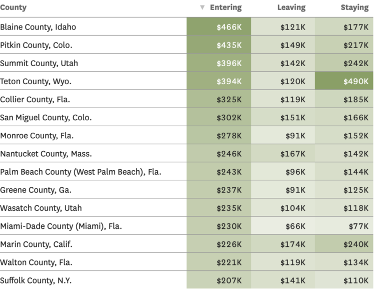
Based on migration data recently released by the IRS, Nami Sumida for the San Francisco Chronicle mapped where people moved to and away from. Enter your county to see what’s happening in your area.
In addition to the maps, there are tables for average income of those moving to and from counties. I wonder what the scatterplot would look like for leaving versus staying incomes.
Also, the IRS migration dataset always makes me think of Jon Bruner’s now defunct map from 2011.
Learn about who is looking at your work and how they interpret it.
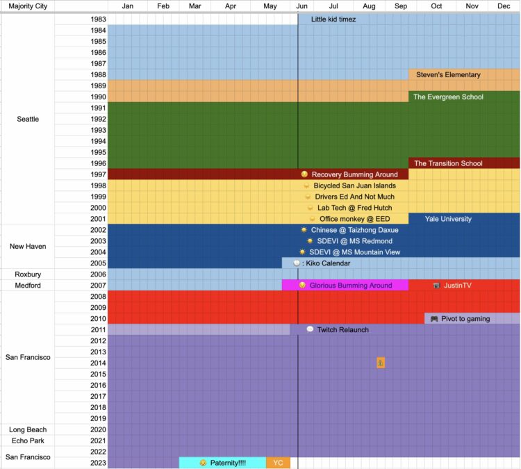
Coming up on 40 years old, Emmett Shear, perhaps best known as a co-founder of Twitch, reflected on his time so far using a spreadsheet. He marked where he lived in the left column, years run top to bottom, and months run left to right. Cells are colored by the main thing going on in his life.
You can access the sheet here, in case you want to make one for your own life.
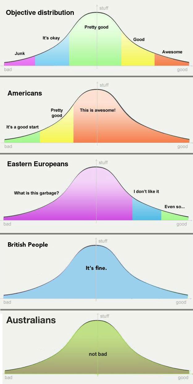
Putting this joke chart up for posterity, because it deserves it. The earliest version of this chart I could find was from 2019, but I’m almost certain it’s older than that. Please let me know if you know where the original is from.
Speaking of non-location in the seas, researchers at the University of California at Santa Cruz, NOAA Fisheries, and Global Fishing Watch are trying to use the absence of data to identify boats fishing illegally. Harry Stevens for The Washington Post has the maps showing when fishermen turned off their transponders to hide location.
There’s plenty of (missing) data, but the tricky part is figuring out if the shutoffs are during illegal activities or are just fishermen keeping their spots private from competitors and pirates. [Thanks, Michael]

The New York Times tracked oil tankers faking their location as they ignore sanctions but keep insurance that is contingent on following the sanctions:
“It’s significant when you look at dollar terms,” said Samir Madani, co-founder of TankerTrackers.com, which monitors global shipping, who first alerted The Times to several of the suspicious ships. “It’s around $1 billion worth of oil that is going under the radar while using Western insurance, and they’re using spoofing in order to preserve their Western insurance.”
The transition from fake data to satellite image reality is slick.
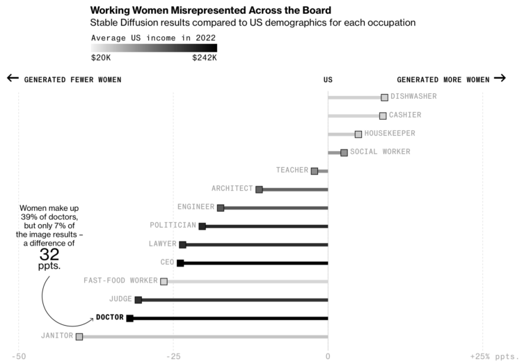
Perhaps to no one’s surprise, generative artificial intelligence models contain bias rooted in the data that drive them and by the people who design the systems. For Bloomberg, Leonardo Nicoletti and Dina Bass examined the extent to which the bias exists through the lens of Stable Diffusion.
Most of the piece is a rundown of what Stable Diffusion shows, but the biggest tell is the chart that compares the generated images against reality.

Wildfires in one area means smoke and pollution travels to surrounding areas, even thousands of miles away. For NYT’s The Upshot, Aatish Bhatia, Josh Katz, and Margot Sanger-Katz have the maps and charts that show how smoke traveled from the wildfires in Quebec, Canada.
Just thinking out loud about when the robot overlords will come for the analysis and visualization jobs.
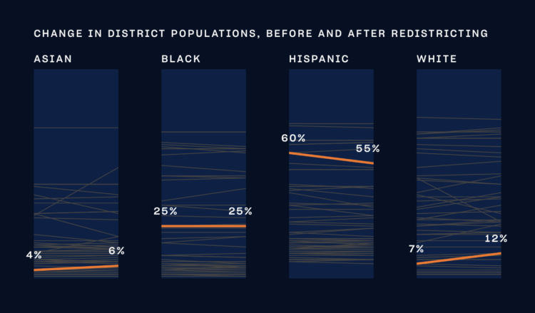
With New York 2023 elections coming up, The City and NY1 put together a straightforward guide for information and voting history for each district. I want something like this for my area, a vast improvement over the paper mailers that can be difficult to navigate. [Thanks, Scott]
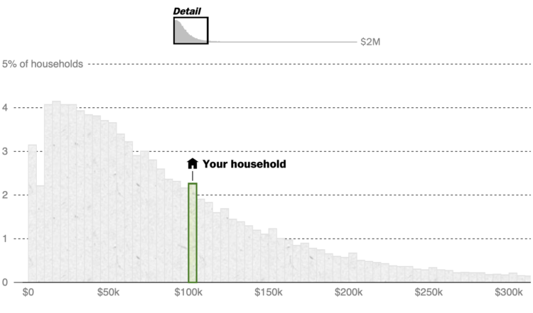
What counts as middle class depends on who and where you’re asking. Even if two households, say a single-person household in Montana and a five-person in California, earn the same income, the latter probably has more expenses than the former. The Washington Post broke it down with various comparisons. Enter a ZIP Code to see where you are.
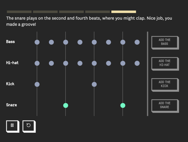
When you first learn to play music, a lot of the instruction is about structure. Turn the metronome on and follow the beats straight up. James Dewitt Yancey, also known as J Dilla, shifted the beats for a different feel and sound. This piece, by Michelle McGhee for The Pudding, demonstrates this difference.
Turn the sound on and press the buttons. It’s neat to hear the breakdown of the rhythm as you walk through the styles.
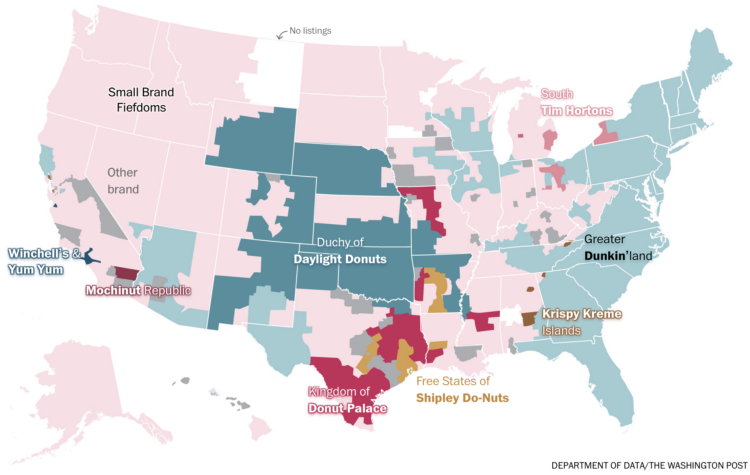
In a fun one by Alyssa Fowers, for The Washington Post’s Department of Data, a map of the most common donut shops in the United States:
We kicked off our investigation with our friends at Yelp, who shared all the doughnut shop listings on the review site. By grouping stores with the same name and calculating the most common doughnut shop in groups of census tracts around the country, we found that our reader’s observation was right on: The United States is a federation of at least nine distinct doughnut nations.
All hail Small Brand Fiefdoms.
Katherine Sayre, for The Wall Street Journal, on Las Vegas casinos squeezing out more juice:
Gambling companies such as MGM Resorts and Caesars, the two biggest operators on the Strip, have reduced how much they will pay for winning hands at blackjack at many of their tables, data show.
Blackjack, a fast-paced card game, historically paid out a ratio of 3:2 when a player hit 21 on the first two cards. That means a gambler wins $15 for every $10 bet. Now, many blackjack tables on the Strip pay out at 6:5, which means that same $10 yields only $12.
During my very first advanced probability course in college, the professor went right into the math of “the house always wins.” It only takes a tiny house advantage to guarantee you lose all your money over a long enough period of time.
For example, it would seem that if you play Blackjack following the same strategy as the dealer, the odds of you winning and losing would be even. But the dealer will always take your money if you bust, regardless of what hand they get. That’s enough advantage for the casino. Well, it was enough, until they started paying out less and increasing minimum bets.
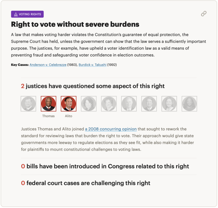
For ProPublica, Ian MacDougall and Sergio Hernandez evaluated records of sitting justices to gauge the rights at risk of being taken away. Each right gets a section with background, bills and court cases challenging the right, and the justices that have questioned the right through judicial opinions and public remarks.
 Visualize This: The FlowingData Guide to Design, Visualization, and Statistics (2nd Edition)
New tools, refined process.


