-
Members Only
-
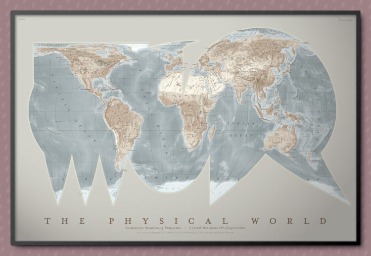
Part amusement and part learning exercise, the “asymmetric monstrosity” by Daniel Huffman is an equal-area projection that looks like a joke but is technically valid.
My projection is a composite of several pieces. This is not unheard of in the world of non-useless projections. The Goode homolosine, for example, is made from a Mollweide (a.k.a. homolographic) projection glued to a sinusoidal. “Glued” is an apt metaphor, as creating my asymmetric monstrosity involved separately projecting each piece and sticking them together in Illustrator and Photoshop.
I see a bird lying face down and maybe a bear claw.
-
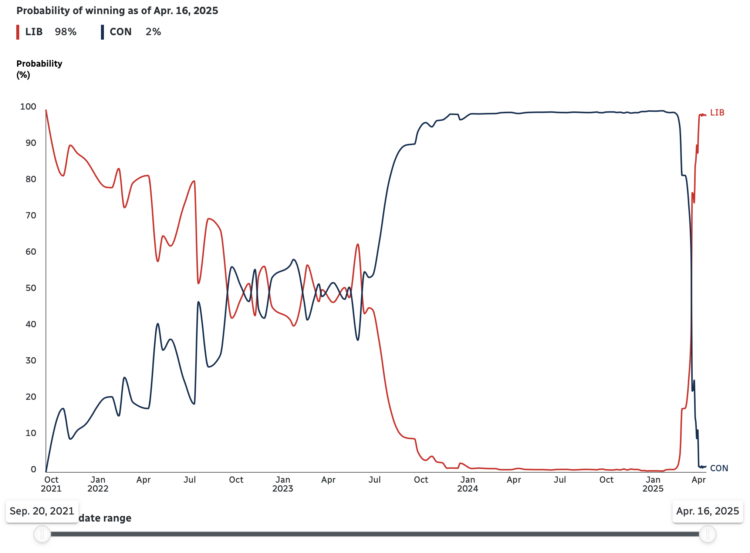
Since early 2024, polls showed near certainty that Conservatives in Canada were going to win the majority of seats in the upcoming federal election. But, as shown by CBC News, Mark Carney replaced Justin Trudeau (among other things) and probabilities flipped in favor of Liberals.
As of April 16, 2025, the Liberals have a 98% chance of winning, up from a previous 1% chance just a few months ago. A flip of such magnitude and speed seems unfathomable here in the United States.
-
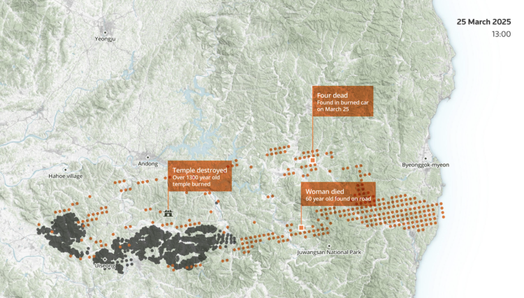
South Korea experienced its largest and most deadly wildfire last month in Uiseong county. For Reuters, Sudev Kiyada, Han Huang, and Adolfo Arranz describe the path of destruction with animated maps and satellite imagery.
Experts have said the spread of the Uiseong fire was extremely unusual in terms of scale and speed, while climate change is expected to make wildfires more frequent and deadly globally.
The wildfires have displaced more than 30,000, many of them elderly, as is typical in rural areas across fast-ageing South Korea. The flames consumed everything in their path, from historic temples to homes, in mountainous North Gyeongsang.
-
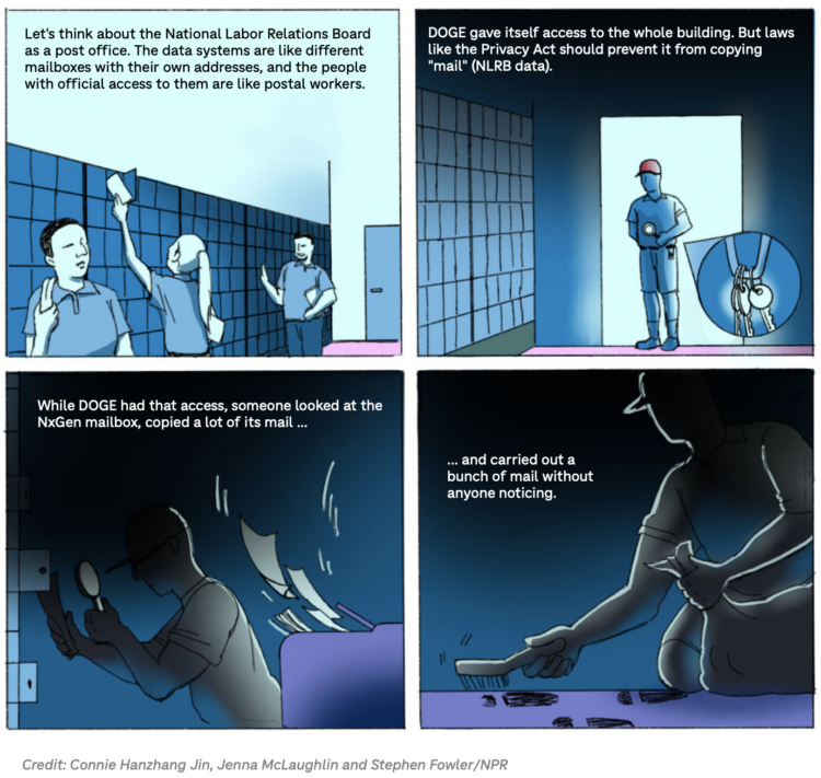
DOGE engineers were at the NLRB for a week but didn’t specify what they were there for. An official whistleblower detailed what he found after they left. For NPR, Jenna McLaughlin reports with a multi-layered breakdown.
Read More -
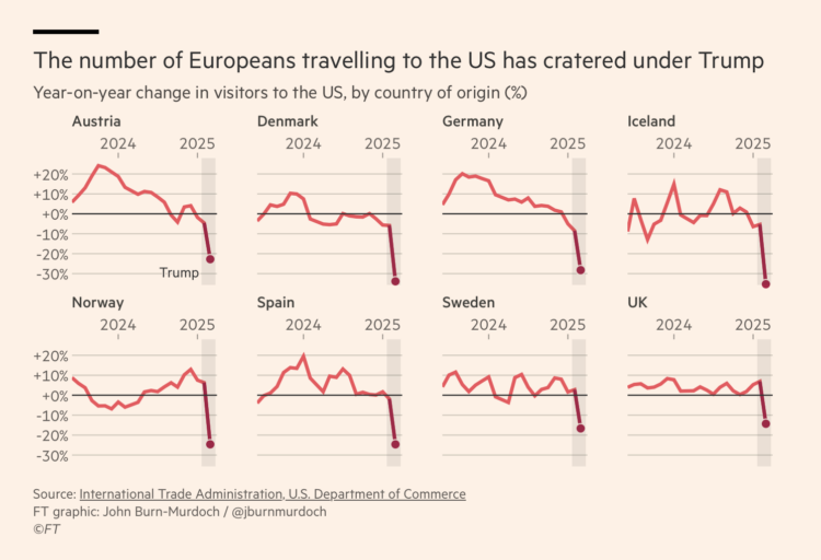
These charts will shock you I am sure. Travel to the United States for Europeans appears much less popular year-over-year. Financial Times shows the steep drop (paywalled) since the new administration began.
Numbers are based on data from the International Visitor Arrivals Program (ADIS I-94), which as the name suggests, tracks the number of people arriving at air and sea ports.
-
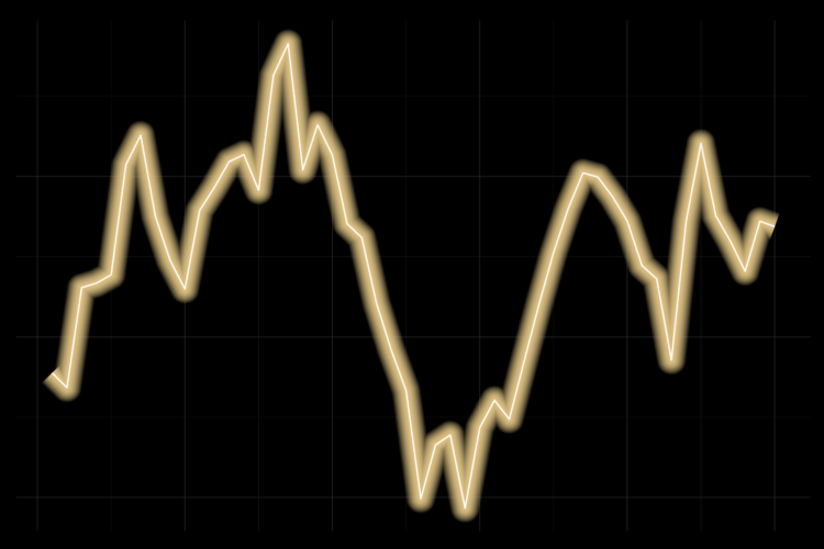
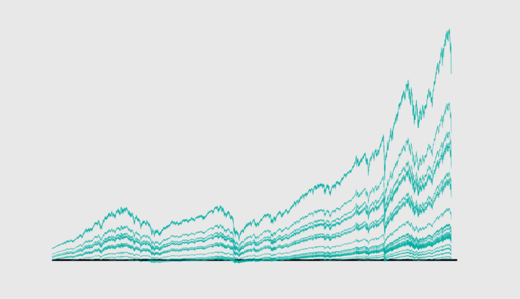
Line Chart with Decorative Neon Accents
We do it because things that glow in the dark are awesome, including line charts.
-
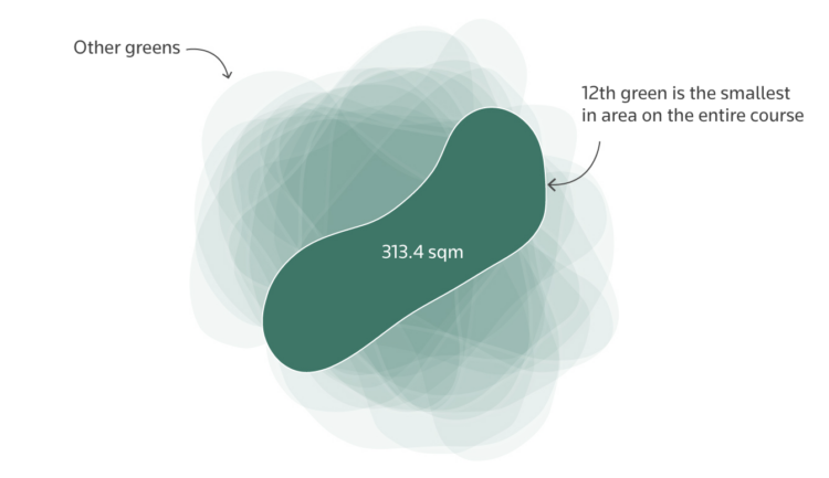
The 12th hole at Augusta National Golf Club, where the Masters is held, has a reputation as the most difficult hole in the tournament. That might not be the reality. For Reuters, Anand Katakam breaks it down.
Despite its reputation, statistically the 12th is not the hardest hole during the four rounds of the tournament. It has been played over 0.13 strokes above par across all four rounds from 2015 to 2024, making it the ninth-hardest hole overall. The hardest is the 11th, which has been played 0.34 strokes over par in the last 10 years.
The approach to the 11th and 12th seem to be different. The par four 11th offers fewer scoring opportunities, primarily because of its length at 520 yards (475 metres). The 12th offers a greater chance for a par and a potential birdie for those who reach the green without incident, especially during earlier rounds.
-
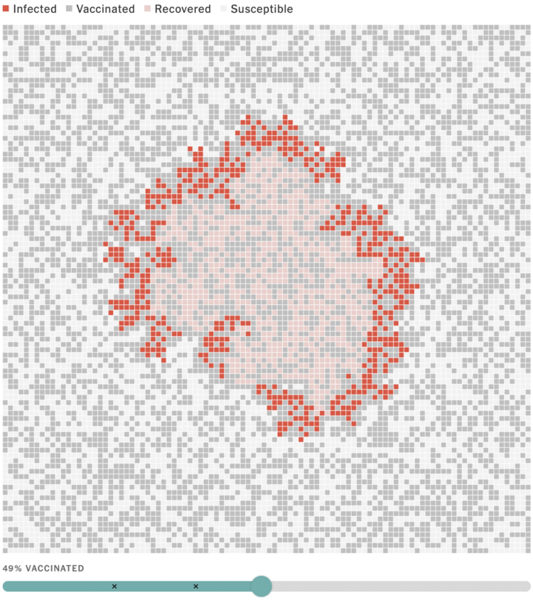
To demonstrate outbreak possibilities of, say, the measles, Aatish Bhatia and Francesca Paris, for NYT’s the Upshot, used simulations to show spread throughout a population. Sliders lets you adjust vaccination rates to see how it changes the control of the spread.
Surprise (to many it seems), lower vaccination rates lead to faster and wider spread. Higher vaccination rates tends higher containment.
-
If you are not vaccinated against measles, you will most likely catch it if you are exposed. For The New York Times, Emily Baumgaertner Nunn and Marco Hernandez illustrate how measles can lead to infection in the lungs and inflammation in the brain of children, who are smaller and more susceptible.
“A lot of families have kind of been surprised, like, ‘Oh, my child was fine, and then all of a sudden, they’re not,’ ” she said.
That mild disease evolves into a fever as high as 104 or 105 degrees for two, three or four days. Poor fluid intake, a sore throat and diarrhea can lead to dehydration, which over time can begin to threaten kidney function.
As of April 10, there have been 693 confirmed cases in the United States, in 2025.
-
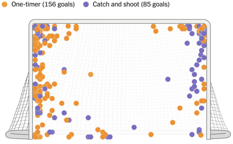
Alex Ovechkin passed Wayne Gretzky’s all-time goals record with number 895. For The Athletic, Dom Luszczyszyn highlights “Ovechkin’s spot” on the ice (paywalled), where he scored 285 of his career goals.
After watching every goal Ovechkin has ever scored from his spot, what became clear is how often he made damn sure that the goalie had absolutely no shot at stopping what was coming. Even with a gaping net facing him, Ovechkin would very often put pucks as far out of reach from a goalie’s potential grasp. These were perfectly placed shots, as if Ovechkin was picking corners on an invisible goalie in front of him. The frequency that one of his goals was laser-focused on just inside the post-crossbar connection was astounding.
I know very little about hockey other than whatever knowledge I gained through osmosis living in Buffalo, New York for a few years. But I appreciated this statistical breakdown and the dots that look like cupcake sprinkles.
-
The Metropolitan Transportation Authority in New York is rolling out an updated subway map that trades geographic accuracy for readability and ease of use.
Read More -
For Associated Press, Fatima Hussein reports:
The acting commissioner of the Internal Revenue Service is resigning over a deal to share immigrants’ tax data with Immigration and Customs Enforcement for the purpose of identifying and deporting people illegally in the U.S., according to two people familiar with the decision.
Melanie Krause, who had served as acting head since February, will step down over the new data-sharing document signed Monday by Treasury Secretary Scott Bessent and Homeland Security Secretary Kristi Noem. The agreement will allow ICE to submit names and addresses of immigrants inside the U.S. illegally to the IRS for cross-verification against tax records.
There are laws that threaten fines and prison time for just accessing IRS data from outside agencies. This seems upside down.
-
Members Only
-
New to me, Anime.js by Julian Garnier seems like a fun library to play with.
Anime.js is a fast, multipurpose and lightweight JavaScript animation library with a simple, yet powerful API. It works with CSS properties, SVG, DOM attributes and JavaScript Objects.
The 4.0 version was just released.
-
Stock markets dropped in value this week, and it seems there is more turbulence ahead. So households are seeing the value of their savings decrease significantly over a short period of time.
Perhaps now is a good time to look at value from a long-term perspective.
-
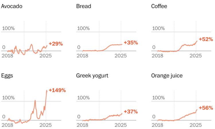
Washington Post Opinion has a tracker updated weekly that groups items by everyday events, such as breakfast, a B.L.T. sandwich, or a backyard barbecue.
Inflation, no longer just a concept discussed at abstract economic levels, is now felt directly in everyone’s receipts at the grocery store. Promises were made last year that the prices would come down. The prices continue to rise fast enough for you to notice. We’ll see where they go.
See also: InflataCart, an inflation tracker for your grocery list.
-
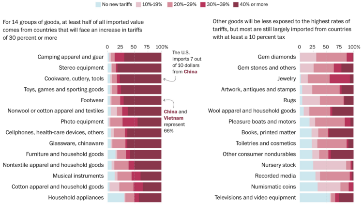
You get a tariff. And you get a tariff. And you. And you. Everybody gets a tariff. But not the same for every type of consumer good. For the Washington Post, Luis Melgar, Rachel Lerman, and Szu Yu Chen show the percentages of imported value by category.
That means products that the United States commonly gets from Vietnam, such as clothing and shoes, would be subject to a new 46 percent tax, whereas goods from Colombia, like flowers, would see a lower new 10 percent levy. Imports from Mexico, such as avocados, will have no new tax. In any case, shopping is about to get more expensive for Americans.
It looks like camping gear, stereo equipment, cookware, and toys are going to get hit the hardest, but at least numismatic (?) coins won’t get taxed as hard.
-
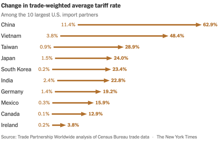
Trade Partnership Worldwide, based on data from the Census Bureau, estimates $714 billion in new tariffs, which will be spread differently for each country. Lazaro Gamio for the New York Times reports:
As companies and consumers will largely bear the higher cost of importing goods, Mr. Trump’s trade policies could come with a large economic toll. Consumer sentiment has begun to fall, inflation is expected to rise, and global stocks have been plunging. Even Mr. Trump has suggested that his policies could cause a recession.
Nevertheless, Mr. Trump suggested on Wednesday that more trade actions could follow.
-
Based on data from the Survey of Consumer Finances, 58% of families have money in the stock market, either directly or through mutual funds or retirement accounts. The percentage has been rising over the decades. Pew Research broke it down by race since 1989:
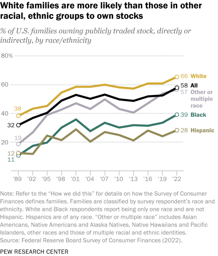
The stock market used to be an investment vehicle primarily for the wealthy, but it’s gotten easier and finances have shifted. The recent tariff-induced downturn is hitting everyone now, directly and indirectly.






 Visualize This: The FlowingData Guide to Design, Visualization, and Statistics (2nd Edition)


