Simone Giertz, bringer of joy and self-described expert in shitty robots, makes machines that succeed in failing. In her TED talk, Giertz talks about her path from “useless” things to expert. It’s all the more relevant after she found out she has a brain tumor.
-
-
Eric Rodenbeck from Stamen Design discusses visualization the medium over visualization the tool or the insight-providing image:
Dataviz! Data visualization! I don’t think it’s for anything! I don’t believe it’s meaningful to say that dataviz is for one thing, any more than it’s meaningful to say that architecture is for any one thing. Or that photography is for one thing, that it has a purpose that can be defined in a sentence or two. Or that movies are for one thing, one that you could win an argument about.
Yes.
See also Martin Wattenberg and Fernanda Viegas’ talk from a while back on the parallels between books and visualization.
-
The 2020 Census is coming up quick, but there’s still a lot up in the air. There’s no director, the bureau has to adjust to budget cuts, and a new digital system that promises to save money hasn’t been fully tested (because of lower funding). Exciting. Alvin Chang for Vox explains in more detail — with cartoons.
-
Most of us don’t read the terms and conditions before we click on “I agree” for the web services we use. They’re too long, and we need likes right away. For a student project, Dima Yarovinsky printed the terms and conditions on paper for major social apps — WhatsApp, Google, Tinder, Twitter, Facebook, Snapchat, and Instagram, respectively — which highlights what we’re getting into. [via @hailmika]
-
Members Only
Moving your data from the digital screen to something more physical isn’t as tricky as it seems. Here’s how I did it.
-
By Neil Freeman, the @everytract bot on Twitter, as the name suggests, is tweeting a map of every Census tract in numerical order. It’s one map each half hour.
Census data, or data in general really, is typically in aggregate or about the overall trends, which requires an abstract view of a bunch of data points pushed together. So it’s nice to see a straightforward project put focus on the individual.
Of this genre, the censusAmericans bot is my favorite. It tweets people’s biographies based on data from the American Community Survey.
-
Kit Chellel for Bloomberg tells the riveting gambling story of Bill Benter, who used statistics to model horse-racing in Japan. My favorite part is the pre-Internet process Benter took to collect data and predict results:
Benter’s model required his undivided attention. It monitored only about 20 inputs—just a fraction of the infinite factors that influence a horse’s performance, from wind speed to what it ate for breakfast. In pursuit of mathematical perfection, he became convinced that horses raced differently according to temperature, and when he learned that British meteorologists kept an archive of Hong Kong weather data in southwest England, he traveled there by plane and rail. A bemused archivist led him to a dusty library basement, where Benter copied years of figures into his notebook. When he got back to Hong Kong, he entered the data into his computers—and found it had no effect whatsoever on race outcomes. Such was the scientific process.
As I said with the lottery–hacking stories: I need to gamble more. This is statistics’ true purpose, right?
-
Roger Peng discusses the importance of managing the relationships between people — analyst, patron, subject matter expert, and audience — for a successful analysis:
Human relationships are unstable, unpredictable, and inconsistent. Algorithms and statistical tools are predictable and in some cases, optimal. But for whatever reason, we have not yet been able to completely characterize all of the elements that make a successful data analysis in a “machine readable” format. We haven’t developed the “institutions” of data analysis that can operate without needing the involvement of specific individuals. Therefore, because we have not yet figured out a perfect model for human behavior, data analysis will have to be done by humans for just a bit longer.
Whenever someone touts a tool for “automatic insights”, whether it be in analysis or chart generation, something like this comes to mind.
-
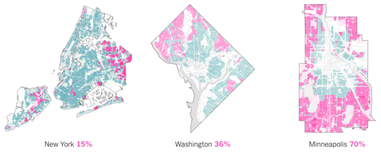
Aaron Williams and Armand Emamdjomeh for The Washington Post delve into diversity and segregation in the United States. The boiling pot continues to get more ingredients, but they’re not mixing evenly.
Some 50 years ago, policies like the Fair Housing Act and Voting Rights Act were enacted to increase integration, promote equity, combat discrimination and dismantle the lingering legacy of Jim Crow laws. But a Post analysis shows that some cities remain deeply segregated — even as the country itself becomes more diverse.
I like how you can easily toggle between diversity and segregation. It allows for a quick comparison of metrics that aren’t always clear-cut.
Scroll to the end to see how diversity and segregation compare in your area.
-
You’ve probably heard of the wisdom of crowds. The general idea, popularized by James Surowiecki’s book, is that a large group of non-experts can solve problems collectively better than a single expert. As you can imagine, there are a lot of subtleties and complexities to this idea. Nicky Case helps you understand with a game.
Draw networks, run simulations, and learn in the process. The game takes about a half an hour, so set aside some time to play it through.
-
We almost always look at data through a screen. It’s quick and good for exploration. So is there value in making data physical? I played around with a 3-D printer to find out.
-
Jonathan Corum, the Science graphics editor at The New York Times, talks about his experiences communicating scientific research to the public. Much of visualization design is about figuring out the audience and making graphics for that audience, so Corum uses a lot of examples that start from technical research papers and finish with a more focused result.
-
Taylor Baldwin mapped all of the buildings in Manhattan using a 3-D layout. Rotate, zoom, and pan, and be sure to mess around with the parameters in the control panel for different looks. Also make sure you try it in Chrome, because it’ll probably send your computer fan whirling.
-
With Numberphile, Lisa Goldberg discusses her research with Alon Daks and Nishant Desai at the University of California, Berkeley on the hot hand in basketball. When a player is hitting shots, is he more likely to hit the next one? The experiment results suggest that the hot hand is actually just randomness.
That said, there are other points of view on this topic.
As a statistician, I don’t think the hot hand exists mathematically, but as a sports fan, I’m more than happy to ride the wave of excitement.
-
It’s been a decade since the first Iron Man movie, and some 30 superhero characters later, we arrive at a two-parter Avengers finale. But maybe you lost track of everything that happened leading up to this point. Sonia Rao and Shelly Tan for the Washington Post got you covered with a filterable timeline. Focus on specific stories, characters, and franchises. Select “block spoilers” in case you still plan to watch something.
I used to watch all of the Marvel movies, but then I had kids. I’ve seen one in five years. So this is right up my alley.
-
When it comes to robots and love, the concept typically deteriorates to subservient tools to satisfy male fantasies. Creative technologist Fei Lu aims for a more complex relationship with Gabriel2052:
Creating Gabriel2052 is obviously technically challenging, but it’s ultimately a process within my control. He will become something—someone—I can form a lifelong bond with. Through bringing Gabriel2052 to life, I am investigating and confronting the ways in which technology and society create both harmful and uplifting narratives; the ones we’ve become complicit in during our search for love and understanding from others, and the world at large.
So instead of a robot that is purely there to serve, Lu explores a robot that’s a bit closer to human and driven by her emotional needs (and an ex-boyfriend’s text messages) — because inevitably, our relationship with robots will impact our relationships with real people.
-
Sisi Wei for ProPublica and Nick Fortugno of Playmatics made a game to provide a feeling of what it’s like for someone who needs escape from their home.
Based on the real case files of five asylum seekers from five countries and interviews with the medical and legal professionals who evaluate and represent them, The Waiting Game is an experimental news game that lets you walk in the shoes of an asylum seeker, from the moment they choose to come to the United States to the final decision in the cases before an immigration judge.
Take your time with this one, and use your headphones.
In the game format, I felt more engrossed in the individual stories than I think if it were a linear profile story.
-
Janelle Shane, who likes to play with output from neural networks, teamed up with knitters in a discussion forum to produce abstract designs. Shane generates the knitting patterns, and the knitters bring the computer output to life. She calls the project SkyKnit.
The neural network produces slightly flawed instructions, but the knitters can figure things out:
Knitters are very good at debugging patterns, as it turns out. Not only are there a lot of knitters who are coders, but debugging is such a regular part of knitting that the complicated math becomes second nature. Notation is not always consistent, some patterns need to be adjusted for size, and some simply have mistakes. The knitters were used to taking these problems in stride. When working with one of SkyKnit’s patterns, GloriaHanlon wrote, “I’m trying not to fudge too much, basically working on the principle that the pattern was written by an elderly relative who doesn’t speak much English.”
Love the meeting between people and computer. [via The Atlantic]
-
Neural networks have shown usefulness with a number of things, but here is an especially practical use case. Chris Rodley used neural networks to create a hybrid of a dinosaur book and a flower book. The world may never be the same again.
-
When watching baseball on television, we get the benefit of seeing whether a pitch entered the strike zone or not. Umpires go by eye, and intentional or not, they tend towards finishing a game over extra innings. Michael Lopez, Brian Mills, and Gus Wezerek for FiveThirtyEight:
The left panel shows the comparative rate of strike calls when, in the bottom of an inning in extras, the batting team is positioned to win — defined as having a runner on base in a tie game — relative to those rates in situations when there’s no runner on base in a tie game. When the home team has a baserunner, umps call more balls, thus setting up more favorable counts for home-team hitters, creating more trouble for the pitcher, and giving the home team more chances to end the game.
I doubt the shift is on purpose, but it’s interesting to see the calls go that way regardless. Also, from a non baseball-viewer, why isn’t there any replay in baseball yet?