How People Meet Their Partners
“So how’d you two meet?” There’s always a story, but the general ways people meet are usually similar. They met through a friend. They met at church. They met through an app. Using the freshly released How Couples Meet and Stay Together dataset, we can see the most common ways.
Most Common Ways to Meet
Percentage of people out of those who were partnered.
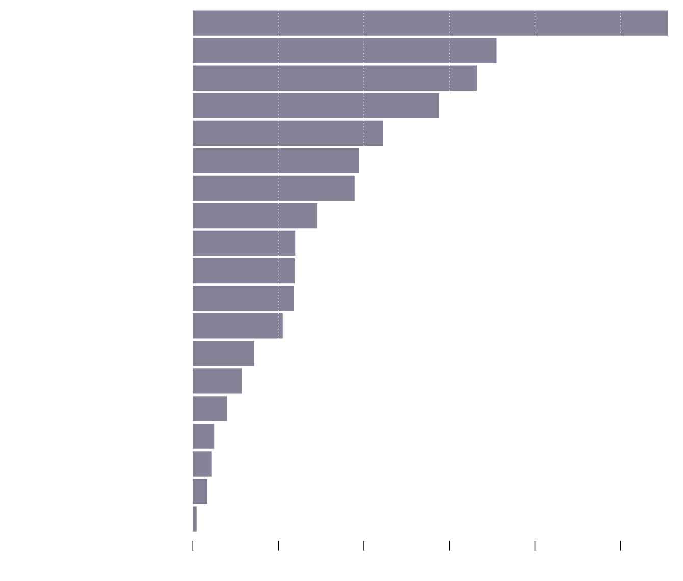
Met Through Friend
Bar/Restaurant
Met Through Co-worker
Met Through Family
School
Met Online
Party
College
Customer
Church
Met Through Neighbor
Volunteering
Public
Blind Date
Military
Vacation
Work Neighbors
Singles Service
Business Trip
0%
5%
10%
15%
20%
25%
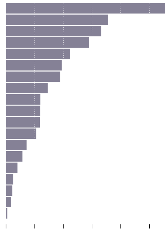
Met Through Friend
Bar/Restaurant
Met Through Co-worker
Met Through Family
School
Met Online
Party
College
Customer
Church
Met Through Neighbor
Volunteering
Public
Blind Date
Military
Vacation
Work Neighbors
Singles Service, Not Online
Business Trip
0%
5%
10%
15%
20%
25%
I’m surprised “met online” isn’t higher, at just under 10 percent. This includes dating sites and apps. I’ll have to look closer at age and the year people met in the next round. (Update: I did it.)
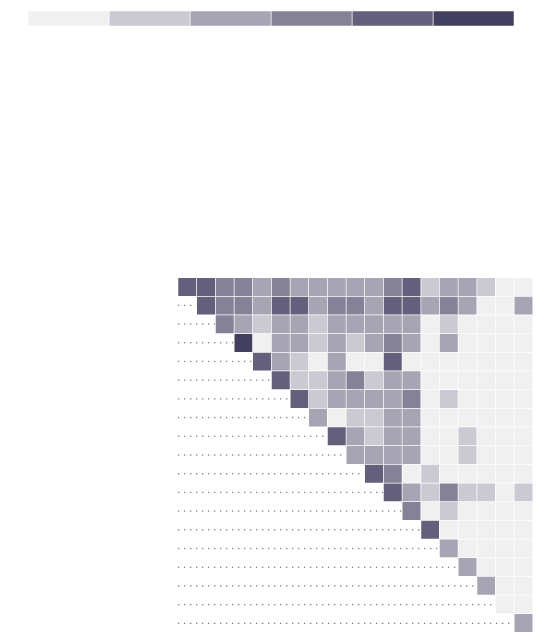
Respondents were asked an open-ended question about how they met and the researchers Michael J. Rosenfeld, Reuben J. Thomas, and Sonia Hausen manually classified each response. So people were allowed to describe more than one way.
For example, maybe a couple met through a friend at a restaurant, in which case two ways of meeting were flagged. Maybe they met at a family party.
Here’s the breakdown.
More Than One Way
Many times, there are multiple forces at work that bring a couple together.

Through Co-worker
Through Neighbor
Work Neighbors
Through Family
Singles Service
Through Friend
Bar/Restaurant
Business Trip
Volunteering
Met Online
Blind Date
Customer
Vacation
College
Church
Military
School
Public
Party
Through Family
Through Friend
Through Neighbor
Through Co-worker
Met Online
School
College
Military
Church
Volunteering
Customer
Bar/Restaurant
Party
Public
Blind Date
Vacation
Singles Service
Business Trip
1 in
1,000
1 in
500
1 in
100
1 in
50
1 in
10
Work Neighbors
1 in
1000
1 in
500
1 in
100
1 in
50
1 in
10
Through Co-worker
Through Neighbor
Work Neighbors
Through Family
Singles Service
Through Friend
Bar/Restaurant
Business Trip
Volunteering
Met Online
Blind Date
Customer
Vacation
College
Church
Military
School
Public
Party
Through Family
Through Friend
Through Neighbor
Through Co-worker
Met Online
School
College
Military
Church
Volunteering
Customer
Bar/Restaurant
Party
Public
Blind Date
Vacation
Singles Service
Business Trip
Work Neighbors
The diagonal represents those who met just one way. For example, the top left grid square represents those who met only through family. That said, when friends and family are involved, it looks like there are often multiple forces at work.
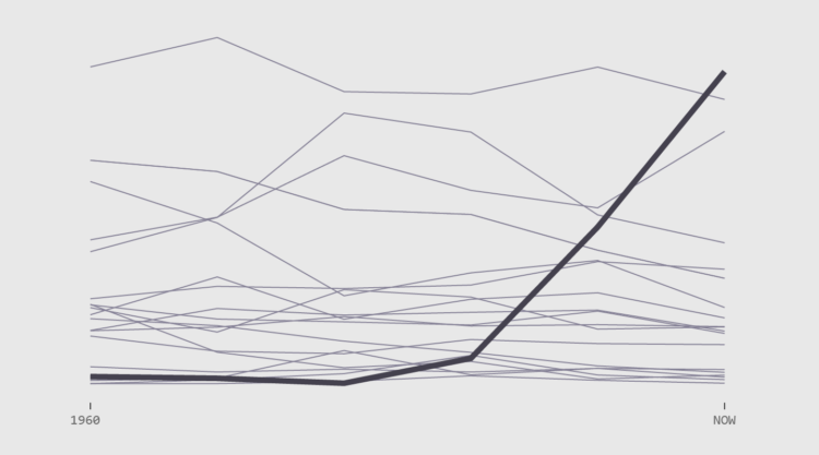
Shifts in How Couples Meet
Watch the changes over six decades. Meeting online now reigns supreme.
Notes
- The data comes from Michael J. Rosenfeld, Reuben J. Thomas, and Sonia Hausen. You can download the How Couples Meet and Stay Together 2017 dataset via Stanford’s SSDS Social Science Data Collection.
- I analyzed the data and made the charts in R. Here are some relevant heatmap tutorials.
Become a member. Support an independent site. Make great charts.
See What You GetFlowingData is made possible by supporting members. Since 2007, I, Nathan Yau, a real person, have been analyzing and visualizing data to help more people understand and appreciate it in their everyday lives.
If you liked this or want to make similar data things, please consider supporting this small corner of the internet. You get unlimited access to visualization courses, tutorials, and extra resources. Thanks. — Nathan
Chart Types Used

