Where Your Job is Most Popular
Some jobs are common nationwide, because they are needed everywhere. Teachers, cashiers, physicians. Then there are jobs more specific to geography. Actors, fishing workers, foresters. Use the searchable map grid below to see the popularity of your job in each state, compared against the national average.
Job Popularity in Each State
Search for a job below.
My favorite thing to do is to just keep clicking for a random occupation. The sudden state-specific spikes surprise me every time.
Like with the map of the most uniquely popular job, I used the location quotient (LQ), based on data from the 2016 5-year American Community Survey. The LQ considers the proportion of workers in a location and divides by the national rate.
So in the above, an LQ of 2 means a job is twice as common in a state as it is nationally. An LQ of 1 means a job is of the same popularity as it is nationally.
There was data for 478 occupations. Of these, economists in Washington, D.C. had the highest regionality at over 59 times the national average. In contrast, elementary and middle school teachers showed the lowest variance with roughly the same rate in all states.
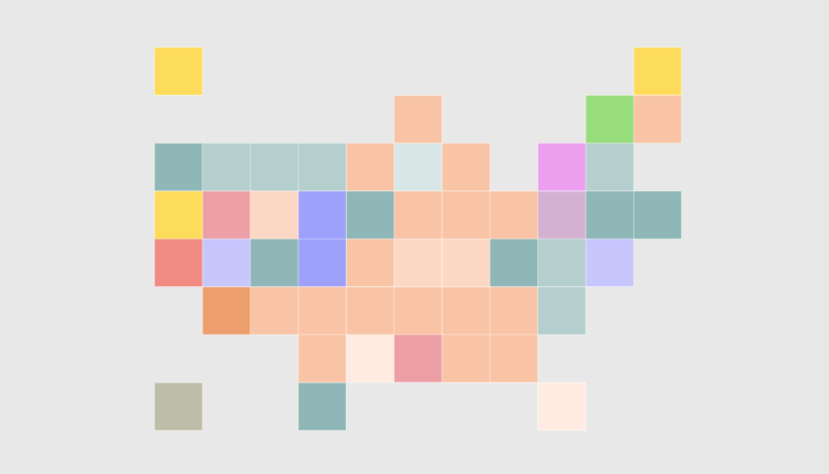
Most Uniquely Popular Jobs
See the job with the highest location quotient in each state.
Notes
- The data comes from the 2016 5-year American Community Survey. I grabbed the microdata using IPUMS extraction tools.
- I used R to analyze and aggregate.
- I used D3.js to make the chart above.
Chart Type Used

Become a member. Support an independent site. Get extra visualization goodness.
See What You Get