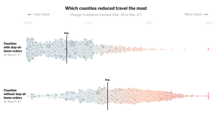
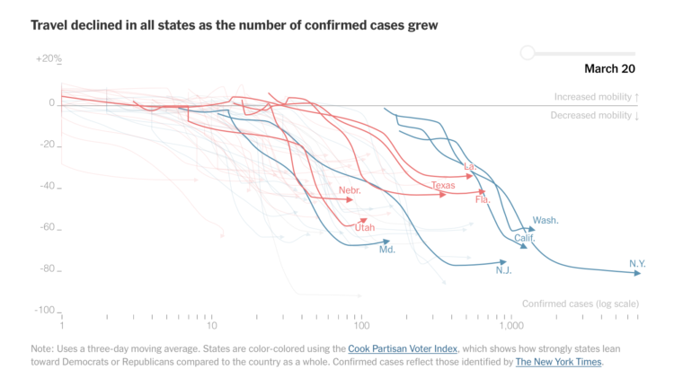
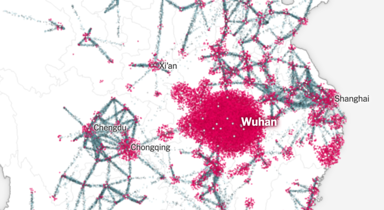
Based on cellphone data from Cuebiq, The New York Times looked at how different parts of the country reduced their travel between the end of February and the end of March. Some counties really stayed at home. Some not so much:
In areas where public officials have resisted or delayed stay-at-home orders, people changed their habits far less. Though travel distances in those places have fallen drastically, last week they were still typically more than three times those in areas that had imposed lockdown orders, the analysis shows.
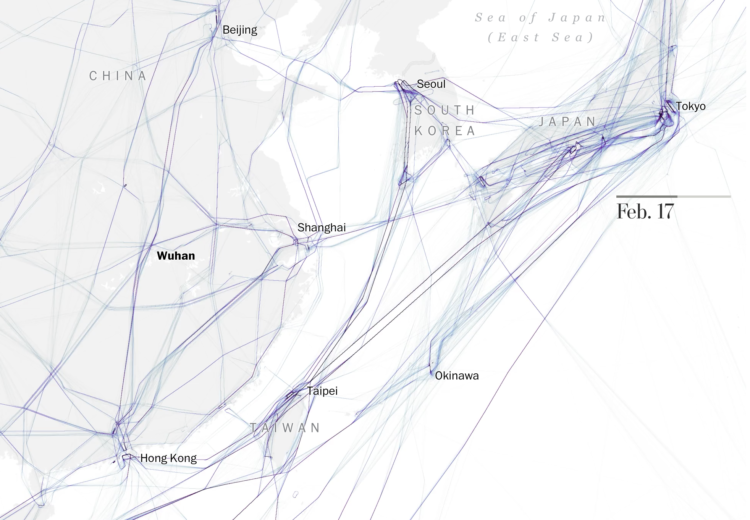
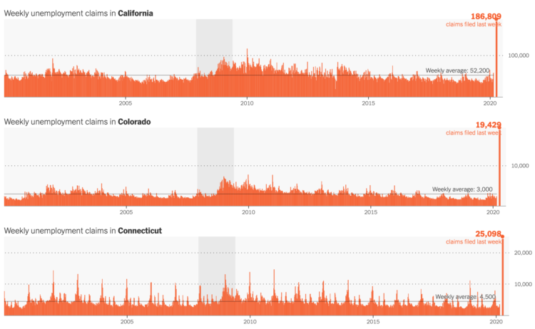
The streets are quiet here in northern California, so this is pretty shocking for me. If you can, stay at home, folks. It’s inconvenient, but it’s a small sacrifice for something much bigger.


 Visualize This: The FlowingData Guide to Design, Visualization, and Statistics (2nd Edition)


