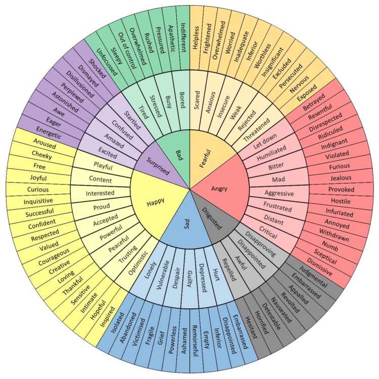
• Membership
  • Newsletter
  • Projects
  • Learning
  • About
  • Member Login
  • Mapping chemical plants, the pollution around them, and more chemical plants

    October 31, 2019

    Topic

    Maps  /  chemical, pollution, ProPublica

    ProPublica, with The Advocate and The Times-Picayune, estimated chemical concentrations in a highly polluted area along the Mississippi River that will probably get worse soon:

    The industrial stretch of the Mississippi River between Baton Rouge and New Orleans, a region known as “Cancer Alley,” is one of the most highly polluted areas in the country. A ProPublica analysis using a scientific model developed by the Environmental Protection Agency shows that some of the neighborhoods where new plants are being built already have very high concentrations of toxic chemicals. But Louisiana continues to approve the building of these new plants and the expansion of existing ones.

    Yikes.

  • Data Underload  /  debt, millennial, money, net worth

    When Americans Reach $100k in Savings

    It was reported that 1 in 6 millennials have at least $100,000 saved. Is this right? It seems high. I looked at the data to find out and then at all of the age groups.

    Read More
  • Worst performing circuits mapped with fire risk

    October 29, 2019

    Topic

    Maps  /  PG&E, Wall Street Journal, wildfire

    This month PG&E has been shutting down power to thousands of households in northern California because of high winds and wildfire risk. A lot of electrical equipment in the area is dated and in need of a repair. The Wall Street Journal mapped fire risk and bad circuits together.

  • High-resolution satellite image of Kincade fire, up close from far away

    October 29, 2019

    Topic

    Maps  /  Planet, satellite imagery, wildfire

    I feel like satellite imagery has upped its skillset in recent years. According to Rob Simmon, the image below from Planet of the Kincade fire in Sonoma, California was taken from 600 miles away in Utah.

    Planet SkySat imagery of the #KincadeFire captured at an extreme angle yesterday, October 27th. pic.twitter.com/WQd7RKsM81

    — Planet (@planetlabs) October 28, 2019

  • Kincade fire in Sonoma County via satellite imagery

    October 28, 2019

    Topic

    Maps  /  satellite imagery, wildfire

    You can see the time-lapsed imagery with this browser. [via @weatherdak]

  • The Myth of ‘Dumbing Down’

    October 28, 2019

    Topic

    Statistics  /  audience, communication

    For The Atlantic, Ian Bogost on communicating complex ideas to an audience:

    One thing you learn when writing for an audience outside your expertise is that, contrary to the assumption that people might prefer the easiest answers, they are all thoughtful and curious about topics of every kind. After all, people have areas in their own lives in which they are the experts. Everyone is capable of deep understanding.

    Up to a point, though: People are also busy, and they need you to help them understand why they should care. Doing that work—showing someone why a topic you know a lot about is interesting and important—is not “dumb”; it’s smart. Especially if, in the next breath, you’re also intoning about how important that knowledge is, as academics sometimes do. If information is vital to human flourishing but withheld by experts, then those experts are either overestimating its importance or hoarding it.

    I struggled with this during my first year of graduate school, because it took a while to get out of my own head and imagine myself as a reader. Or, in the case of that first-year regression analysis course, I was supposed to imagine a policymaker on a tight schedule.

    I would crunch numbers or whatever and write reports. My professor told me I had to do a better job explaining the meaning behind the numbers. How should a non-statistician interpret these results? It was my job as the statistician to explain.

  • How Charts Lie

    October 25, 2019

    Topic

    Visualization  /  Alberto Cairo, misleading

    Charts can reveal truths that we never would see otherwise, but they can also be misused to show us something in the data that doesn’t reflect reality. Alberto Cairo’s new book How Charts Lie is a guide on how to better spot the latter. It’s about reading charts more critically and understanding data better, which are necessary skills for everyone these days.

    I’m putting this at the top of my queue.

  • Visualizing the Friends sitcom

    October 25, 2019

    Topic

    Infographics  /  Friends, television

    Marion Rouayroux, a graphic designer and a big fan of the show Friends, collated a bunch of data about the sitcom. Then she visualized the data with a series of information graphics.

  • How to Use IPUMS Extraction Tools to Download Survey Data

    Almost all of my visualization projects that use data from the Census Bureau comes via IPUMS. In this guide, I provide five steps to getting the data you need using their tools.

  • Members Only

    Analysis as Detective Work (The Process #62)

    October 24, 2019

    Topic

    The Process  /  analysis, messy

    Analysis and visualization are often a messy process that never matches up to the step-by-step guides you read, but that’s normal.

  • Cleaning your data with Excel and Google Spreadsheets

    October 24, 2019

    Topic

    Software  /  cleaning, Excel, Lisa Charlotte Rost, spreadsheet

    For Datawrapper, Lisa Charlotte Rost outlines the steps to prepare and clean your data in Excel or Google Spreadsheets. From the beginning:

    When you download an Excel file, it often has multiple sheets. Our data set has three of them, as seen on the bottom: “Data”, “Metadata – Countries” and “Metadata – Indicators”. Look through all of your sheets and make sure you understand what you’re seeing there. Do the headers, file name and/or data itself indicates that you downloaded the right file? Are there footnotes? What do they tell you? Maybe that you’re dealing with lots of estimates? (Does that maybe mean that you need to look for other data?) If you don’t find notes in the data, make sure you look for them on the website of your source.

    The guide is in the context of prepping your data to load into the Datawrapper tool, but the advice easily applies more generally.

  • Photographs from above, an Overview

    October 23, 2019

    Topic

    Data Art  /  photography, satellite imagery

    Overview is an ongoing project that uses a zoomed out view for a new perspective on the world:

    Seeing the Earth from a great distance has been proven to stimulate awe, increase desire to collaborate, and foster long-term thinking. We aim to inspire these feelings — commonly referred to as the Overview Effect — through our imagery, products, and collaborations. By embracing the perspective that comes from this vantage point, we believe we can stimulate a new awareness that will lead to a better future for our one and only home.

    Far away enough to see patterns. Close enough to stay connected to the parts.

  • Data Underload  /  commute

    Mapping When and Where People Start their Commute

    For commuters, the farther away you live from the workplace, the earlier you have to leave your house to get to work on time. How much does that start time change the farther out you get?

    Read More
  • How data changes the design process at every stage

    October 22, 2019

    Topic

    Design  /  process, real data

    On Multiple Views, the Interactions Lab talks about their experience as a design studio and how quickly implementations can change when you introduce real data into the system:

    It’s easy to assume that the tools and approaches used for general software design apply equally to data visualization design. But data visualization design and interface design are often deeply and fundamentally distinct from one another. We learned this the hard way when we turned our research lab into a collaborative data visualization design studio for a few years. Data permeates visualization interfaces in ways that pose challenges at every stage of the design process. These challenges are even greater within large visualization teams. By reflecting on and articulating these challenges, we hope to inspire new, powerful data visualization design tools and communication processes.

    Always start with real data. You’re wasting your time otherwise.

  • Scientology city takeover

    October 21, 2019

    Topic

    Maps  /  Scientology, Tampa Bay Times

    For Tampa Bay Times, Tracey McManus and Eli Murray delve into the purchasing of properties Clearwater, Florida by the Church of Scientology:

    The Church of Scientology and companies run by its members spent $103 million over the past three years buying up vast sections of downtown Clearwater.

    They now own most commercial property on every block within walking distance of the waterfront, putting the secretive church firmly in control of the area’s future.

    Most of the sales have not previously been reported. The Tampa Bay Times discovered them by reviewing more than 1,000 deeds and business records, then interviewed more than 90 people to reconstruct the circumstances surrounding the transactions.

    The lead-in scrollytelling through Clearwater is quite effective in laying the foundations of the story.

  • Microsoft’s visual data explorer SandDance open sourced

    October 18, 2019

    Topic

    Software  /  Microsoft, open-source, SandDance

    Microsoft just open sourced their data exploration tool known as SandDance:

    For those unfamiliar with SandDance, it was introduced nearly four years ago as a system for exploring and presenting data using “unit visualizations.” Instead of aggregating data and showing the resulting sums as bar charts, SandDance shows every single row of a dataset (for datasets up to ~500K rows). It represents each of these rows as a mark that can be colored and organized into different areas on the screen. Thus, bar charts are made of their constituent units, stacked, or sorted.

    Nice. I hadn’t heard about SandDance until now, but I’m saving for later. You can grab the source on GitHub.

  • Members Only

    Less Time With Methods, More Time With Questions and Context (The Process #61)

    October 17, 2019

    Topic

    The Process  /  context, Kevin Durant, Nate Silver, questions

    Data represents the real world, and visualization represents data. But sometimes data and the real world disagree with each other.

  • Techniques for adding context to visualization

    October 17, 2019

    Topic

    Design  /  context, Richard Brath, talk

    [arve url=”https://vimeo.com/304321201″ /]

    When it comes to meaningful visualization, context is everything. Richard Brath, at the 2018 Information+ Conference, looks back on historical visualization approaches and how they might be applied today to make data graphics easier to read and use.

  • Data Underload  /  commute, threshold, work

    How Much Commuting is Too Much?

    One person’s long commute is another’s dream. Another person’s normal might be someone else’s nightmare. What counts as a long commute depends on where you live.

    Read More
  • Study retracted after finding a mistaken recoding of the data

    October 15, 2019

    Topic

    Mistaken Data  /  recode, retraction

    A study found that a hospital program significantly reduced the number of hospitalizations and emergency department visits. Great. But then the researchers realized that the data was recoded incorrectly, and the program actually increased hospitalizations and emergency department visits. Not so great.

    They retracted their paper:

    The identified programming error was in a file used for preparation of the analytic data sets for statistical analysis and occurred while the variable referring to the study “arm” (ie, group) assignment was recoded. The purpose of the recoding was to change the randomization assignment variable format of “1, 2” to a binary format of “0, 1.” However, the assignment was made incorrectly and resulted in a reversed coding of the study groups. Even though the data analyst created and conducted some test analysis programs, they were of the type that did not show any labeling of the arm categories, only the “arm” variable in a regression, for example.

    Here’s the original, now-retracted study. And here’s the revised one.

    Data can be tricky and could lead to unintended consequences if you don’t handle it correctly. Be careful out there.

  • Page 116 of 392
  • <
  • 1
  • ...
  • 113
  • 114
  • 115
  • 116
  • 117
  • 118
  • ...
  • 392
  • >

Analyze, visualize, and communicate data usefully, beyond the defaults.

Become a member →

Recently for Members

May 8, 2025
When the data is not what it seems

May 1, 2025
Finding the Right Charts

April 24, 2025
Visualization Tools, Datasets, and Resources – April 2025 Roundup

April 17, 2025
Breaking Out of Chart Software Defaults

April 15, 2025
Line Chart with Decorative Neon Accents

Browse by Chart Type See All →

Difference Chart Packed Bubble Chart Radar Chart Parallel Sets Heatmap Bubble Chart Baseline Chart Word Cloud Barcode Chart Glyph Chart

Browse By Topic

  • Visualization

    Seeing data

  • Maps

    Seeing geographic data

  • Infographics

    Explaining data

  • Networks

    Connecting data

  • Statistics

    Analyzing data

  • Software

    Working with data

  • Sources

    Getting data

  • Design

    Making data readable

Get the Book

Visualize This: The FlowingData Guide to Design, Visualization, and Statistics

Available now.

Order: Amazon / Bookshop

Made by FlowingData

  • The Process

  • Data Underload

  • Chart Everything

  • Guides

  • Books

  • Shop

  • About
  • Contact
  • Newsletter
  • LinkedIn
  • Instagram
  • Bluesky
  • RSS
Copyright © 2007-Present FlowingData. All rights reserved.