
The data might exist on a single page or in a single file, but there’s always more to it. Take a step outside for a better view.
The data might exist on a single page or in a single file, but there’s always more to it. Take a step outside for a better view.
Manuel Lima hosted a free online panel with Michale Friendly and Sandra Rendgen historical data visualization. It already happened, but you can listen to the archived version:
Human beings have been involved in the visual representation of information for thousands of years. While some books on Data Visualization go as far back as the 18th century, to what’s considered to be the golden age of information graphics, the history of the practice is much deeper. The participants on this panel have spent years exploring key characters and major contributions to the field of Data Visualization over many centuries. We will be discussing ancient visual metaphors, the challenges of doing research in this area, what we can learn from the past, and many other topics.
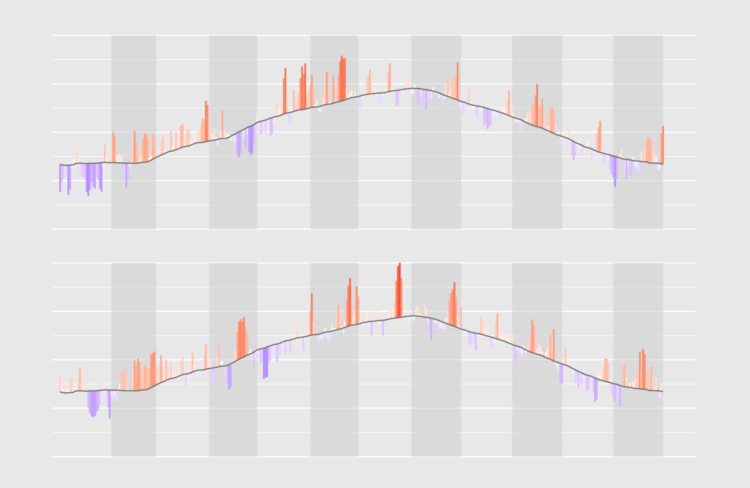
Quickly see what’s below and above average through the noise and seasonal trends.
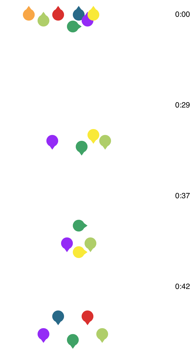 BTS, the South Korean boy band, is apparently really good at dancing. Ketchup Duck breaks down a routine into individual formations to show the precision:
There are a lot of impressive things about their dance routine, but the most impressive thing, to me, is how seamlessly they move around each other. As Lainey put it, it is art “the way they move so quickly, shifting from position to position, always aware of where they all are, taking space for themselves and creating space for each other.”
There’s a rabbit hole begging to be explored here. [via @Caged]
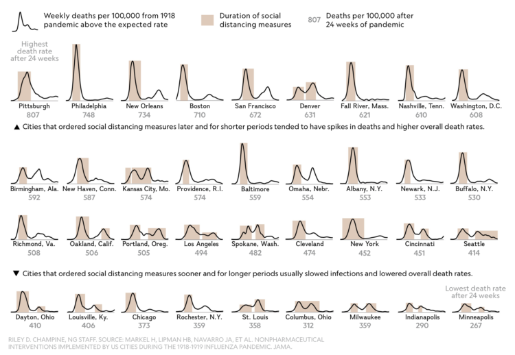
For National Geographic, Nina Strochlic and Riley D. Champine look back at the 1918 pandemic for clues about the future:
The 1918 flu, also known as the Spanish Flu, lasted until 1920 and is considered the deadliest pandemic in modern history. Today, as the world grinds to a halt in response to the coronavirus, scientists and historians are studying the 1918 outbreak for clues to the most effective way to stop a global pandemic. The efforts implemented then to stem the flu’s spread in cities across America—and the outcomes—may offer lessons for battling today’s crisis.

Using 3-D simulation data from the Kyoto Institute of Technology, The New York Times shows how droplets from a sneeze or a cough can spread in a space. In a nutshell, six feet is the recommendation while in public areas, but the farther you away you can stay away the better. Go to the end, and there’s also an augmented reality segment that puts a six-foot range around you.
I may never set foot in a crowded place again.
See also: how different cough coverings can change the spread of droplets.
The Ohio Department of Health released this video to show the advantages of social distancing:
That’s a lot of balls and mousetraps to setup.
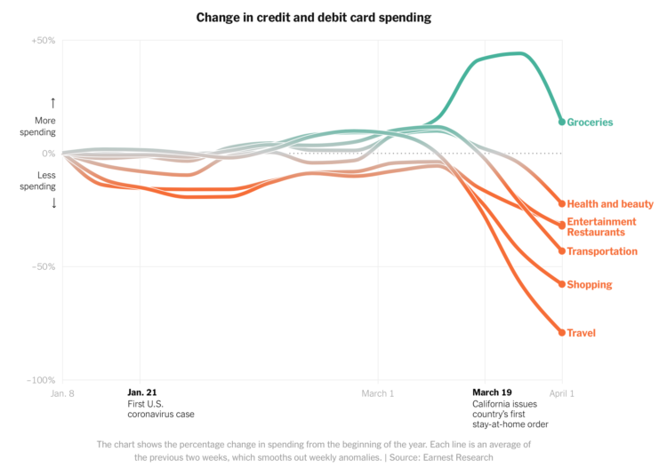
Consumer spending has shifted dramatically since most people have to stay at home. For The New York Times, Lauren Leatherby and David Gelles show by how much:
All of the charts in this article are based on a New York Times analysis of data from Earnest Research, which tracks and analyzes credit card and debit card purchases of nearly six million people in the United States. While the data does not include cash transactions, and therefore does not reflect all sales, it provides a strong snapshot of the impact of the virus on the economy.
The article also includes breakdowns for the main categories above. The only reason restaurants and entertainment aren’t down more is because delivery services and at-home streaming slightly offset the dip.

The pandemic has affected all parts of life, which can be seen from many points of view. For National Geographic, Taylor Maggiacomo and Maya Wei-Haas on the decrease in average ground displacement:
Lulls in seismic activity have occurred in the past, generally in short spurts. But COVID-19—the disease caused by the novel coronavirus—has imposed a lengthy hush in populated regions across the planet. And seismometers on multiple continents are recording the shift.
Measured in nanometers.
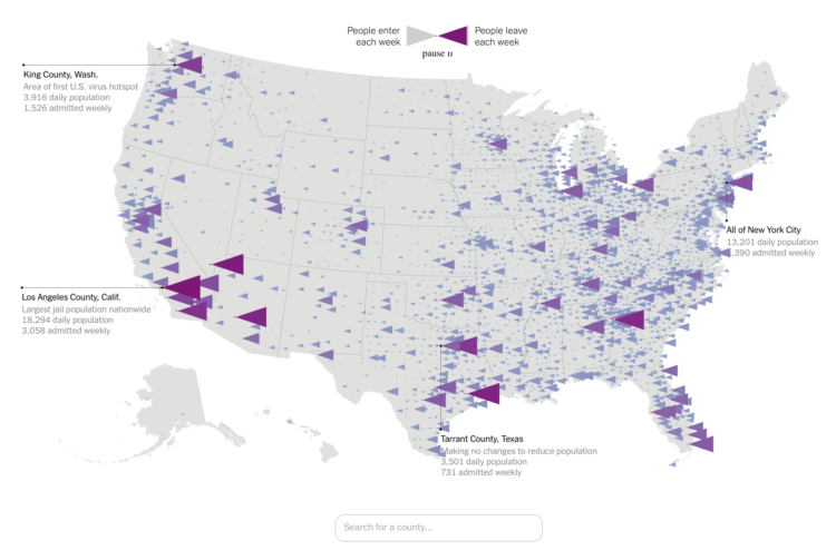
In a collaboration between The Marshall Project and The Upshot, Anna Flagg and Joseph Neff look at the flow in and out of jails and what that means during these times of social distancing:
Preventing the spread of the virus in jails is challenging. Social distancing is crucial, but it’s virtually impossible in dormitories with rows of beds in a common room. The same is true of two people in a single cell, or group showers or bathrooms that serve dozens. All these dangers escalate when jails are overcrowded, filthy or understaffed.
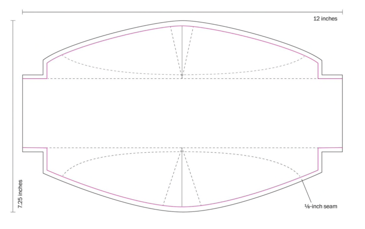
The Washington Post provides clear instructions on how to sew your own mask. Download and print the template, attach elastic straps, and sew.

I have a lot of books stacked on my desk. It’s kind of embarrassing. Now seems like a good as time as any to read them.
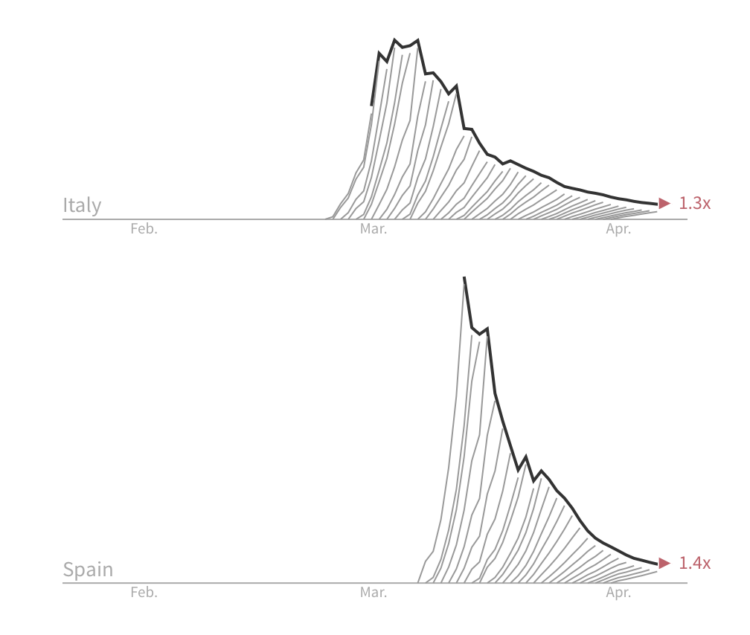
For Reuters, Jon McClure looks at the death counts for each country from a different angle. “Each line measures how much the number of fatalities grew in seven days.” The goal is to “break the wave” to get the rates down.
The charts are a combination of flattening the curve and the daily updated charts from The Financial Times showing death tolls. I have a feeling the geometry will confuse some people, but I like the metaphor.
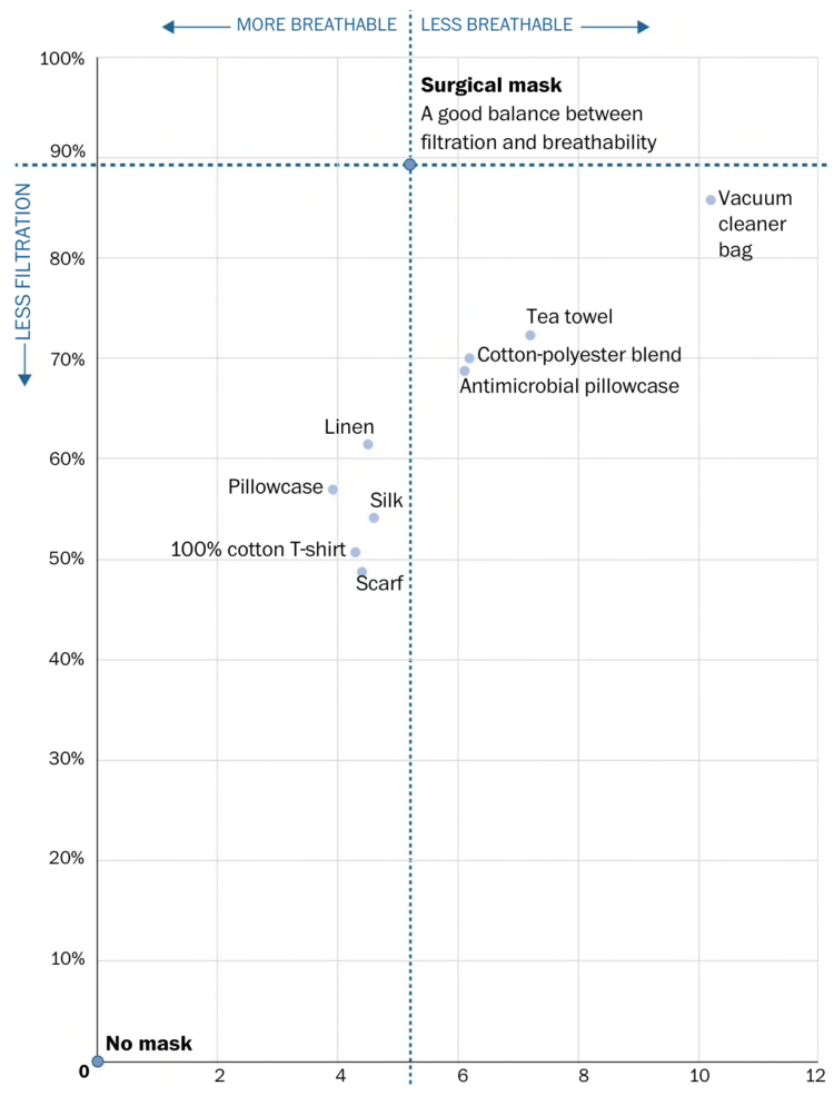
The CDC now recommends that you wear a cloth face mask if you leave the house. For The Washington Post, Bonnie Berkowitz and Aaron Steckelberg answer some questions you might have about making your own, including the chart above. You need material that provides both filtration and breathability.
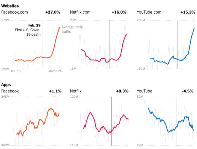
Your schedule changed. The time spent in front of or using a screen probably shifted. Using data from SimilarWeb and Apptopia, Ella Koeze and Nathaniel Popper for The New York Times look at how these changes are reflected in average daily traffic for major websites and apps.
More video games, more social apps, and more virus news.
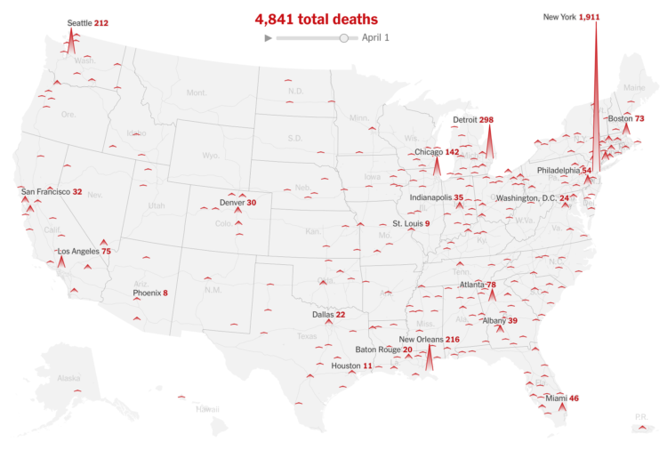
For The New York Times, Lazaro Gamio and Karen Yourish use an animated map to show known total coronavirus deaths over time. The height of each triangle represents the count for a Core-Based Statistical Area. Let it play out, and New York almost spikes out of view.
See also the county-based circular version for total confirmed cases.
Will Chase, who specialized in visualization for epidemiological studies in grad school, outlined why he won’t make charts showing Covid-19 data:
So why haven’t I joined the throng of folks making charts, maps, dashboards, trackers, and models of COVID19? Two reasons: (1) I dislike reporting breaking news, and (2) I believe this is a case of “the more you know, the more you realize you don’t know” (a.k.a. the Dunning-Kruger effect, see chart below). So, I decided to watch and wait. Over the past couple of months I’ve carefully observed reporting of the outbreak through scientific, governmental, and public (journalism and individual) channels. Here’s what I’ve seen, and why I’m hoping you will join me in abstaining from analyzing or visualizing COVID19 data.
There’s so much uncertainty attached to the data around number of deaths and cases that it’s hard to understand what it actually means. This takes a high level of context in other areas on the ground. On top of that, people are making real life decisions based on the data and charts they’re seeing.
So while I think a lot of the charts out there are well-meaning — people under stay-at-home trying to help the best way they know how — it’s best to avoid certain datasets. As Chase describes, there are other areas of the pandemic to point your charting skills towards.
See also: responsible coronavirus charts and responsible mapping.
From researchers at Bauhaus-University Weimar, this video shows how various methods of covering a cough change the spread of air from your mouth.
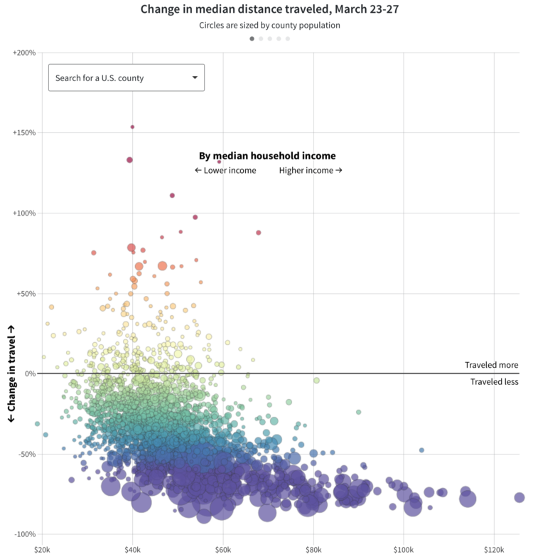
For Reuters, Chris Canipe looks at social distancing from the perspective of household income:
Anonymized smartphone data in the United States shows some interesting trends. People in larger cities and urban corridors were more likely to change their travel habits, especially in early March. By the end of the month, most U.S. residents were traveling dramatically less than they did in February, but social and demographic differences were strong predictors of how much that changed.
The above shows median change in distance traveled against median household income by county. Note the downwards trend showing counties with lower median incomes with less change in travel.
For many, it’s not possible to work from home or it isn’t safe to stay at home. Don’t be too quick to judge.
An aside: There are bigger things to concentrate on right now, but after this is all done, I feel like we need to think more about who has access to our location via cellphone. Clearly the data has its uses, but that’s not always going to be the case.

Here are some useful distractions for you as you stay-at-home and wait for an unknown amount of time.
 Visualize This: The FlowingData Guide to Design, Visualization, and Statistics (2nd Edition)
New tools, refined process.


