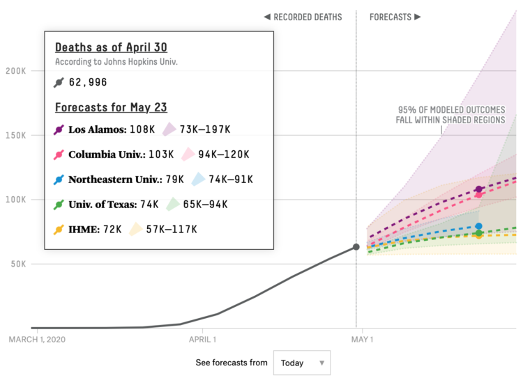
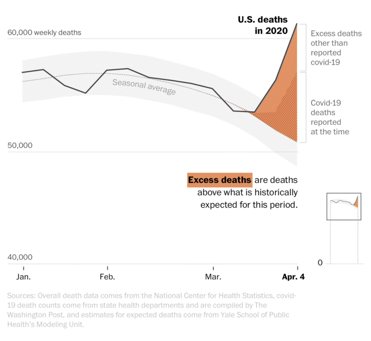
• Membership
  • Newsletter
  • Projects
  • Learning
  • About
  • Member Login
  • Scripts from The Office, the dataset

    December 30, 2019

    Topic

    Data Sources  /  R, scripts, The Office

    The decade is almost done. You’re sitting there and you’re thinking: “I wish I could easily access the scripts from all seasons of The Office so that I could analyze the dialogue and relationships between characters.” Well, your wish is granted. Bradley Lindblad stuck all the scripts in an R package. It’s called schrute.

    Take that, 2019.

  • Making invisible gas leaks visible

    December 30, 2019

    Topic

    Statistical Visualization  /  methane, New York Times, pollution

    For The New York Times, Jonah M. Kessel and Hiroko Tabuchi went to oilfields in Texas with an infrared camera to look for methane leaks.

    Okay, important topic here, and the contrast between regular photograph and infrared video is alarming, but I may have been drawn to the methodology at the end:

    To create images of methane emissions in the Permian Basin, The Times used a custom-built FLIR camera that converts infrared energy into an electronic signal to create moving pictures. The camera’s filter allows infrared wavelengths between 3.2 to 3.4 micrometers on the electromagnetic spectrum to pass through to the sensor.

    To visualize gas, the camera uses helium to cool down the sensor to the temperature of liquid nitrogen, around minus 200 degrees Celsius. Unlike traditional photography lenses, which are glass, the infrared images were created using metal lenses made from germanium, which is transparent at infrared wavelengths.

  • Arctic ice melting

    December 27, 2019

    Topic

    Maps  /  Arctic, climate, ice, NASA

    One way to gauge the amount of ice in the Arctic is to look at the average age of the ice. From the NASA Scientific Visualization Studio, the map above shows the estimated age of ice on a monthly basis, going back to 1984:

    One significant change in the Arctic region in recent years has been the rapid decline in perennial sea ice. Perennial sea ice, also known as multi-year ice, is the portion of the sea ice that survives the summer melt season. Perennial ice may have a life-span of nine years or more and represents the thickest component of the sea ice; perennial ice can grow up to four meters thick. By contrast, first year ice that grows during a single winter is generally at most two meters thick.

  • Analysis of online sermons

    December 24, 2019

    Topic

    Statistics  /  Pew Research, religion, sermon, text

    Pew Research Center analyzed online sermons in U.S. searches, taking a closer look at what people typically hear across religions:

    For instance, the distinctive words (or sequences of words) that often appear in sermons delivered at historically black Protestant congregations include “powerful hand” and “hallelujah … come.” The latter phrase (which appears online in actual sentences such as “Hallelujah! Come on … let your praises loose!”) appeared in some form in the sermons of 22% of all historically black Protestant churches across the study period. And these congregations were eight times more likely than others to hear that phrase or a close variant. Although the word “hallelujah” is by no means unique to historically black Protestant services, this analysis indicates that it is a hallmark of black Protestant churches.

  • Where Christmas trees come from

    December 23, 2019

    Topic

    Maps  /  Christmas, Lauren Tierney, Tim Meko, trees, Washington Post

    For The Washington Post, Tim Meko and Lauren Tierney:

    Before the 1930s, Christmas trees typically were cut down on an individual’s property or out in the wild. Now, tree farms in all 50 states (yes, Hawaii too) are where most Christmas trees come from, accounting for 98 percent of live Christmas trees brought into homes. These farms churn out many kinds of conifers, but two main regions — Clackamas County near Portland, Ore., and the Blue Ridge Mountains of North Carolina — produce the most.

    I wonder if we can see a similar map for artificial Christmas trees.

  • Color breakdown of Scientific American covers

    December 20, 2019

    Topic

    Statistical Visualization  /  color, covers, Scientific American

    For Scientific American, Nicholas Rougeux and Jen Christiansen show the shift in hues for the magazine’s covers over the past 175 years. The changes serve as a proxy for technology advancements, changes in ownership, and shifts in thinking.

  • Visualization  /  best-of

    Best Data Visualization Projects of 2019

    As I do every year, I picked my ten favorite visualization projects. Here they are in no particular order.

    Read More
  • Members Only

    Visualization Tools, Data, and Resources Roundup – December 2019 Roundup (The Process #69)

    December 19, 2019

    Topic

    The Process  /  roundup

    Every month I collect links to new tools, datasets, and visualization resources. Here’s the good stuff for December 2019 and the last roundup for the decade.

  • Best visual illusion of the year

    December 19, 2019

    Topic

    Design  /  axes, illusion

    Our brains are pretty good at finding patterns, but it has some blindspots and then we get confused. The Illusion of the Year contest targets those blindspots. This year’s winner shows a rotating pattern that seems to switch axes depending on where you look.

  • How online school ratings are flawed

    December 18, 2019

    Topic

    Infographics  /  ratings, school, Vox

    Standardized ratings are a challenge, because they often try to encapsulate many variables into a single variable. On the upside, a single score is quick and easy to see, but on the downside, variance goes into hiding and people/things that don’t fit a defined standard get dinged.

    Vox looks at these challenges in the context of online school ratings.

  • Deaths from child abuse, a starting dataset

    December 18, 2019

    Topic

    Data Sources  /  Boston Globe, children, deaths, ProPublica

    By way of the Child Abuse Prevention and Treatment Act, ProPublica and The Boston Globe requested records from each state. They compiled the many documents into a single dataset:

    In each record, CAPTA requires states to list the age and gender of the child, and information about a household’s prior contact with welfare services. The information is supposed to help government agencies prevent child abuse, neglect and death, but reporting across states is so inconsistent that comparisons and trends are impossible to identify. ProPublica is releasing the data we’ve collected as a minimum count of child fatality records in the United States. Researchers and journalists can download the full records with summaries at the ProPublica Data Store.

    Unfortunately, not all state agencies are compliant, but it’s a start.

    Also, Jessica Huseman of ProPublica discussed some of the emotional challenges of working with such sensitive data.

  • Color palettes browsable in context

    December 17, 2019

    Topic

    Apps  /  color

    Color scheme selections are nice and all, but they’re even better when viewed in context. It’s part of ColorBrewer’s charm, in the context of maps. Happy Hues offers color schemes in the context of a web page. A combination of this plus Viz Palette would be killer.

  • How to Make a Grid Map with Histograms in R, with ggplot

    Layout multiple charts in a single view. Then adjust the scales appropriately for maximum comparability and a unified graphic.

  • How to Make Interactive Frequency Trails with D3.js

    Layering time series data or distributions with this method can change the feel and aesthetic versus a multi-line chart or small multiples. In some cases, frequency trails let you show more in less space.

  • Data Underload  /  work

    Occupation Growth and Decline

    We looked at shifts in job distribution over the past several decades, but it was difficult to see by how much each occupation group changed individually. This chart makes the changes more obvious.

    Read More
  • Datawrapper updates pricing structure, do more for free

    December 13, 2019

    Topic

    Apps  /  Datawrapper

    Datawrapper, a focused web tool that makes online charts easier to put together and share, changed their pricing structure. There used to be a couple of paid tiers for individuals and small teams, but now you get more for free. And even though it’s free:

    • We won’t sell your data. Some companies make the user into the product, but this is not our business model. All data you upload to Datawrapper is treated as confidential and only belongs to your account.
    • We won’t track your readers. Your embedded charts will not contain any code that tracks you or your readers. We’ve never done that, and will continue to not do that, regardless of your plan.
    • Your charts are private. You decide when it’s time to share your charts with the world. Until you hit “Publish”, your charts are visible only to you and your team.
    • Published charts will stay online indefinitely. We will never delete or disable any of your Datawrapper visualizations that you embedded somewhere. We stand by our pledge to keep all our users’ charts online.

    They continue to impress.

    It wasn’t that long ago when online charting tools felt buggy and overly limited. But Datawrapper is laying some strong groundwork (and Flourish continues to build up their offerings). Instead of a one-size-fits-all, we’re seeing an application focus, which allows for more specific tools.

  • Using old ship logs as a window into the weather in the 1800s

    December 13, 2019

    Topic

    Maps  /  climate, Feilding Cage, Reuters, ships

    For Reuters, Feilding Cage describes a weather time machine project by NOAA that uses old shipping logs to build climate models for the 19th century:

    In the 19th and early 20th centuries, millions of weather observations were carefully made in the logbooks of ships sailing through largely uncharted waters. Written in pen and ink, the logs recorded barometric pressure, air temperature, ice conditions and other variables. Today, volunteers from a project called Old Weather are transcribing these observations, which are fed into a huge dataset at the National Oceanic and Atmospheric Administration. This “weather time machine,” as NOAA puts it, can estimate what the weather was for every day back to 1836, improving our understanding of extreme weather events and the impacts of climate change.

    Consider my mind blown.

    I wonder what researchers will extract from our current data streams a century from now.

    Nevermind. I don’t want to know.

  • Members Only

    Moratorium On Bar Chart Races; When Impractical Visualization is More Practical (The Process #68)

    December 12, 2019

    Topic

    The Process  /  bar chart race, novelty, Reddit

    The dataisbeautiful subreddit announced a moratorium on the ever popular bar chart race. The frequency of submissions that used the method got out of hand and spam made it all the less savory. Still, the method holds value.

  • Haikus generated based on your map location and OpenStreetMap data

    December 12, 2019

    Topic

    Data Art  /  haiku, OpenStreetMap

    Satellite Studio made a map thing that generates haikus based on OpenStreetMap data and your location. From the announcement:

    [W]e automated making haikus about places. Looking at every aspect of the surroundings of a point, we can generate a poem about any place in the world. The result is sometimes fun, often weird, most of the time pretty terrible. Also probably horrifying for haiku purists (sorry).

    This is pretty great. It’s neat how the poems generate on the fly.

  • Data Underload  /  work

    Shifts in Job Distribution

    In the 1950s, almost half of all employed people were either in farming or manufacturing. As you can imagine, work changed a bit over the years.

    Read More
  • Page 113 of 391
  • <
  • 1
  • ...
  • 110
  • 111
  • 112
  • 113
  • 114
  • 115
  • ...
  • 391
  • >

Analyze, visualize, and communicate data usefully, beyond the defaults.

Become a member →

Recently for Members

May 8, 2025
When the data is not what it seems

May 1, 2025
Finding the Right Charts

April 24, 2025
Visualization Tools, Datasets, and Resources – April 2025 Roundup

April 17, 2025
Breaking Out of Chart Software Defaults

April 15, 2025
Line Chart with Decorative Neon Accents

Browse by Chart Type See All →

Horizon Graph Small Multiples Gantt Chart Calendar Voronoi Diagram Dot Density Map Radar Chart Timeline Strip Plot Area Chart

Browse By Topic

  • Visualization

    Seeing data

  • Maps

    Seeing geographic data

  • Infographics

    Explaining data

  • Networks

    Connecting data

  • Statistics

    Analyzing data

  • Software

    Working with data

  • Sources

    Getting data

  • Design

    Making data readable

Get the Book

Visualize This: The FlowingData Guide to Design, Visualization, and Statistics

Available now.

Order: Amazon / Bookshop

Made by FlowingData

  • The Process

  • Data Underload

  • Chart Everything

  • Guides

  • Books

  • Shop

  • About
  • Contact
  • Newsletter
  • LinkedIn
  • Instagram
  • Bluesky
  • RSS
Copyright © 2007-Present FlowingData. All rights reserved.