Saving for Retirement and Age
Previously, we looked at when Americans reach $100,000 in savings. It depends on what you consider to be savings — money in a savings account, retirement accounts, financial assets, net worth, etc. — but it becomes more common in people’s 40s and 50s. That said, $100k is kind of an arbitrary amount of savings, especially in the context of retirement savings.
It’s almost certainly not enough if you plan on retiring when you’re 67. So instead of looking at just a six-figure threshold, let’s look at how much people actually save over time. We come back to the Survey of Consumer Finances (SCF) from the Federal Reserve Board.
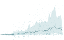
The chart below shows amounts saved, by age and by type of savings (retirement accounts, financial assets, or net worth). The line shows the median amount of savings, the band shows the 25th to 75th percentile range, and the dots are a sample of 1,000 to show variation.
How Much Savings Grow with Age
As we get older, savings tend to grow, but so does the range.
You can see how wide the range gets as we get older. The effects of incremental saving over time becomes more obvious, especially when you look at net worth.
However, just looking at savings alone isn’t the best comparison. Someone who retires in an expensive area needs to save more money than someone who lives in a low-cost area. The dataset from the SCF doesn’t provide cost of living, but it does provide income, which seems like a good indicator for how people spend.
So instead of looking at savings straight up, we can look at it as a multiple of income.
Savings as a Multiple of Income
It’s more useful to think of savings as a multiple of income, since it’s a pretty good indicator for your lifestyle after retiring.
We see a similar trend, but it’s less noisy.
Either way, it’s kind of alarming to see so many people with less than a year’s worth of income as they approach retirement age. When you look at retirement savings alone, the values are really low.
Are people working more in their later years? Is Social Security enough? Do people not account for all of their assets when answering government surveys? How much savings should you have as you get older? Are you on track?
There are a lot of variables to consider, so it’s hard to answer any of these questions exactly. But for the time being, let’s consider the saving recommendations from Fidelity (with the grain of salt that they’re in the business of retirement accounts). They recommend you have a year’s salary saved by age 30, twice your income by 35, and ten times your income by 67.
Here’s the percentage of people who actually have that much, based on the SCF.
Recommended Savings
Most people have less than the recommended amount, regardless of what you consider “savings.”
If you’re looking at net worth, only 22% of people are on track, based on Fidelity’s recommendations. Practically speaking, a big portion of net worth is in non-financial assets like a house, so it’s probably more reasonable to look at financial assets alone. That brings down the percentage to 7%. Account for debt, and that percentage drops more.
I need to save more.
Notes
- The data comes from the 2016 Survey of Consumer Finances. I originally downloaded the microdata via the Federal Reserve Board, but then I quickly thought better and grabbed a subset via the UC Berkeley-hosted Survey Documentation and Analysis extraction tool.
- The SCF provides values for households, so the calculations above use savings and income at this level rather than for individuals. So technically, each dot represents a household.
- I analyzed and prepared the data in R. I made the charts using D3.js.
Become a member. Support an independent site. Make great charts.
See What You GetFlowingData is made possible by supporting members. Since 2007, I, Nathan Yau, a real person, have been analyzing and visualizing data to help more people understand and appreciate it in their everyday lives.
If you liked this or want to make similar data things, please consider supporting this small corner of the internet. You get unlimited access to visualization courses, tutorials, and extra resources. Thanks. — Nathan
Chart Types Used


