How Much You Should Be Saving for Retirement
We know when Americans reach $100,000 in savings. We know how much people are saving. But this begs the question: How much should you be saving?
There are a lot of variables to consider, but for people of middle income, here’s a suggestion from the Center for Retirement Research that accounts for when you start saving and when you want to retire.
Save Early for Maximum $$$$
The younger you start saving, the less of your income you have to save per year to maintain your current standard of living.
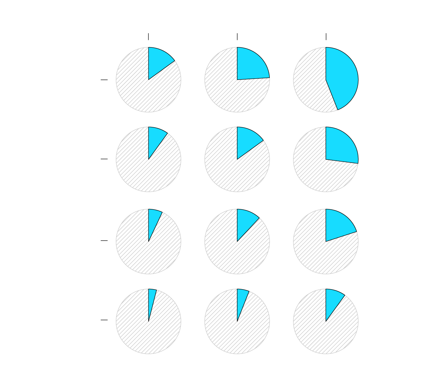
AGE YOU START SAVING
25
35
45
The earlier you retire and the later you start saving, the more you need to put away.
WHEN YOU PLAN TO RETIRE
15%
24%
44%
62
65
10%
15%
27%
67
12%
20%
7%
Save earlier and retire later to minimize how much you need to save per year.
4%
6%
10%
70
SOURCE: Center for Retirement Research at Boston College
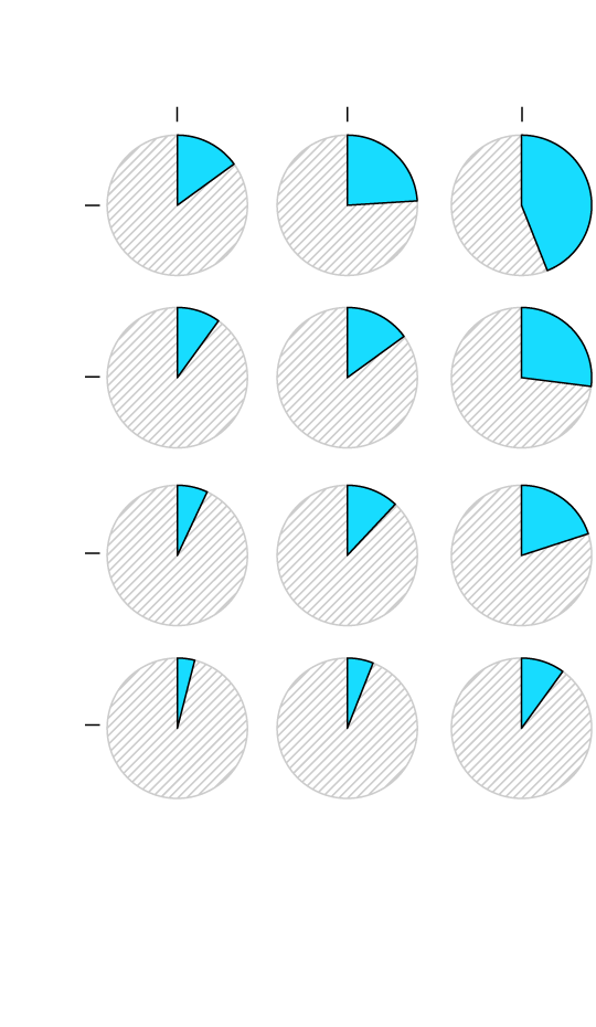
AGE YOU START SAVING
25
35
45
15%
24%
44%
62
WHEN YOU PLAN TO RETIRE
10%
15%
27%
65
7%
12%
20%
67
70
4%
6%
10%
Save earlier and retire later to minimize how much you need to save per year.
SOURCE: Center for Retirement
Research at Boston College
If you can, start saving early, so that you can slowly work towards the goal and let interest do its thing. Wait longer to save, and you’ll have to work for more years or live on less.
Notes
- Read the full brief from the Center for Retirement Research at Boston College. (Thanks, Jon for the pointer.)
- The brief doesn’t define “middle income” and doesn’t provide percentages for low and high income groups unfortunately. That would’ve been interesting to compare.
Chart Type Used

Become a member. Support an independent site. Get extra visualization goodness.
See What You Get