How to Make a Multi-Series Dot Plot in Excel
Easily compare multiple categories and spot differences between two or more series.
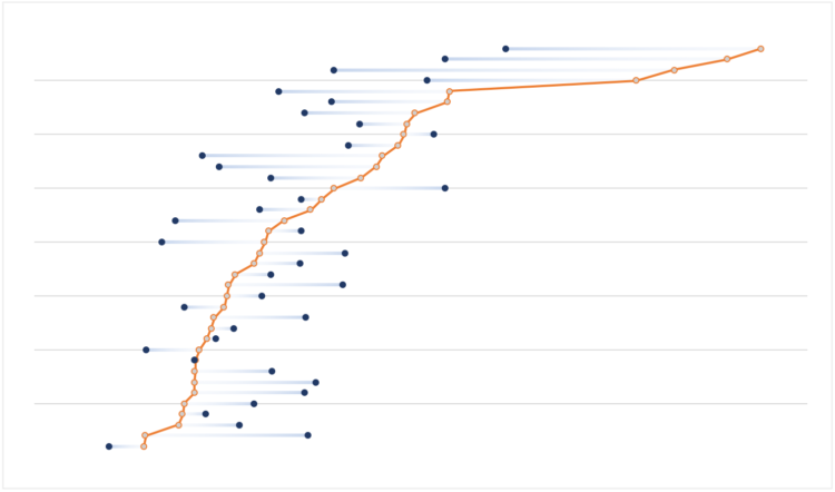
Similar to a standard bar chart, you can use dot plots to compare categories. However, dot plots offer some advantages with certain data sets. If you are using more than one series, it’s easier to spot the differences between them, because dots use less visual space than bars. Also, it’s often (strongly) suggested that, when using bar charts, we should start the scale at zero, because they can be misleading if the scale starts at a different point. With dot plots it’s easier to compare relative positions, so you don’t have to start the scale at zero.
In this tutorial, you will learn how to make a dot plot with two series in Excel. It is not available as a default Excel chart but, with a few tweaks, you can easily turn one of the available charts into a dot plot.
To access this full tutorial, you must be a member. (If you are already a member, log in here.)
Get instant access to this tutorial and hundreds more, plus courses, guides, and additional resources.
Membership
You will get unlimited access to step-by-step visualization courses and tutorials for insight and presentation — all while supporting an independent site. Files and data are included so that you can more easily apply what you learn in your own work.
Learn to make great charts that are beautiful and useful.
Members also receive a weekly newsletter, The Process. Keep up-to-date on visualization tools, the rules, and the guidelines and how they all work together in practice.
See samples of everything you gain access to:
About the Author
Jorge Camoes is a data visualization consultant based in Lisbon. Author of the book Data at Work. Runs ExcelCharts.com, where he discusses how to use Excel as data visualization tool. Recently playing with PowerBI & PowerQuery.