Thomas Dimson trained a model to generate words that don’t exist in real life and definitions for said imaginary words. If you didn’t tell me the words were machine-generated, I’d believe a lot of them were actual parts of the English dictionary.
-
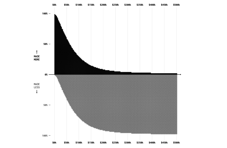
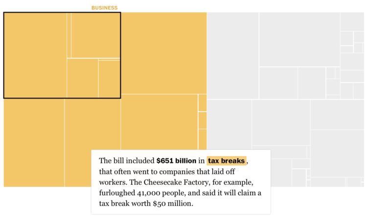
Economists at the University of Chicago analyzed unemployment benefits from the CARES act and compared them against median salaries for different occupations and by state. FiveThirtyEight highlighted the differences:
The researchers uncovered other kinds of inequality, too. In some professions, like janitorial work, people who are employed by essential businesses are continuing to show up to their jobs under hazardous conditions. But in doing so, they may be eligible for less money than janitors who have been laid off or furloughed by a nonessential business. In an ideal world, Ganong said, the people who have kept working at hospitals or grocery stores would be receiving some kind of hazard pay. “But that’s generally not the reality, which means there’s a weakness in the current system,” he said. “We’re giving more money to certain workers to stay home than to other workers who are putting themselves at risk by going to work.”
I don’t know the right answers to any of this, but it underscores the difficulties of making decisions based on averages. The system is built for simplicity and basic values. How do we adjust or rebuild the system for real-world variation and distributions?
-
Let’s just animate all statistical concepts with LEGO from now on:
My daughter loved the @FryRsquared Christmas Lectures so much she made this Lego Statistics Animation https://t.co/Q3X2FUYS2m pic.twitter.com/caavfR8ESD
— Caroline Lear (@CarolineLear) May 15, 2020
-
Harry Stevens and John Muyskens for The Washington Post put you in the spot of an epidemiologist receiving inquiries from policymakers about what might happen:
Imagine you are an epidemiologist, and one day the governor sends you an email about an emerging new disease that has just arrived in your state. To avoid the complexities of a real disease like covid-19, the illness caused by the novel coronavirus, we have created a fake disease called Simulitis. In the article below, we’ll give you the chance to model some scenarios — and see what epidemiologists are up against as they race to understand a new contagion.
Fuzzy numbers, meet real-world decisions.
-
For The Statesider, Andy Murdock wondered how many typefaces are named after American locations. Then he put those typefaces on a map. So how many?
The answer is 222. That’s not actually the answer, it’s just where I had to stop, because the more I looked the more I found. What started as a quirky challenge to make a US font map during COVID-19 quarantine days started to edge into obsessive-compulsive territory. I’d wake up in the middle of the night thinking, “Did I check to see if there’s a Boise font?” (I did. There isn’t.) I finally found the limit to how many fonts I could use in one place.
-
This issue of The Process is public.
Hi,
Nathan here. This is The Process, the weekly newsletter for FlowingData members where I look at charts closer.
This issue is public, but if you’d like to support FlowingData, becoming a member is the best way to do it. Membership keeps the blog running as a free resource for everyone and gets you bonus access to tutorials, courses, and more.
A new tutorial on animated charts went up yesterday. Maarten Lambrechts explains step-by-step, using the ggplot and gganimate packages in R.
This week, I follow up on the coronavirus visual rundown from two months ago, when there were only 1,190 confirmed cases in the United States. (omg.) A lot has happened since then.
-
From Andy Kirk, there’s a new visualization podcast in town:
Explore Explain is a new data visualisation podcast and video series. Each episode is based on a conversation with visualisation designers to explore the design story behind a single visualisation, or series of related works. The conversations provide an opportunity to explain their design process and to share insight on the myriad little decisions that underpin the finished works. It also shines a light on the contextual circumstances that shaped their thinking.
Audiences will gain an appreciation of the what, the why and the how, learning about the hidden problems and challenges, the breakthroughs and the eureka moments, the pressures and frustrations, the things that were done and the things that were not done, as well as the successes and the failures.
My main podcast-listening mode was while driving, so I’m way behind, but this sounds promising. It’s right in line with Kirk’s Little of Visualization Design blog project.
-
How to Make Animated Histograms in R, with ggplot and gganimate
Make them move to show a shift in distributions over time.
-
Ed Hawkins, who you might recognize from charts such as spiraling global temperature and the aforementioned temperature grid, encourages you to show your stripes. Select your region, and see how average temperature increased. I saw this last year, but I just realized that people are using this chart to print, knit, and decorate.
Read More -
Based on a chart by Ed Hawkins, the shower wall of Gretchen Goldman and Tom Di Liberto transformed into a canvas to show global warming.
Each row represents a country, and each cell — I mean tile — represents the temperature difference compared to the overall average for the time period.
-
For Bloomberg, Ellen Huet and Lizette Chapman reported on the jolt for Instacart to shift into an essential service. Around the middle of the article is this chart that shows the shifts in what people were shopping for post-coronavirus versus pre-coronavirus.
Bread making and cleaning. These percentage changes are for mid-April, but I’d say that’s about where this household is at.
-
Is bread-making still a thing, or is that so two weeks ago? If you’re late to the sourdough train or still working out the feeding schedule, the Bread Scheduler by Stuart Thompson makes the timing more obvious. Just enter when you want to start or finish, and the scheduler works out the details.
I haven’t found the patience yet for sourdough. For less time-sensitive breads, try out no-knead bread or this easy focaccia.
-
I’m just gonna put this right here, from @_daviant: “Another day another stupid Excel chart”.
-
To show events over time, you can use a timeline, which is often marks on a line that runs from less recent to more recent. But you can vary the shape. Sara Di Bartolomeo and her group researched the effectiveness of different layouts:
Considering the findings of our experiment, we formulated some design recommendations for timelines using one of the data set types we took into account. Here is a list of recommendations regarding timeline readability:
- Use linear vertical timelines for situations which require fast data lookup.
- Avoid spiral timelines when the task requires fast lookup.
- If you use a more creative, expressive shape, such as a spiral timeline, also include a tutorial or visual cues to assist the user in learning and understanding.
Also: it “heavily depends on the context.”
-
The USGS released a unified geologic map of the moon on a 1:5,000,000-scale — and the data to go with it:
This new work represents a seamless, globally consistent, 1:5,000,000-scale geologic map derived from the six digitally renovated geologic maps (see Source Online Linkage below). The goal of this project was to create a digital resource for science research and analysis, future geologic mapping efforts, be it local-, regional-, or global-scale products, and as a resource for the educators and the public interested in lunar geology. Here we present the completed mapping project as unit contacts, geologic unit polygons, linear features, and unit and feature nomenclature annotation.
That paintball aesthetic is quite becoming.
-
I thought we (i.e. me) could use a break, so I made these abstract charts to represent the most popular quotes about hope.
-
Members Only
-
At greater disparities between low resources and high volumes of sick people, doctors must decide who lives and who dies, which seems a moral burden with a single case, much less anything more. So systems are setup to relieve some of that pressure. For Reuters, Feilding Cage uses clear illustrations to describe possible policies to help healthcare workers decide who receives care first.
-
Brian Foo is the current Innovator-in-Residence at the Library of Congress. His latest project is Citizen DJ, which lets you explore and remix audio from the Library:
It invites the public to make hip hop music using the Library’s public audio and moving image collections. By embedding these materials in hip hop music, listeners can discover items in the Library’s vast collections that they likely would never have known existed. For technical documentation and code, please see the repo.
Give it a go. Even if you’re not into making music, you can still explore the sounds, listen to them in their full context, and end up reading about some song written in the early 1900s.
I’ll take all the rabbit holes I can get.
-
It’d be great if we could conjure a vaccine or a “cure” seemingly out of nowhere just like in the movies. Unfortunately, there’s a necessary process involved to make sure that something works and that it is safe to distribute to billions of people. For New York Times Opinion, Stuart A. Thompson shows typical vaccine timelines, which can take decades, against hopeful coronavirus vaccine timelines.