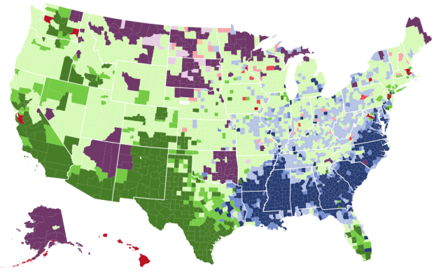
Mapping the Most Common Races
It’s been a challenge for me to fully understand what’s been going on lately, so I find myself looking at a lot of data and maps. It kind of feels like grasping at straws, but at least it’s something.
The map above shows the most prevalent race in each county, based on data from the 2013 American Community Survey 5-year estimates. Select and deselect to make various comparisons. Or, select just one race to see distribution. Low, medium, and high saturation indicates whether the prevalent race percentage is below or about the same, higher (greater than the national average plus-minus interval), or much higher than the national average (at least 50% higher), respectively.
For reference, the national estimates from the 5-year 2013 estimates where 63.3% white, 16.6% percent Hispanic, 12.2% black, 4.8% Asian, 0.7% Native American or Alaskan, and 0.2% Pacific Islander. The margin of error for all estimates is 0.1.
Click, drag, and zoom for details.
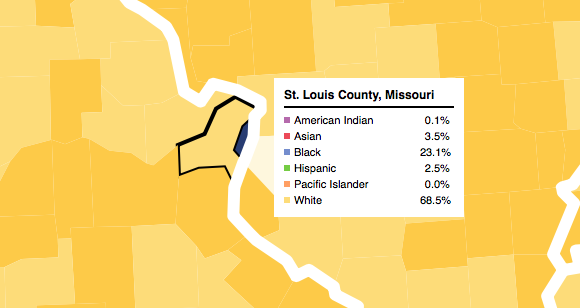
Here’s St. Louis County, Missouri, place of Ferguson. The small, dark blue sliver is St. Louis city.
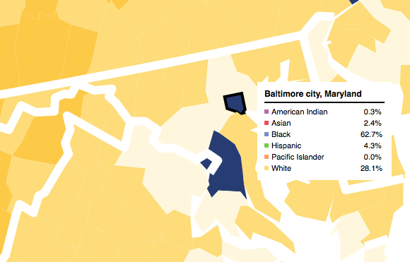
Similarly, below is Baltimore, Maryland. The city is about 62 percent black and 28 percent white, whereas Baltimore County is an estimated 26 percent black and 62 percent white.
For me, it was interesting to compare nonwhite races, because whites tend to make up a high percentage that obscures the single-digit distributions. I didn’t expect to see such high percentages of Asian people in some counties, particularly in the Midwest.
So yeah, there that is.
The map doesn’t show everything. It’s on the county level, and as we’ve seen from Dustin Cable’s racial dot map, there’s plenty of variation on a block level. But it seems to be a decent quick mode of comparison, at least for the smaller groups.
Chart Type Used

Become a member. Support an independent site. Get extra visualization goodness.
See What You Get