This Age is the New Age

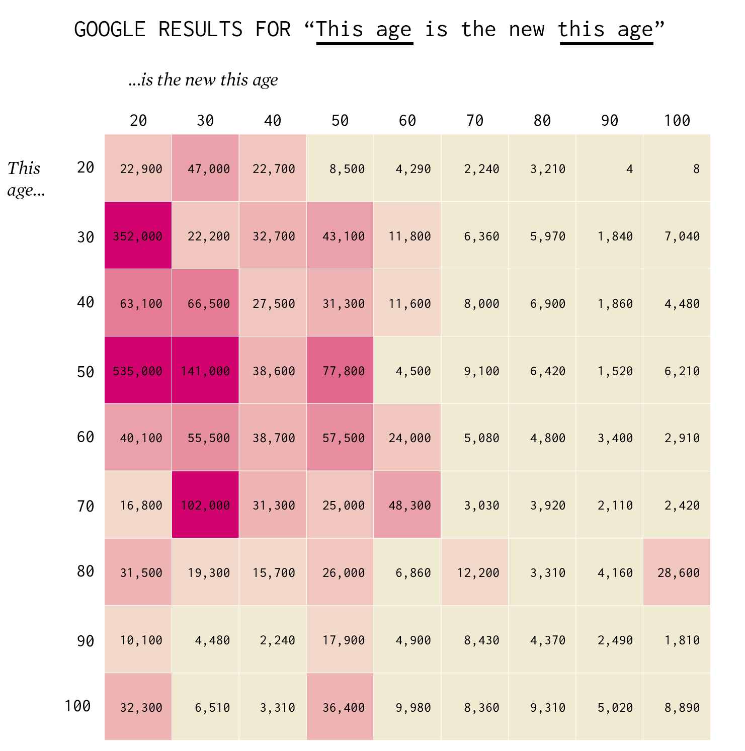
30 is the new 20. Wait. 40 is the new 20. No, scratch that. 50 is the new 20. Or is 50 the new 30? Here’s what the Google says, so you know it must be true.

Become a member. Support an independent site. Make great charts.

See What You Get

Learn to Visualize Data See All →

Introducing a Course for Mapping in R

Mapping geographic data in R can be tricky, because there …

How to Visualize Anomalies in Time Series Data in R, with ggplot

Quickly see what’s below and above average through the noise and seasonal trends.

How to Make a Moving Bubble Chart, Based on a Dataset

Ooo, bubbles… It’s not the most visually efficient method, but it’s one of the more visually satisfying ones.

How to Untangle a Spaghetti Line Chart (with R Examples)

Put multiple time series lines on the same plot, and you quickly end up with a mess. Here are practical ways to clean it up.

Favorites

Best Data Visualization Projects of 2016

Here are my favorites for the year.

Seeing How Much We Ate Over the Years

How long will chicken reign supreme? Who wins between lemon and lime? Is nonfat ice cream really ice cream? Does grapefruit ever make a comeback? Find out in these charts.

How to Spot Visualization Lies

Many charts don’t tell the truth. This is a simple guide to spotting them.

Reviving the Statistical Atlas of the United States with New Data

Due to budget cuts, there is no plan for an updated atlas. So I recreated the original 1870 Atlas using today’s publicly available data.