Using Consumer Price Index, Alyssa Fowers and Rachel Siegel for The Washington Post…
Statistical Visualization
Finding patterns, distributions, and anomalies.
-
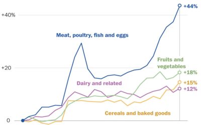
Rising prices of everything
-
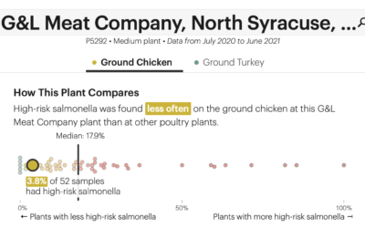
Check the frequency of salmonella in your chicken
The USDA recommends that you cook your chicken to at least 165°F to…
-
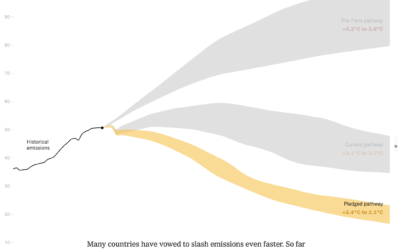
Bend the emissions curve
There has been progress since the Paris climate agreement in 2014, but there’s…
-
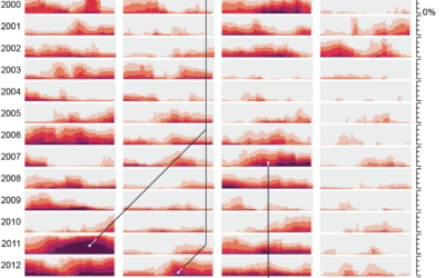
Drought extent by region
For Scientific American, Cédric Scherer and Georgios Karamanis charted drought extent by region…
-
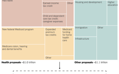
Spending bill in a treemap box
Margot Sanger-Katz and Alicia Parlapiano for NYT’s The Upshot broke down a Democrat…
-
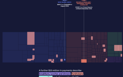
Treemap tour of political donations
The Digital Story Innovation Team for ABC News in Australia looked at political…
-
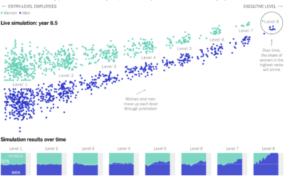
Simulating how just a little gender bias in the workplace can lead to big effects up the chain
Yuhao Du, Jessica Nordell, and Kenneth Joseph used simulations to study the effects…
-

Possible cheating seen in a scatterplot
When plotting Russian election results, a structured grid patterns appear. From The Economist:…
-
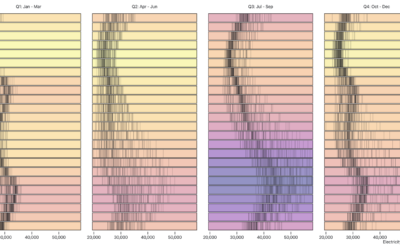
Visualizing time-based data
Zan Armstrong, Ian Johnson, and Mike Freeman for Observable wrote a guide on…
-
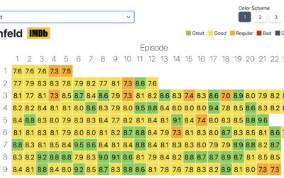
Heatmap of average IMDb ratings for all the shows
Inspired by a graphic on Reddit, Jim Vallandingham expanded the format for all…
-
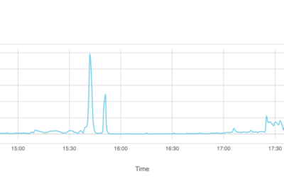
How Facebook disappeared from the internet
Cloudflare describes how things looked from their point of view the day that…
-
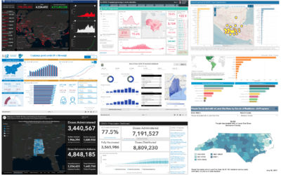
Assessment of the Covid-19 dashboards
Researchers evaluated 158 Covid-19 dashboards, assessing design, implementation, and usefulness. Marie Patino for…
-
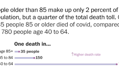
Using rates for more relatable Covid-19 numbers
With millions of Covid-19 deaths worldwide, and hundreds of thousands in the US,…
-
Data visualization activities for kids
Nightingale has a kid’s section with printable visualization activities. Get the kids started…
-
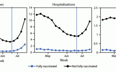
Cases, hospitalizations, and deaths for vaccinated vs. unvaccinated
The CDC released a chart that shows case, hospitalization, and death rates for…
-
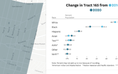
How the demographics of your neighborhood changed
The San Francisco Chronicle compares demographics in your neighborhood in 2020 against 2010.…
-

Lightning algorithm
Matt Henderson on Numberphile shows off a “lightning algorithm” which is actually a…
-
Inflation isn’t that exciting
For NYT Opinion, Josh Bivens and Stuart A. Thompson argue that you don’t…
Recently for Members
Second Edition
 Visualize This: The FlowingData Guide to Design, Visualization, and Statistics (2nd Edition)
 Visualize This: The FlowingData Guide to Design, Visualization, and Statistics (2nd Edition)
New tools, refined process.
Browse by Chart Type See All →


