Visualization and perception researcher Lace Padilla was on the kid-centric show Mission Unstoppale…
Statistical Visualization
Finding patterns, distributions, and anomalies.
-

How perception can save lives
-

Most common professional marriages
Susie Neilson for the San Francisco Chronicle compared the marriage of professions in…
-
Historical shifts in where people live
The places in the United States with the highest populations weren’t always like…
-
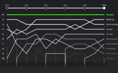
Rankings for YouTube video greetings
If you’ve watched even just a few videos on YouTube, you probably noticed…
-
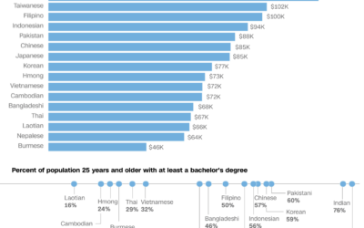
Varying demographics within the Asian American population
We often hear about the Asian American community as one big group of…
-
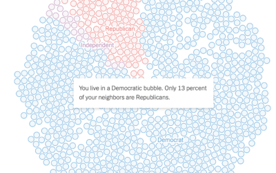
See if you live in a political bubble
Gus Wezerek, Ryan D. Enos, and Jacob Brown for NYT Opinion use neighborhood-level…
-
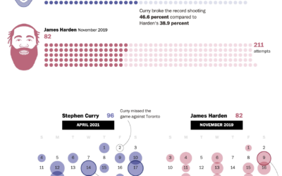
Stephen Curry’s record-setting month for shooting threes
Steph Curry has been on a tear as of late. In April he…
-
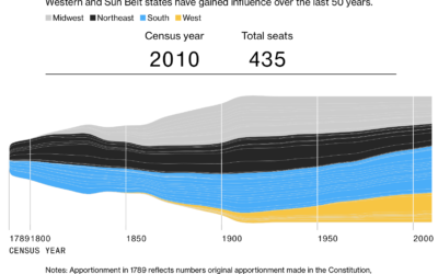
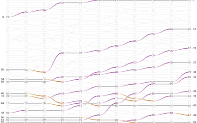
Seat apportionment over time
The 2020 Census count at the state level is set for release this…
-
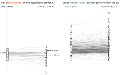
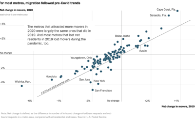
Where people moved during the pandemic
In another look at migration through the lens of USPS change of address…
-
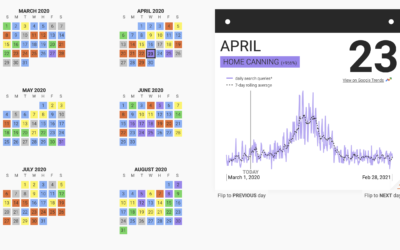
Trending hobbies during the pandemic
This past year has seen a rising interest in long-lost hobbies due to…
-
Pandemic migrations
With the restrictions of the pandemic, you might expect an unusually big wave…
-
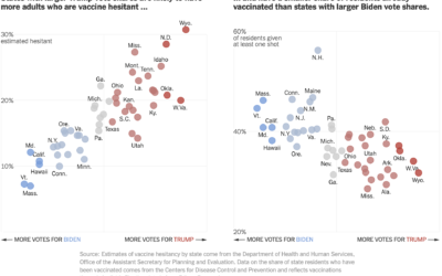
Voting and vaccination rate
Danielle Ivory, Lauren Leatherby and Robert Gebeloff for The New York looked at…
-
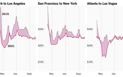
Tracking airfare as a proxy for summer travel plans
Quoctrung Bui and Sarah Kliff for NYT’s The Upshot used difference charts to…
-
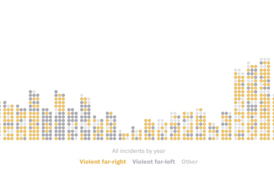
Domestic terrorism incidents plotted over time
The Washington Post (paywall) shows the recent rise in domestic terrorism incidents in…
-
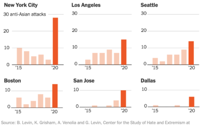
Collecting reports of anti-Asian hate crimes
The New York Times collected, categorized, and linked to reports of anti-Asian hate…
-
GDP and vaccination rates
For The New York Times, Keith Collins and Josh Holder look at the…
-
Analysis of skin tones in beauty ads on Instagram
For Quartz, Amanda Shendruk and Marc Bain analyzed skin tones that appeared in…
-
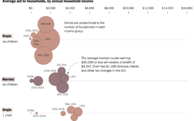
Average stimulus aid, by household size and income
Alicia Parlapiano and Josh Katz, reporting for NYT’s The Upshot, plotted the average…
Recently for Members
Second Edition
 Visualize This: The FlowingData Guide to Design, Visualization, and Statistics (2nd Edition)
 Visualize This: The FlowingData Guide to Design, Visualization, and Statistics (2nd Edition)
New tools, refined process.
Browse by Chart Type See All →


