I am told people use these things called emoji in their messages to…
Statistical Visualization
Finding patterns, distributions, and anomalies.
-
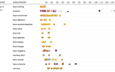
Most used emoji for the year
-
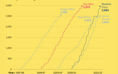
Stephen Curry career threes compared to other players
Stephen Curry is about to break the record for number of three-pointers made…
-
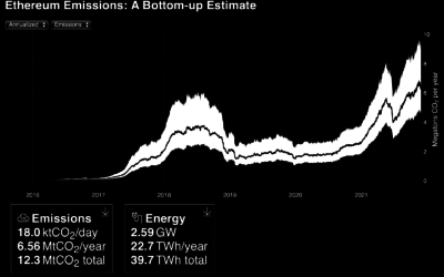
Emissions and energy usage from Ethereum network
It seems clear that Ethereum (and other cryptocurrencies) in its current state is…
-
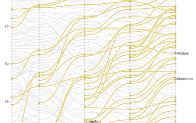
Rapidly growing African cities
In a multi-faceted piece, The Washington Post described the rapidly growing cities in…
-
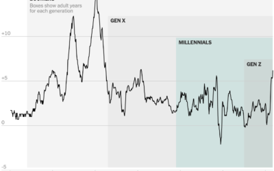
Inflation in the context of age generations
When you compare the price of things today against prices one year ago,…
-
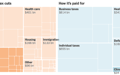
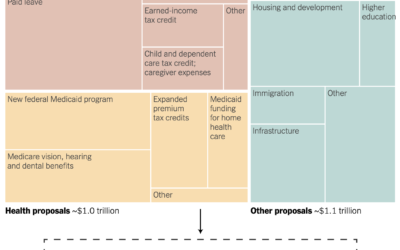
All the provisions in the Build Back Better bill
For NYT’s The Upshot, Alicia Parlapiano and Quoctrung Bui outlined all of the…
-
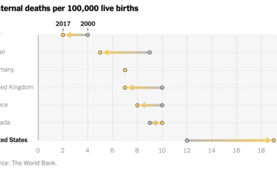
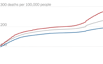
Increased maternal death in the United States
While still relatively rare, maternal mortality in the United States increased over the…
-
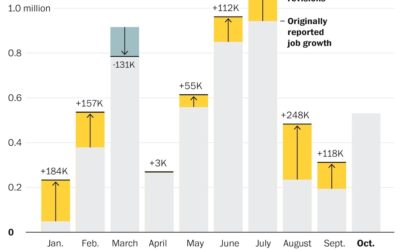
Job growth was underestimated
Andrew Van Dam for The Washington Post used a bar chart with corrections…
-
Partisan gap in Covid death counts
David Leonhardt for The New York Times looked at the partisan gap for…
-
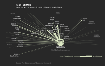
Palm oils and rainforest destruction
Palm oil is in our food, cosmetics, cleaning supplies, and biofuels, but it…
-
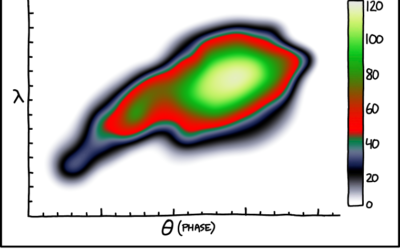
Painbow color scale
xkcd poked fun at the sometimes questionable color choices of researchers.…
-
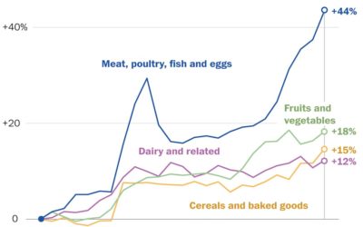
Rising prices of everything
Using Consumer Price Index, Alyssa Fowers and Rachel Siegel for The Washington Post…
-
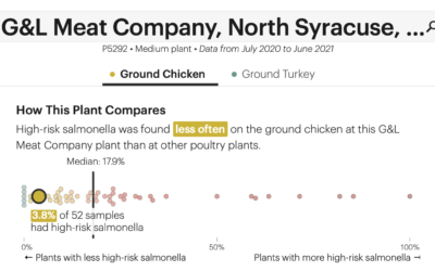
Check the frequency of salmonella in your chicken
The USDA recommends that you cook your chicken to at least 165°F to…
-
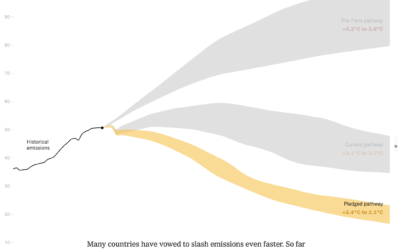
Bend the emissions curve
There has been progress since the Paris climate agreement in 2014, but there’s…
-
Drought extent by region
For Scientific American, Cédric Scherer and Georgios Karamanis charted drought extent by region…
-
Spending bill in a treemap box
Margot Sanger-Katz and Alicia Parlapiano for NYT’s The Upshot broke down a Democrat…
-
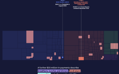
Treemap tour of political donations
The Digital Story Innovation Team for ABC News in Australia looked at political…
-
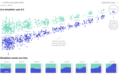
Simulating how just a little gender bias in the workplace can lead to big effects up the chain
Yuhao Du, Jessica Nordell, and Kenneth Joseph used simulations to study the effects…
Recently for Members
Second Edition
 Visualize This: The FlowingData Guide to Design, Visualization, and Statistics (2nd Edition)
 Visualize This: The FlowingData Guide to Design, Visualization, and Statistics (2nd Edition)
New tools, refined process.
Browse by Chart Type See All →


