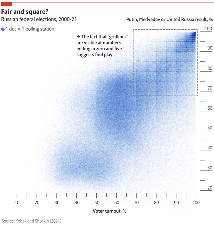
When plotting Russian election results, a structured grid patterns appear. From The Economist:
When Dmitry Kobak and Sergey Shpilkin, two researchers, analysed the results, they found that an unusually high number of turnout and vote-share results were multiples of five (eg, 50%, 55%, 60%), a tell-tale sign of manipulation. According to Messrs Kobak and Shpilkin, there were at least 1,310 polling stations (out of 96,325) with results that were suspiciously tidy, with rounder numbers than you would expect to see by chance.
I’m not familiar with Russian elections, but this seems like lazy cheating. Are they just making up numbers by hand or what?
Check out the full results of Kobak and Shpilkin’s analysis in Python notebook form.


 Visualize This: The FlowingData Guide to Design, Visualization, and Statistics (2nd Edition)
