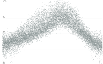
Ben Casselman and Ella Koeze for The New York Times compared time use…
Statistical Visualization
Finding patterns, distributions, and anomalies.
-
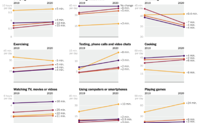
How time use changed in 2020
-
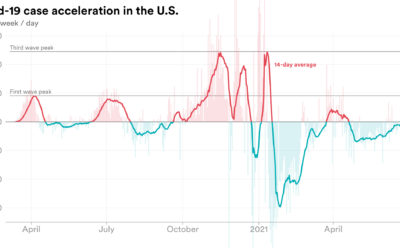
Rate of change in Covid-19 cases
We’re all familiar with the Covid-19 line charts that show cases over time,…
-
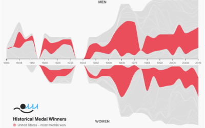
Olympic medal tracker
The Bloomberg medal tracker is fun to look at. I think the graphics…
-
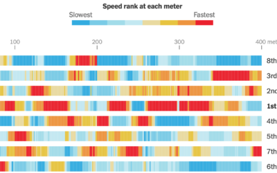
Calculating swim speeds
The New York Times charted speed ranks during the women’s 4×100 freestyle relay.…
-
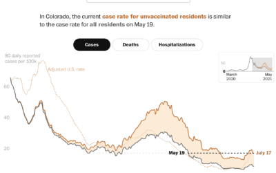
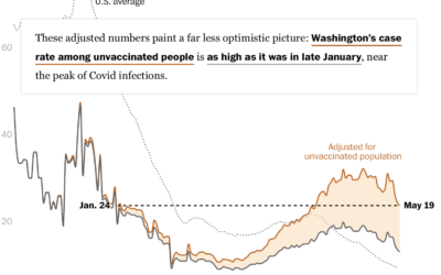
Case rates adjusted for the unvaccinated
Covid-19 cases in the United States were down, but they’re moving up again,…
-
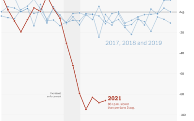
Falling spin rates in baseball after rule enforcement
NYT’s The Upshot analyzed spin rate on pitches before and after enforcing a…
-
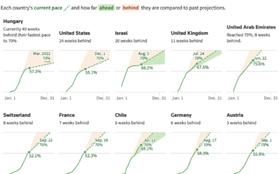
Slowing and then renewed interest in getting vaccinated
When countries gained access to vaccines, there was an initial burst of vaccinations,…
-
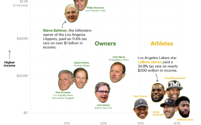
How sports owners pay less taxes than athletes
ProPublica continues their analysis of an anonymous dump of tax records, this time…
-
Historical context for the heat in the Pacific Northwest
It’s been hot in the Pacific Northwest the past few days. NYT’s The…
-
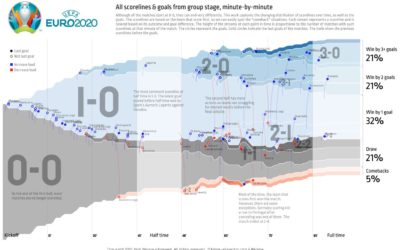
All the matches from Euro 2020 in one chart
To see all the matches from the group stage of Euro 2020 in…
-
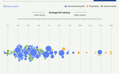
Scoring hospitals by billing quality
Using data collected by Johns Hopkins University, Michelle McGhee and Will Chase for…
-
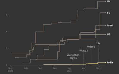
India vaccine procurement compared to other countries
Prasanta Kumar Dutta and Manas Mishra reporting for Reuters on the slow rollout…
-
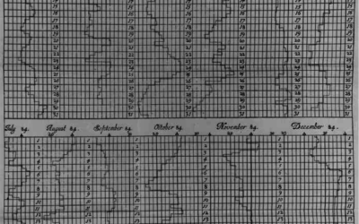
Graphs before anyone knew what they were
Michael Friendly and Howard Wainer have a new book out: A History of…
-

All the passes in soccer visualized at once
This is a fun soccer graphic by Karim Douïeb. It shows 882,536 passes…
-
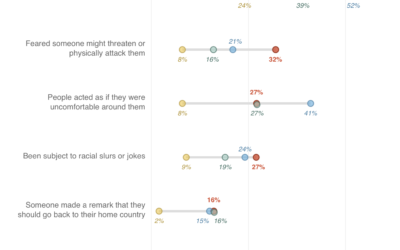
Myth of the Asian American model minority, explained with charts
Asian Americans are often viewed as a “model minority”, but when you look,…
-

Where chess pieces are most often captured
Reddit user desfirsit made heatmaps to show where on the chess board pieces…
-
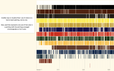
Colors of Bob Ross explored
Connor Rothschild charted all the colors Bob Ross used in The Joy of…
-
Hospitalization rates for the unvaccinated
Overall, Covid-19 cases and hospitalizations are down in the United States, but much…
Recently for Members
Second Edition
 Visualize This: The FlowingData Guide to Design, Visualization, and Statistics (2nd Edition)
 Visualize This: The FlowingData Guide to Design, Visualization, and Statistics (2nd Edition)
New tools, refined process.
Browse by Chart Type See All →


