National Geographic, in collaboration with Bestiario, looks at the improving accessibility to clean…
-
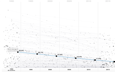
Greater access to clean water
-
Simulation shows why polls don’t always match future results
With election season in full swing, as far as the news is concerned…
-
Link
What Makes Software Good? →
Thoughtfulness in design from d3.js maker Mike Bostock. One of the main reasons I go with d3.js over other libraries.
-
Moving to the “worst” place in America
In 1999, the Department of Agriculture published a Natural Amenities Scale that took…
-
Evolving graphics department at the New York Times
Ken Doctor for Nieman Lab had a chat with Steve Duenes from the…
-
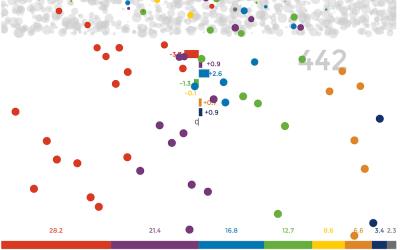
Never Been Married
Some people never get married, and some wait longer than others. Let’s look at these people.
-
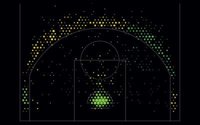
Basketball shot charts, make your own
Based on data from the NBA stats API and using the visual layout…
-

What I Use to Visualize Data
“What tool should I learn? ” I hesitate to answer, because I use what works best for me, which isn’t necessarily the best for someone else or the “best” overall. Nevertheless, here’s my toolset.
-
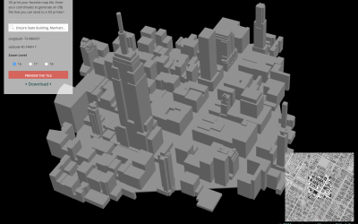
Send map tiles to 3-D printer
Mapzen, which offers a vector tile service, made Tile Exporter, so that you…
-
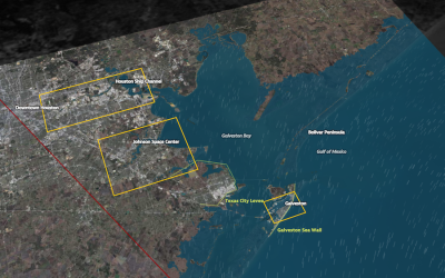
Hurricane simulations show severe flooding in Houston
In 2008, Hurricane Ike blew just past the Houston Ship Channel, “home to…
-
Marrying Age
People get married at various ages, but there are definite trends that vary across demographic groups. What do these trends look like?
-
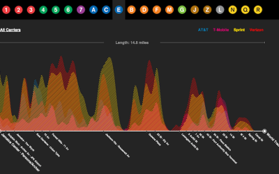
Cell reception on the subway, mapped
Daniel Goddemeyer and Dominikus Baur grew interested in cell reception while on the…
-
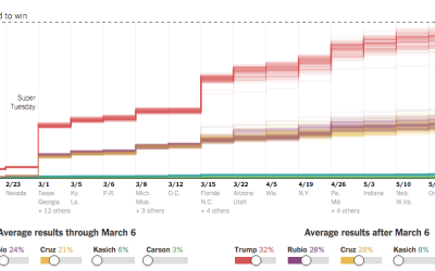
Super Tuesday simulation to show uncertainty
As we know, there are various outcomes during election season, with uncertainty in…
-
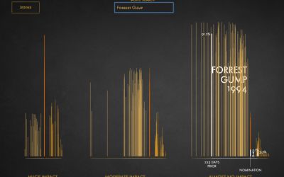
Impact of Best Picture Oscar nomination on profit
I think the general assumption is that getting an Oscar nomination for Best…
-
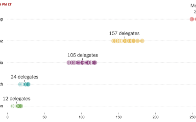
Possible paths for a Trump nomination loss or win
It pains me to imagine a time when Donald Drumpf earns a Republican…
-
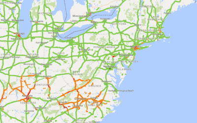
Screen-capping Google Maps for traffic
Alyson Hurt quickly wrote some code to take screen captures of a Google…
-
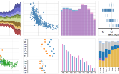
Vega-Lite for quick online charts
A few years ago, Trifacta released Vega, a “visualization grammar” that lets you…
-
Link
Perceptual Scaling of Map Symbols →
Scale circles by area or by how they are actually perceived?
-

Code as microorganism
Taking a step beyond 2-D glyphs, Codeology depicts GitHub user activity based on…
-
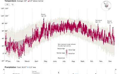
How much warmer your city was in 2015
It was hotter in 2015 than any other year ever. K. K. Rebecca…
Recently for Members
Second Edition
 Visualize This: The FlowingData Guide to Design, Visualization, and Statistics (2nd Edition)
 Visualize This: The FlowingData Guide to Design, Visualization, and Statistics (2nd Edition)
New tools, refined process.
Browse by Chart Type See All →


