Plants and animals interact with each other to stay alive, which in turn…
-
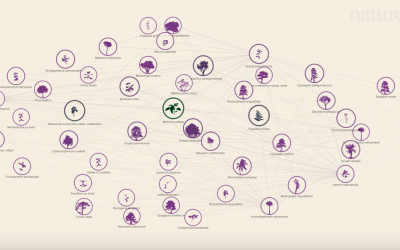
Social network of Earth’s plants and animals
-

The Daily Mail Stole My Visualization, Twice
Last month, I published an interactive visualization that simulates how and when you…
-
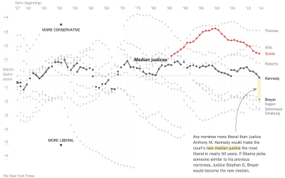
Supreme Court shifts in power
The Upshot has been doing a good bit on the Supreme Court dynamics…
-
Data scientists mostly just do arithmetic
Noah Lorang, a data scientist at Basecamp, explains the key for most companies…
-
Emergency room data in R
For my graphic on emergency room visits over time and the other on…
-

Math of crime and terrorism
Numberphile, from the Mathematical Sciences Research Institute, is one my new favorite YouTube…
-

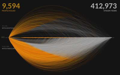
Million to One Shot, Doc
Between 2009 and 2014, there were an estimated 17,968 visits to the emergency room for things stuck in a rectum. Here are those things’ stories.
-
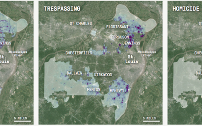
Predictive policing
Crime and data have an old history together, but because there are new…
-
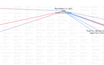
Who marries who, by profession
People with certain professions tend to marry others with a given profession. Adam…
-
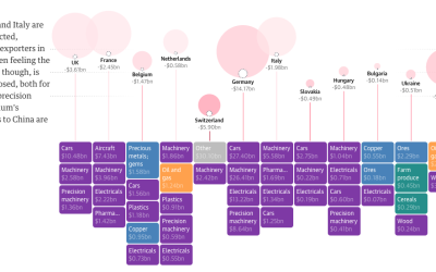
International impact of China’s economic slowdown
China’s economic slowdown means a major decline in imports from other countries, which…
-
Members Only

How to Make an Interactive Stacked Area Chart
Stacked area charts let you see categorical data over time. Interaction allows you to focus on specific categories without losing sight of the big picture.
-
Suite of data tools for beginners, focused on fun
Data can be intimidating and confusing for beginners, and as a result they…
-

Why People Visit the Emergency Room
These are the top 250 products that people injure themselves on or with in a year.
-
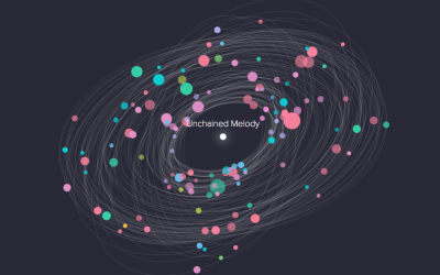
Galaxy of cover songs
A fun one from Interactive Things that shows cover songs with a galaxy…
-
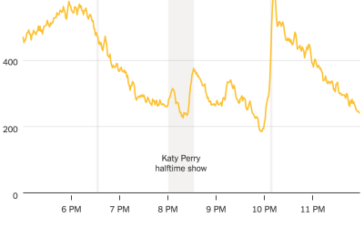
Taxi ride volume during Super Bowl key moments
A high percentage of Americans are glued to the television or party sample…
-
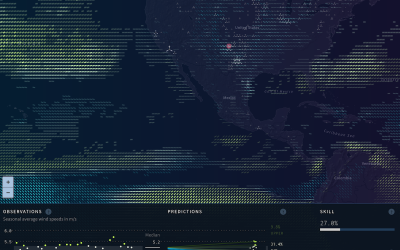
Wind prediction and potential power
As we use up current energy resources, it grows more important to look…
-
Campaign Finance API moves to ProPublica
Back in 2008, the New York Times rolled out a campaign finance API…
-
Catalog of criminal justice data
There’s a lot of data on criminal justice — prison populations, crime rates,…
-
Link
How do you learn d3.js? →
Small projects. Decide what you want to make first, and then figure out how to do it.
-
Role of empathy in visualization
On the PolicyViz podcast, Kim Rees of Periscopic and Mushon Zer-Aviv of Shual…
Recently for Members
Second Edition
 Visualize This: The FlowingData Guide to Design, Visualization, and Statistics (2nd Edition)
 Visualize This: The FlowingData Guide to Design, Visualization, and Statistics (2nd Edition)
New tools, refined process.
Browse by Chart Type See All →


