It was hotter in 2015 than any other year ever. K. K. Rebecca Lai for the New York Times shows just how much hotter it was in your city. Simply type in your city name or click on the arrows to browse to see a time series for the year.
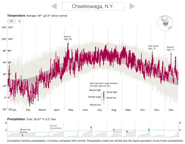
The background bars in lighter gray show all-time highs and lows, the darker gray bars show normal range, and the red bars show the lows and and highs for 2015. So when you look at a time series for a single city, you’re essentially looking at three maximum and minimum value pairs for each slice of time.
Precipitation levels are shown on the bottom, and to top it off, there’s a spinny globe in the top right to orient you geographically. It packs a lot of information into one space, but it works. And speedy.
 Visualize This: The FlowingData Guide to Design, Visualization, and Statistics (2nd Edition)