Marrying Age
People get married at various ages, but there are definite trends that vary across demographic groups. You’ve probably experienced this, either through your own marriage or via the sudden realization that everyone around you seems to be getting married. Good times.
So what do these trends look like? When do people of various races usually get married? Does it change by education level? Employment status? The interactive chart below provides the answers.
Using data from the American Community Survey, made more useable by the Integrated Public Use Microdata Series, I tabulated the ages of people who married between 2009 and 2014.
So for each demographic group, you can see the typical age people were when they married. The green line is for women, and the orange line is for men. Click the checkbox to toggle between first-time marriages only and all marriages during the timespan.
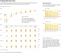
As one might expect, women tend to marry at a younger age than men, regardless of the demographic group. The median age of women marrying for the first time was 26, and the median age of men marrying for the first time was two years older at 28. Similarly, for marriages overall, not just the first-time marriages, the medians for women and men was 29 and 31, respectively.
Median is just a broad measurement though. Looking at the full distributions, it’s interesting how much smoother the lines get as you go from high school level education up to advanced. Or, toggle between employed and unemployed and there’s a clear difference.
It basically follows the same pattern as in the movies. You find stability in your own life, and you get married.
As a Chinese male, I was particularly interested in the Asian group. Apparently I got married relatively early, as Asians appear to get married the latest. I suspect it has something to do with years spent on education. Go to college, earn an advanced degree, and a spouse magically appears, because, well, now you’re fit to be a spouse.
Is it your time yet?
 Seven year itch: When do people get married and divorced?
Marrying age keeps changing. Here’s the trend since 1986.
Chart Type Used

Become a member. Support an independent site. Get extra visualization goodness.
See What You Get