Three or four articles on the gender wage gap popped up on my radar last week, some focusing on the rise of women as the lead household earner and others on how much less women make. I took a look.
interactive
-
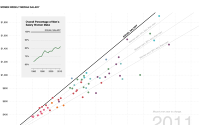
Gender wage gap, how much less women make than men
-
Members Only
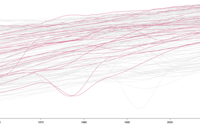
Interactive Time Series Chart with Filters
Time series charts can easily turn to spaghetti when you have multiple categories. By highlighting the ones of interest, you can direct focus and allow comparisons.
-
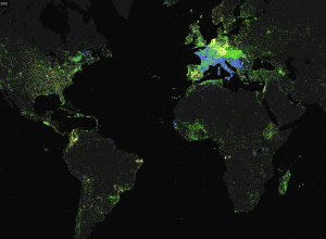
Explore Geographic Coverage in Mapping Wikipedia
TraceMedia, in collaboration with the Oxford Internet Institute, maps language use across Wikipedia…
-
Rising Water Levels in the Immediate Future
Stamen Design, in collaboration with Climate Central, shows major areas that could be…
-
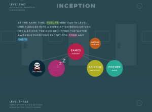
Inception Explained in Animated Infographic
Designer Matt Dempsey explains the storyline of Inception in this fun experiment. There…
-
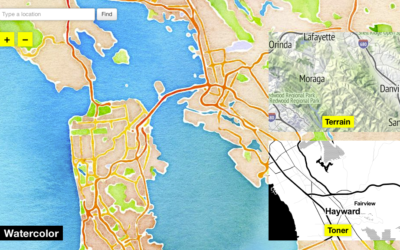
Watercolor Map Tiles
A couple of years ago, when you thought about online interactive maps, what…
-
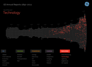
Innovation History via 6,000 Pages of Annual Reports
Fathom Information Design, in collaboration with GE, visualizes GE annual reports from 1892…
-
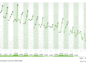
Towards a Low-carbon World
Carbon output. We want to reduce it, but some countries have a longer…
-
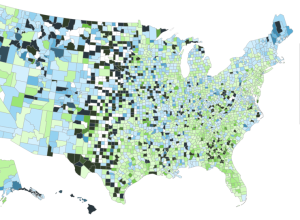
Comparing heritage in the Melting Pot
At first I thought this map, by David Yanofsky for Bloomberg, was your…
-
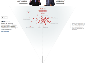
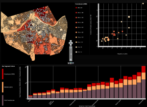
Who voted for Santorum and Romney
As a complement to Shan Carter’s exit poll dancing boxes, The New York…
-
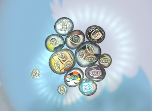
Your personal networks visualized as microbiological cells in Biologic
Data exists in digital form, on our computers and spreadsheets, but the exciting…
-
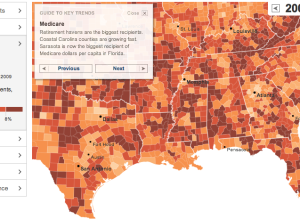
Geography of government benefits
I missed this one a while back, but The New York Times had…
-
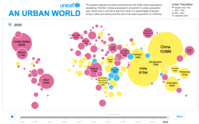
Growing urban populations
In this simple interactive animation by Periscopic, in partnership with UNICEF, we see…
-
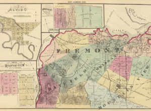
Really old maps online
Maps have been around for a long time, but you might not know…
-
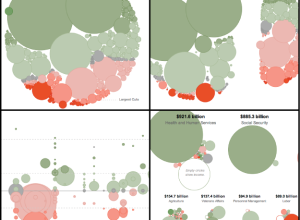
Slicing Obama’s 2013 budget proposal four ways
With Obama’s recent budget for next year proposed, Shan Carter et. al of…
-
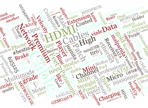
Interactive and animated word cloud
For those who die a little inside every time they see a word…
-
Weave for visualization development
Web-based Analysis and Visualization Environment, or Weave for short, is open source software…
-
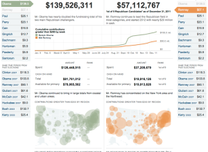
Compare presidential candidate fundraising
Presidential candidates have raised $186 million up to now, according to the Federal…
-
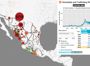
Mapping the drug wars in Mexico
Diego Valle-Jones maps homicides and trafficking routes in Mexico.
To unclutter the map… -

In perspective: One hour of video uploaded to YouTube per second
YouTube surpassed the one hour of video uploaded per second threshold recently. To…
Recently for Members
Second Edition
 Visualize This: The FlowingData Guide to Design, Visualization, and Statistics (2nd Edition)
 Visualize This: The FlowingData Guide to Design, Visualization, and Statistics (2nd Edition)
New tools, refined process.
Browse by Chart Type See All →


