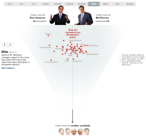
 As a complement to Shan Carter’s exit poll dancing boxes, The New York Times provides another view with an interactive triangular scatterplot.
In the dancing boxes, you can see how states are inclined to vote based on exit poll groups. In the scatterplot, on the other hand, the groups within each state are plotted, with an added dimension towards candidates other than Santorum and Romney. The navigation bar on top and clicker on the left let you see tendencies of each state.
Like the dancing boxes, the transitions make the chart. As you browse by state or by category, you’re able to see differences between groups when shapes move across the screen.
In somewhat related news, The New York Times graphics department is looking for summer interns. Send your interest to Steve Duenes (duenes [at] nytimes [dot] com) and Amanda Cox (coxa [at] nytimes [dot] com). I interned there a few years ago, so I can tell you first-hand that you’ll learn a lot — probably more than in any class you’ve taken — while working with the best in the business.

 Visualize This: The FlowingData Guide to Design, Visualization, and Statistics (2nd Edition)

the infographic can be replaced by a single word (idiots)
I didn’t see it, is there a recognized demographic for ‘voted in the primary solely to skew the Republican vote towards the loon(iest) candidate of the moment’? Or was it just me?
They could not make the size of the dots proportional to percentage of electorate?
That would have been good. You can see what % of voters each blob represents by hovering over (so the data is clearly there), it’s a shame that it isn’t shown visually. Size might make the graphic too busy – some (e.g. abortion in Ohio) are as low as 12% while others (e.g. not an evangelical in Mass.) are as high as 84%, a range which would likely lead to either obtrusively massive blobs or unclickably small blobs. Just noticed most areas have a ‘White’ blob that is near 100%…
However, linking fill opacity to % of voters, with a fixed thin stroke on the outside of each so the small ones remain visible, would be easy to implement and would add no extra complexity – and by giving a neat visual hierarchy, I’d argue it’d make the graphic simpler to digest.
For me this was a great graphic, with that lack of visual hierarchy being the one flaw. Other seeing which move around most in the transitions, there’s little hook or clue as to where to start exploring the many anonymous, equally weighted blobs.
Well said.
Can we please stop calling this a triangular scatterplot? It’s not. There are only two dimensions: the first is the NET vote between Romney and Santorum, the second is the vote for all other candidates.