Fathom Information Design, in collaboration with GE, visualizes GE annual reports from 1892 to 2011. It doesn’t sound so interesting at first, but browse the appearance of keywords, and you do get a sense of change.
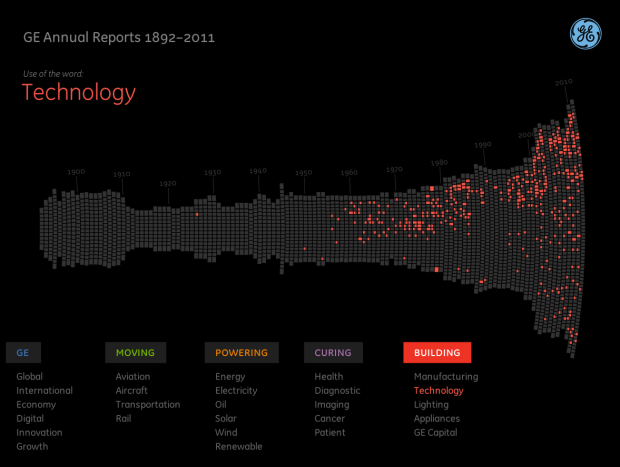
We’ve scanned 6,000 pages of GE’s annual reports to build this interactive visualization. But why? What’s the point? Not only does this provide a rich history of how GE has always been at work building, moving, powering and curing the world, but it is a true reflection of how the economy, U.S. and the world as a whole has progressed from 1892 until 2011. By diving deep into key terms, users can uncover interesting stories about innovation over the last century.
Each column represents an annual report, and each little square represents a page. Select a keyword, and pages that use that word are highlighted. Finally, you can actually read each page of the report by clicking on a column. It expands.
Update: Fathom provides background on what you can glean from the interactive.
 Visualize This: The FlowingData Guide to Design, Visualization, and Statistics (2nd Edition)
Woah!.. It’s Amarr Avatar (Titan class capital ship)