Amelia Wattenberger wrote a guide on how you can use the JavaScript library…
D3
-
Guide for React with D3.js
-
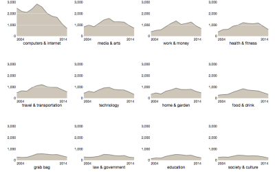
How to Make Interactive Linked Small Multiples
Small multiples are great, and the right interactions can make them even better. A primer and a how-to.
-
Members Only
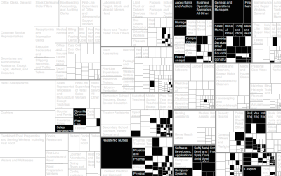
How to Make an Interactive Treemap
Treemaps are useful to view and explore hierarchical data. Interaction can help you look at the data in greater detail.
-
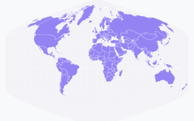
Responsive maps with D3.js
A challenge these days with visualization is that a piece might look great…
-
Link
For Example
Mike Bostock, creator of D3, believes in using examples to show what can be done with his code.
-
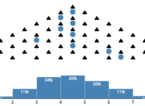
Central limit theorem animation
The central limit theorem:
In probability theory, the central limit theorem (CLT) states… -
Link
Making the game of thrones visualization
Jerome Cukier describes the process behind making his Game of Thrones interactive.
-
Link
Creating a hexagonal cartogram
How to create a hexagonal cartogram using a combination of ArcGIS, Python, and D3.
-
Link
Geographic Bounding Boxes
Geographic Bounding Boxes. A trivial task in a 2-D space, but tricker on sphere.
-
Link
Selections in D3
Mike Bostock continues to beef up the documentation and tutorials for D3. This one for selections.
-
Link
Crosslet
Crosslet is “a free small (22k without dependencies) JavaScript widget for interactive visualisation and analysis of geostatistical datasets.” It’s a combination of Crossfilter, Leaflet, and D3.
-
Vega: A visualization grammar to create without programming
Visualization online can be a challenge if you don’t know how to program.…
-
Link
Visual Sedimentation
By Samuel Huron and Romain Vuillemot, Visual Sedimentation is “a JavaScript library for visualizing streaming data, inspired by the process of physical sedimentation.” Be sure to check out the examples.
-
How to Animate Transitions Between Multiple Charts
Animated transitioning between chart types can add depth to your data display. Find out how to achieve this effect using JavaScript and D3.js.
-
Link
Small multiples with details on demand →
Small charts. Click. Big chart.
-
Link
Cartograms in D3 →
Cartograms in D3. Way smooth and interactive.
-
Link
Geometry simplification →
Demo by Jason Davies for simplifying geographic boundaries in D3
-
Link
Basics of JavaScript and D3 for R Users →
From a statistician’s perspective
-
Link
mbostock →
Lots of D3 snippets and projects by the creator
-
Color names plotted against gender
A couple of years ago, xkcd ran a survey that asked people to…
Recently for Members
Second Edition
 Visualize This: The FlowingData Guide to Design, Visualization, and Statistics (2nd Edition)
 Visualize This: The FlowingData Guide to Design, Visualization, and Statistics (2nd Edition)
New tools, refined process.
Browse by Chart Type See All →


