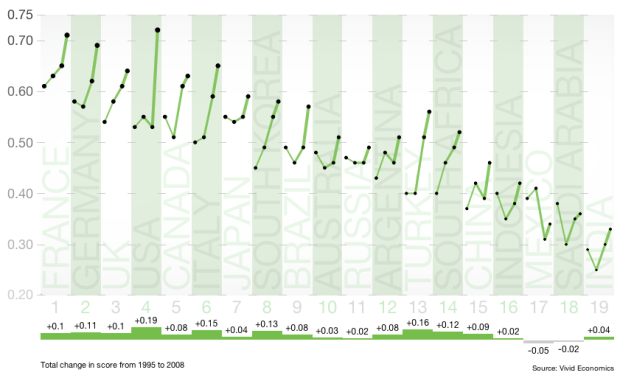
Carbon output. We want to reduce it, but some countries have a longer way to go than others. Pitch Interactive shows progress (or non-progress) by country in this interactive for the Climate Institute. Three indices are shown along with an overall score, which is a composite of the three, and countries are sorted by the average score from 1995 to 2008. Higher scores are better.
The interaction makes this graphic. When you switch between indices, the countries are sorted appropriately and the time series for each country are drawn. You can also click on a country to get a closer view, which albeit is only four data points per country and index, but it’s still useful.
The lines for each country get thicker from left to right, which was to provide a sense of progress, but I wonder if it would be worthwhile to use thickness to represent an increase or decrease from the previous year. Then again, that’s easy enough to see already, so maybe not.
 Visualize This: The FlowingData Guide to Design, Visualization, and Statistics (2nd Edition)
Pretty, but the metrics don’t make a lot of sense. The energy-innovation system is just way too nonlinear and dynamic for this kind of balanced scorecard to tell you much. A coherent underlying causal model is desperately needed here.