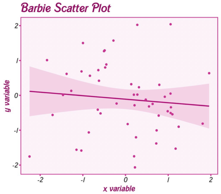
Matthew Jané made a small R package called Theme Park, which is meant to supply movie-based themes for ggplot. For now, it just has Barbie and Oppenheimer themes.
Matthew Jané made a small R package called Theme Park, which is meant to supply movie-based themes for ggplot. For now, it just has Barbie and Oppenheimer themes.

This is the good stuff for July.
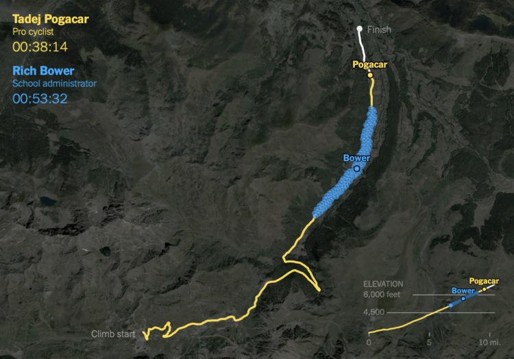
It takes strength and dedication to race in the Tour de France. It’s just that when you see the leading cyclist alone on a steep climb, they kind of look the same as some random person riding up a hill. For NYT’s The Upshot, K.K. Rebecca Lai and Ben Blatt provide a point of comparison.
Data from Strava was used to show how a caterpillar-like group of amateurs rode against a professional. As you might have guessed, the professional climbs much faster. Just a tad.
Sarah Bell made an animated version of John Snow’s classic map from 1854.
I know dinner time varies around the world, but I wanted to know if dinner time was different within the United States, and if so, by how much. Who eats the earliest? Who eats the latest?
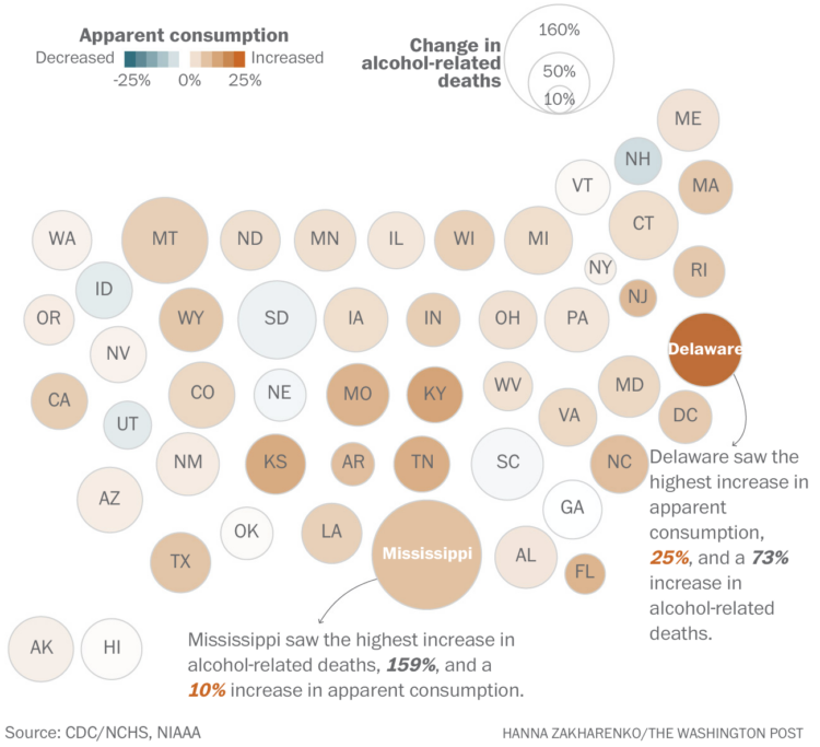
Alcohol consumption, based on ethanol volume estimates, has been rising over the past couple of decades. The pandemic appears to have sped that up, leading to more deaths. For The Washington Post, Caitlin Gilbert, David Ovalle and Hanna Zakharenko report:
At the same time, the number of deaths caused by alcohol skyrocketed nationwide, rising more than 45 percent. In 2021, alcohol was the primary cause of death for more than 54,000 Americans, causing nearly 17,000 more deaths than just a few years before, in 2018, according to data from the Centers for Disease Control and Prevention.
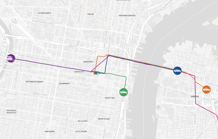
To find the fastest route from Philadelphia to the Jersey Shore, The Philadelphia Inquirer got five of their reporters to race via different routes and modes of transportation. Overlaid on a map of moving dots, the mix of text, video clips, and photos from the racers had me rooting for my pick all the way through even though I know little about the area and have never wondered about reaching the Jersey Shore.

The SVG path element can be useful for drawing regular and irregular shapes. However, if you just look at how a path is defined, it’s not entirely clear how to use it. Nanda Syahrasyad made a visual guide to help you figure it out.
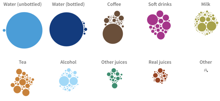
When I was a kid, I drank a lot of milk, and bottled water wasn’t really a thing. In high school, coffee entered the picture (mostly because my friends liked to hang out at coffee shops), and in adulthood, beer is more common. For USAFacts, we looked at the drinking habits for all Americans and how it’s changed for children, teens, and adults.
One of the things that makes AI seem neat is that it sometimes feels like magic when you enter a question and get a reasonable answer in a human-like tone. For Bloomberg, Davey Alba reports on how some of that magic is just a bunch of people labeling data for low wages:
Other technology companies training AI products also hire human contractors to improve them. In January, Time reported that laborers in Kenya, paid $2 an hour, had worked to make ChatGPT less toxic. Other tech giants, including Meta Platforms Inc., Amazon.com Inc. and Apple Inc. make use of subcontracted staff to moderate social network content and product reviews, and to provide technical support and customer service.
“If you want to ask, what is the secret sauce of Bard and ChatGPT? It’s all of the internet. And it’s all of this labeled data that these labelers create,” said Laura Edelson, a computer scientist at New York University. “It’s worth remembering that these systems are not the work of magicians — they are the work of thousands of people and their low-paid labor.”
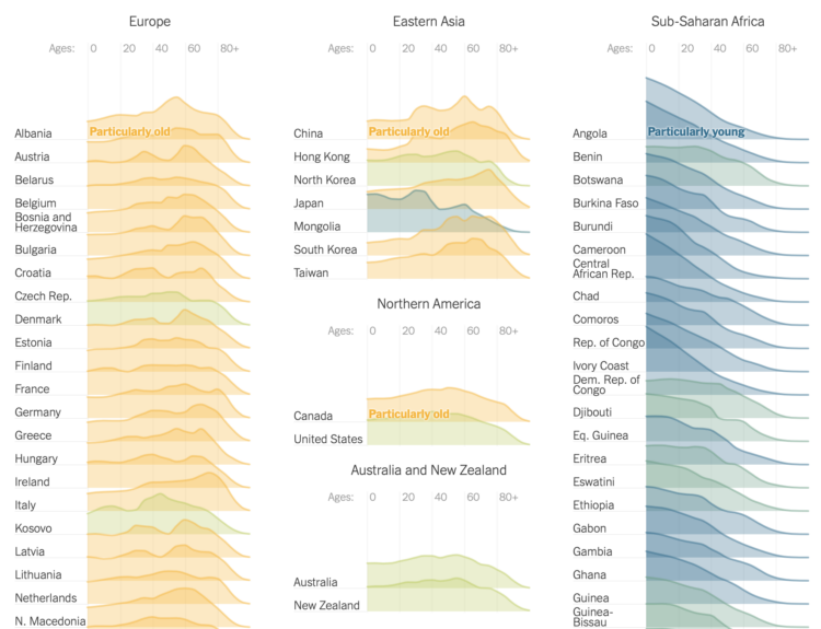
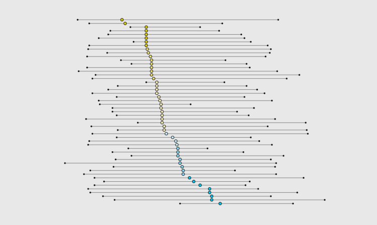
The world is getting older overall. For The New York Times, Lauren Leatherby broke it down by country with a set of animated frequency trails, along with charts for more demographic shifts. I like it.
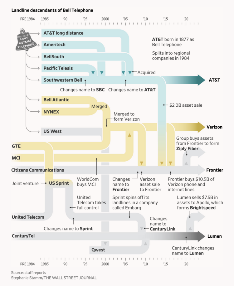
Bell System’s monopoly broke up in 1984 leading to independent phone companies, which have merged with or were acquired by other companies. The Wall Street Journal used a flowchart to show the history, which is how companies like AT&T and Verizon inherited a system of lead-covered cables.
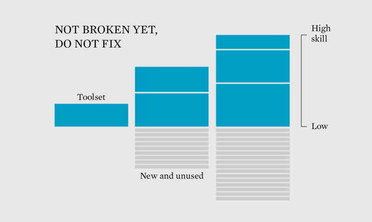
With all the new tools available, maybe it’s time to add to the existing toolset.
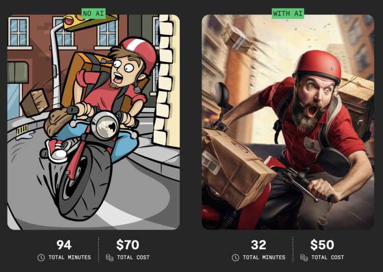
For Rest of World, Andrew Deck turned the AI focus on outsourced workers, whose jobs have been directly affected as of late and will probably shift much more. Deck profiled and commissioned four workers to make things without AI and with:
For more than seven years, Santiago Bautista González worked full time selling his cartoon-style illustrations, using the freelance gig marketplace Fiverr. His income, around $1,500 in a good month, dropped by a third this past January. February was equally disappointing.
In search of an explanation, Bautista, 31, read about the growing popularity of visual generative AI software. He found that Fiverr had added a section for AI artists. “And I say, ‘Well, maybe it’s because of this,'” he told Rest of World.
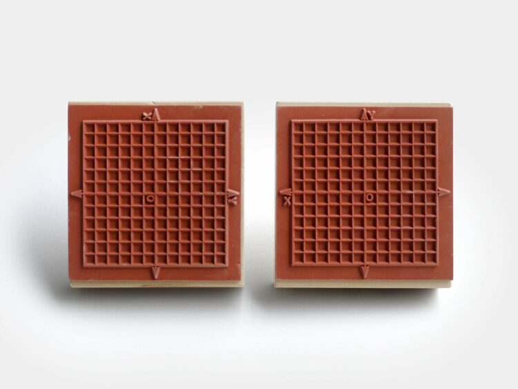
For graphing on the go, Present & Correct offers a rubber stamp with a grid and x-y-axes. I think I need this.
 An Introduction to Statistical Learning, with Applications in R by Gareth James, Daniela Witten, Trevor Hastie, and Rob Tibshirani was released in 2021. They, along with Jonathan Taylor, just released an alternate version with applications in Python. So if Python is your thing, have at it. Like the R version, it is free to download as a PDF.
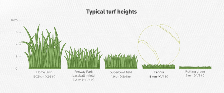
This might surprise you, but the grass at the Wimbledon tennis tournament is not the same as the grass in people’s backyards. It has to stay short so that tennis balls maintain speed and bounce and strong enough to hold up to professional tennis play. For Reuters, Travis Hartman and Ally J. Levine illustrate the differences between court surfaces and how grass impacts play.
I’m into the tennis textures used throughout the piece.
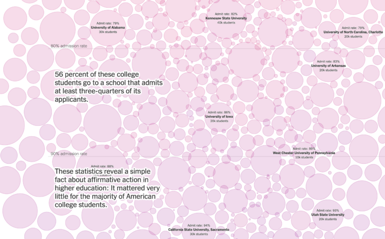
For NYT Opinion, Richard Arum and Mitchell L. Stevens, with graphics by Quoctrung Bui, turn their attention to the four-year colleges that accept most applicants, which is most schools:
While the Supreme Court’s decision is a blow to Black and Hispanic students who dream of attending the most competitive universities, improving and better supporting the institutions that serve the lion’s share of students of color will do far more to advance the cause of racial equality in this country than anything that admissions officers can do in Cambridge, Palo Alto and Chapel Hill.
The selective schools get all the attention, but there are a surprising percentage of programs that accept just about everyone. The beeswarm bubbles fill to the edge of the screen to highlight the point.
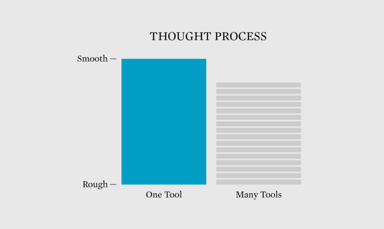
There are many tools, which makes it tempting to learn them all. Instead, learn one tool really well and the logic carries over to the others.
 Visualize This: The FlowingData Guide to Design, Visualization, and Statistics (2nd Edition)
New tools, refined process.