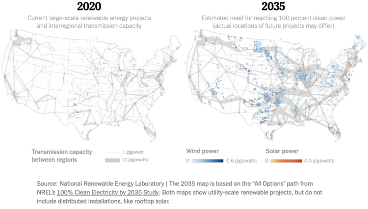
• Membership
  • Newsletter
  • Projects
  • Learning
  • About
  • Member Login
  • Meaning of the Chinese New Year meal

    January 20, 2023

    Topic

    Infographics  /  Lunar New Year, Taiwan Data Stories

    In celebration of Chinese New Year, Julia Janicki, Daisy Chung, and Joyce Chou rotate through the traditional foods served with an illustrated Lazy Susan.

  • Reservoir refills in California

    January 20, 2023

    Topic

    Statistical Visualization  /  California, drought, New York Times, rain

    There’s been a lot of rain in California, which has been good to relieve some of the pressures from drought, at least in the short-term. For The New York Times, Elena Shao, Mira Rojanasakul, and Nadja Popovich show the sudden bump in water supply.

    The areas to show historical averages in the background was a good choice. Very reservoir-ish.

  • Manual removal of harmful text to train AI models

    January 20, 2023

    Topic

    Statistics  /  AI, cleaning, ethics, OpenAI, Sama

    AI training data comes from the internet, and as we know but maybe forget sometimes, there are harmful areas that are terrible for people. For Time, Billy Perrigo reports on how OpenAI outsourced a firm to label such data, which required people to read disturbing text:

    To build that safety system, OpenAI took a leaf out of the playbook of social media companies like Facebook, who had already shown it was possible to build AIs that could detect toxic language like hate speech to help remove it from their platforms. The premise was simple: feed an AI with labeled examples of violence, hate speech, and sexual abuse, and that tool could learn to detect those forms of toxicity in the wild. That detector would be built into ChatGPT to check whether it was echoing the toxicity of its training data, and filter it out before it ever reached the user. It could also help scrub toxic text from the training datasets of future AI models.

    To get those labels, OpenAI sent tens of thousands of snippets of text to an outsourcing firm in Kenya, beginning in November 2021. Much of that text appeared to have been pulled from the darkest recesses of the internet.

  • Members Only

    More Noise, Better Signal

    January 19, 2023

    Topic

    The Process  /  noise, uncertainty

    Sometimes the noise, something we often try to minimize in data, makes for a better signal.

  • Barely a map of the west coast

    January 19, 2023

    Topic

    Maps  /  coastline, Peter Gorman

    Barely Maps is an ongoing project by Peter Gorman that shows geographic data as barely a map. Gorman strips away almost all context to the edge before being too abstract to comprehend.

    The above is for the western coast of the United States. There are many more of the same flavor available in print.

  • Scrolly video JavaScript library

    January 18, 2023

    Topic

    Coding  /  JavaScript, scrollytelling, video

    ScrollyVideo.js is a JavaScript library that makes it easier to incorporate videos in a scrollytelling layout. The examples look really straightforward, which means I’m saving this for later.

  • Snow cover mapped using snowflakes

    January 17, 2023

    Topic

    Maps  /  Althea Archer, R, snow, USGS

    To show snow cover across the United States, Althea Archer for the USGS used hexbins, but instead of hexbins, she used snowflakes. Archer provided her R code and outlined her process in a blog post, which is something I’m not used to seeing from a government agency. I like it.

  • Tracking hundreds of pizza slices

    January 13, 2023

    Topic

    Self-surveillance  /  Liam Quigley, pizza

    For eight years, Liam Quigley tracked every slice of pizza he ate in New York City, which added up to 454 slices. Quigley did not rate the slices to “avoid controversy and bribes”, but I kind of wish he rated all those slices. Instead he logged the location, the price, and the type of pizza.

    Also I want pizza now.

  • Members Only

    Alternative Ways to Represent Data

    January 12, 2023

    Topic

    The Process  /  senses

    We’ve seen data in many forms, but we should dig deeper into using our other senses.

  • Data Underload  /  time use, well-being

    Happiness and Meaning in What We Do

    We looked at what makes people happy. We looked at activities that people rate as meaningful. Now let’s put them together and see what people rate as both meaningful and joy-inducing.

    Read More
  • Origins of the world map

    January 11, 2023

    Topic

    Maps  /  history, Jeremy Shuback

    [arve url=”https://www.youtube.com/watch?v=AJBBVQrRwqo” /]

    Mapping the entire planet is not exactly a straightforward thing to do, especially during a time when there weren’t any flying objects to take photographs from above. Jeremy Shuback rewinds all the way back to this time and asks how the first world map came to be.

  • Tom Brady of other jobs

    January 10, 2023

    Topic

    Statistical Visualization  /  age, Tom Brady, Upshot, work

    Tom Brady, the quarterback for the Tampa Bay Buccaneers, is 45 years old, which makes him the oldest player in the National Football League. Francesca Paris, for NYT’s The Upshot, places Brady’s age under the perspective of other occupations. For example, Lilian Thomas Burwell, who is an artist at 95 years old, is well in the upper percentile for those in her field (and the general population).

    See also: the distributions of age and occupation.

  • Bias in AI-generated images

    January 9, 2023

    Topic

    Mistaken Data  /  AI, bias, images, Lensa, MIT Technology Review, Stable Diffusion

    Lensa is an app that lets you retouch photos, and it recently added a feature that uses Stable Diffusion to generate AI-assisted portraits. While fun for some, the feature reveals biases in the underlying dataset. Melissa Heikkilä, for MIT Technology Review, describes problematic biases towards sexualized images for some groups:

    Lensa generates its avatars using Stable Diffusion, an open-source AI model that generates images based on text prompts. Stable Diffusion is built using LAION-5B, a massive open-source data set that has been compiled by scraping images off the internet.

    And because the internet is overflowing with images of naked or barely dressed women, and pictures reflecting sexist, racist stereotypes, the data set is also skewed toward these kinds of images.

    This leads to AI models that sexualize women regardless of whether they want to be depicted that way, Caliskan says—especially women with identities that have been historically disadvantaged.

  • Generative AI trade-offs

    January 9, 2023

    Topic

    Statistics  /  AI, ethics, generative art, Maggie Appleton

    People have been having fun with generative AI lately. Enter a prompt and get a believable body of text, or enter descriptive text and get a photorealistic image. But as with all things that are fun on the internet, there are those who are looking to exploit the popularity. Maggie Appleton discusses the trade-offs:

    There’s a swirl of optimism around how these models will save us from a suite of boring busywork: writing formal emails, internal memos, technical documentation, marketing copy, product announcement, advertisements, cover letters, and even negotiating with medical insurance companies.

    But we’ll also need to reckon with the trade-offs of making insta-paragraphs and 1-click cover images. These new models are poised to flood the web with generic, generated content.

    You thought the first page of Google was bunk before? You haven’t seen Google where SEO optimizer bros pump out billions of perfectly coherent but predictably dull informational articles for every longtail keyword combination under the sun.

  • Every hour tracked, for five years

    January 6, 2023

    Topic

    Self-surveillance  /  everyday

    In the department of tedious and thorough, Reddit user _tsweezy_ tracked every hour of his life for five years. It’s like a personal American Time Use Survey diary for slightly longer than a single day. I’m sure there’s some estimation or fill-ins after-the-fact, but still, that’s a lot of days and hours.

  • Data Underload  /  happiness, time use, well-being

    When Americans Are Happiest

    What people are doing when they are happy and not, from age 20 to 70.

    Read More
  • Animal extinction over time

    January 4, 2023

    Topic

    Statistical Visualization  /  animals, extinction, Reuters

    Animals are going extinct at a faster rate. Reuters shows a developing pattern across species:

    Losing hundreds of species over 500 or so years may not seem significant when there are millions more still living on the planet. But in fact, the speed at which species are now vanishing is unprecedented in the last 10 million years.

    “We are losing species now faster than they can evolve,” O’Brien said.

  • Names that are more dog or more human

    January 3, 2023

    Topic

    Statistical Visualization  /  dogs, names, Washington Post

    There appears to be a trend of using human names for pets. Alyssa Fowers and Chris Alcantara, for WP’s Department of Data, asked the natural questions that come after: “How human is your dog’s name? How doggy is your name?” Enter your own name or a dog’s name to see where it falls on the dog to human scale.

  • Mapping the sea floor

    January 2, 2023

    Topic

    Maps  /  Jon Keegan, nature, ocean, USGS

    Jon Keegan on how USGS researchers collected data for 125 square miles of sea floor:

    In 2004 and 2005, two research vessels, Ocean Explorer and Connecticut set off into the waters off Cape Ann, Massachusetts on a U.S. Geological Survey mission to map a section of the bottom of the sea. Equipped with cameras, advanced sonar and bathymetric scanners, these ships mapped 125 square miles of the sea floor capturing a detailed dataset that allowed U.S. Geological Survey scientists to characterize the makeup of the sediment and bedrock in waters up to 92 meters deep.

  • Members Only

    Visualization Tools and Learning Resources, December 2022 Roundup

    December 29, 2022

    Topic

    The Process  /  roundup

    The year’s almost up, so let’s get right into it. Here’s the good stuff for December.

  • Page 48 of 391
  • <
  • 1
  • ...
  • 45
  • 46
  • 47
  • 48
  • 49
  • 50
  • ...
  • 391
  • >

Analyze, visualize, and communicate data usefully, beyond the defaults.

Become a member →

Recently for Members

May 8, 2025
When the data is not what it seems

May 1, 2025
Finding the Right Charts

April 24, 2025
Visualization Tools, Datasets, and Resources – April 2025 Roundup

April 17, 2025
Breaking Out of Chart Software Defaults

April 15, 2025
Line Chart with Decorative Neon Accents

Browse by Chart Type See All →

Unit Chart Baseline Chart Glyph Chart Stacked Area Chart Streamgraph Area Chart Heatmap Frequency Trails Pie Chart Voronoi Diagram

Browse By Topic

  • Visualization

    Seeing data

  • Maps

    Seeing geographic data

  • Infographics

    Explaining data

  • Networks

    Connecting data

  • Statistics

    Analyzing data

  • Software

    Working with data

  • Sources

    Getting data

  • Design

    Making data readable

Get the Book

Visualize This: The FlowingData Guide to Design, Visualization, and Statistics

Available now.

Order: Amazon / Bookshop

Made by FlowingData

  • The Process

  • Data Underload

  • Chart Everything

  • Guides

  • Books

  • Shop

  • About
  • Contact
  • Newsletter
  • LinkedIn
  • Instagram
  • Bluesky
  • RSS
Copyright © 2007-Present FlowingData. All rights reserved.