Snow cover mapped using snowflakes
Jan 17, 2023

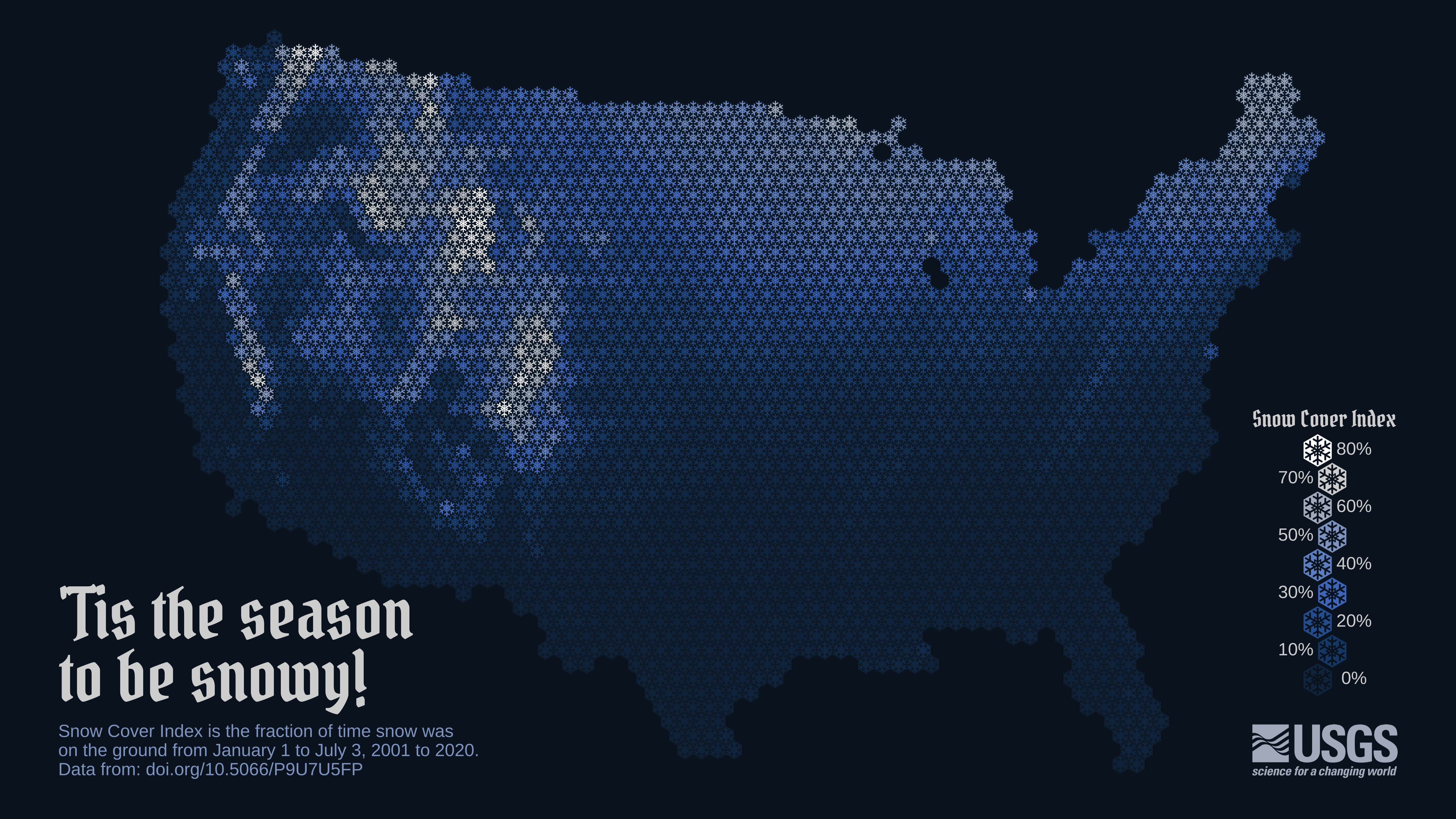
To show snow cover across the United States, Althea Archer for the USGS used hexbins, but instead of hexbins, she used snowflakes. Archer provided her R code and outlined her process in a blog post, which is something I’m not used to seeing from a government agency. I like it.

Become a member. Support an independent site. Make great charts.

See What You Get

Learn to Visualize Data See All →

How I Made That: Interactive Beeswarm Chart to Compare Distributions

The histogram is my favorite chart type, but it’s unintuitive for many. So I’ve been using the less accurate but less abstract beeswarm.

How to Make a Spiral Chart in R

Using a spiral might not be the best way to encode data. But here’s how to do it anyway. Just in case.

How to Make a Connected Scatter Plot

The combination of a time series chart and a scatter plot lets you compare two variables along with temporal changes.

How to Make a Heatmap in Excel

Heatmaps quickly translate data tables into a visual form, making them a great tool to explore a new dataset.

Favorites

When Americans Reach $100k in Savings

It was reported that 1 in 6 millennials have at least $100,000 saved. Is this right? It seems high. I looked at the data to find out and then at all of the age groups.

Divorce and Occupation

Some jobs tend towards higher divorce rates. Some towards lower. Salary also probably plays a role.

10 Best Data Visualization Projects of 2015

These are my picks for the best of 2015. As usual, they could easily appear in a different order on a different day, and there are projects not on the list that were also excellent.

How You Will Die

So far we’ve seen when you will die and how other people tend to die. Now let’s put the two together to see how and when you will die, given your sex, race, and age.