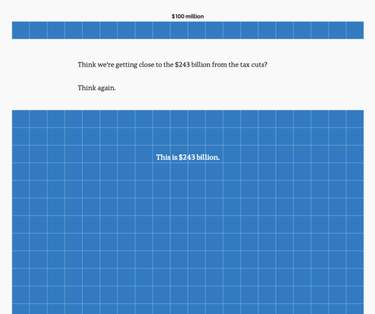
To show the scale of tax cuts and Australia’s budget, ABC News takes the long, vertical unit chart approach, and the squares just keep coming. This is one of those scrollers that works best on mobile.
To show the scale of tax cuts and Australia’s budget, ABC News takes the long, vertical unit chart approach, and the squares just keep coming. This is one of those scrollers that works best on mobile.

Filed under random but fun calculations, Alasdair Rae estimated the number of people within interstate boundaries:
I loaded up a MapTiler streets backdrop layer in QGIS, created polygons from the the US national road network file from the Department of Transportation website (this required a lot of error checking/fixing) and then summed the population of all areas bounded by Interstates – including those in Hawaii, Alaska and Puerto Rico.
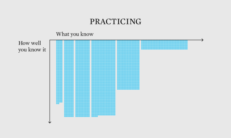
One of the most straightforward ways to “do the thing” — and stay on the right track towards work you want to do — is to mimic projects that you like.

People scored their current life from 0 to 10, where 0 is their worst possible life and 10 is their best possible life. The older they were, the more likely they were to say they were living their best.
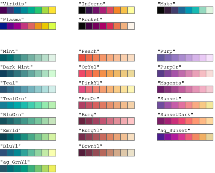
Achim Zeileis and Paul Murrell provide a rundown of the more user-friendly color palettes available in R by default since version 4.0. The new palettes make it easier to see differences and less like saturated output from an old computer.
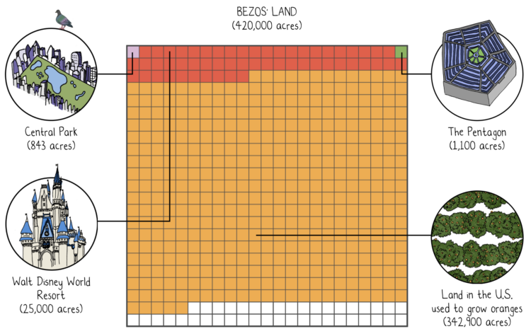
Mona Chalabi, known around these parts for her illustrative approach to data journalism, was awarded a Pulitzer Prize for her New York Times piece on Jeff Bezos’ extreme wealth. She compared the scale of Jeff Bezos wealth against median wealth, and the absurdity of the scale leant itself to ridiculous comparisons.
Amazing. Congratulations to Mona.
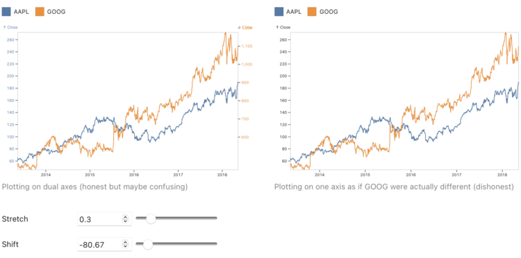
Charts that use two different scales on the same vertical often get the automatic “misleading” label, because if you stretch and shrink two data series enough, you’ll eventually find a way to make them look related. Toph Tucker argues that the automatic dismissal is misguided:
So yes, dual axes transform the series, and that transformation can lie. But it is the same kind of transformation that is already built into the Pearson correlation coefficient. Insofar as dual axes are bad, so is the Pearson correlation coefficient. Their merits and their badness go together. Dual axes are good at showing spurious correlation because they are good at showing correlation.
The challenge is that when you see a line chart with time on the horizontal axis and multiple data lines, it’s hard to separate coordinate systems and we’ve learned to read the lines as patterns over time. On the other hand, a scatterplot (or a connected one for time) highlights the relationship.
So while you don’t need to avoid dual axes completely, you should be careful when you do.
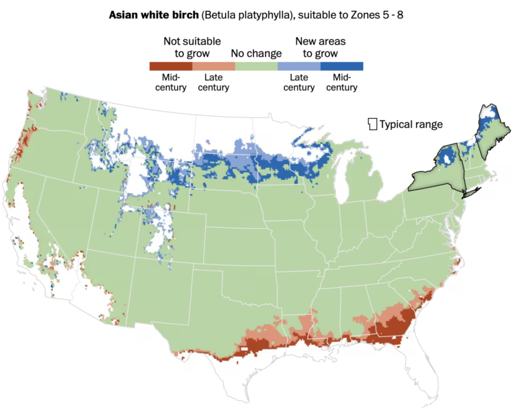
As the climate changes, the places that different types of trees will grow also shifts. Harry Stevens, for The Washington Post, provides the searchable maps to show the changes, based on data from the Davey Tree Expert Company.
Maybe the most interesting part is that there’s a “check my work” section at the end, which points you to the code to make the maps.

You might’ve heard about large language models lately. They’re the “brains” behind recent chatbots that seem to know an awful lot. Aatish Bhatia, for NYT’s The Upshot, walks you through how such a model “learns” to write based on a relatively small body of text.
There’s a little bit of Choose Your Own Adventure mixed in, so you can select the type of text. Bhatia used nanoGPT, an open source library, to model Jane Austen, Shakespeare, and Star Trek: The Next Generation.
Quantum computing promises a higher level of processing power over current computers, but it comes with its own challenges with implementation. When it comes to fruition, it’ll also break current privacy measures like your banking password. Financial Times explains how this works with a fine set of animations and illustrations.

Mira Rojanasakul and Max Bearak for The New York Times highlight the rise of pumped storage around the world. Instead of a big dam to store water, two reservoirs are used. One is high. The other is low. When there is excess power available, water is pumped to the higher one, and when more is needed, water is released down to the lower one.
The 30-Day Chart Challenge tasks you with a visualization prompt each day in April. I’ve wanted to do it the past couple of years, but my schedule doesn’t really fit with the daily-thing-for-thirty-days genre of challenges. So my genius idea was to compress the challenge into one day.

Stephen Curry of the Golden State Warriors scored 50 points in game 7 against the Sacramento Kings. He made 20 shots. Instead of the standard shot chart with dots on a simplified court, Todd Whitehead overlaid video frames of every made shot for a single image.
I assume all shot charts will take this format from now on. Thanks, ESPN.
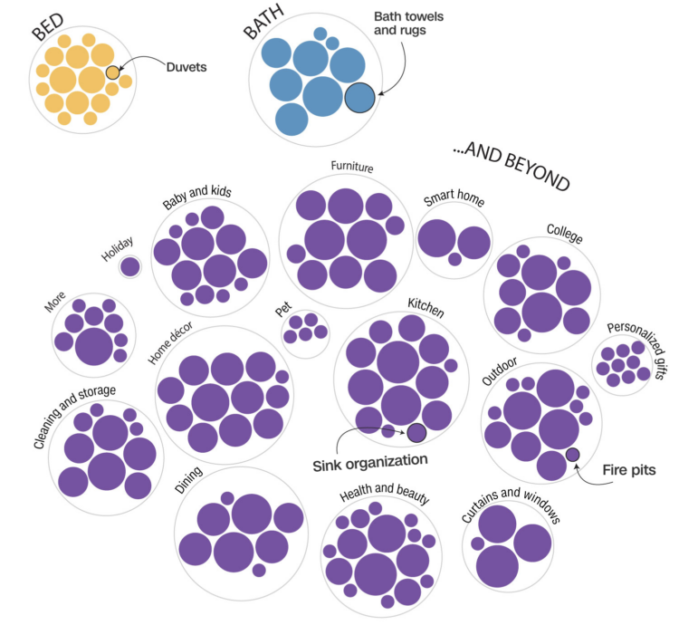
Bed Bath & Beyond filed for bankruptcy, so Alex Leeds Matthews and Amy O’Kruk for CNN took the chance to look at the product offerings for the store. It is mostly beyond at this point.
I enjoyed the goofy premise.
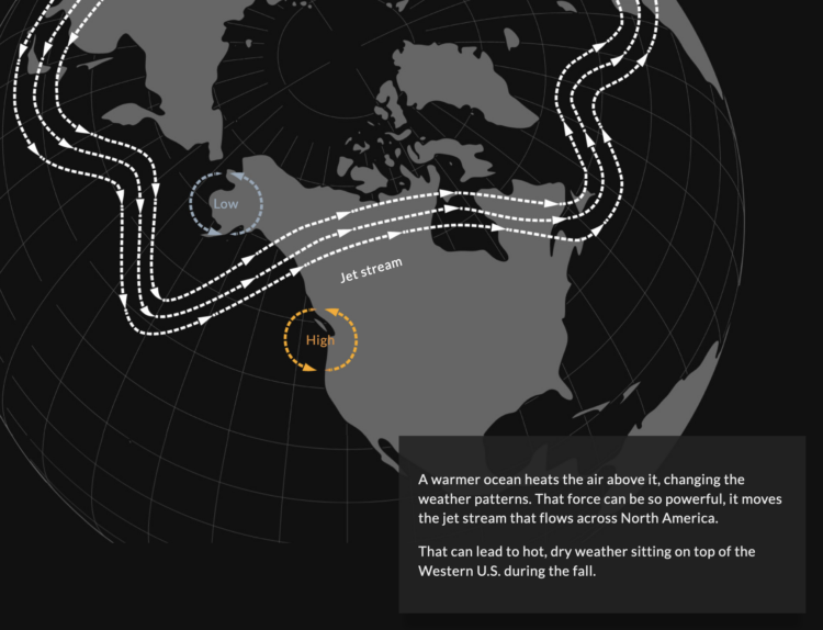
Ice is melting at the poles, which makes it seem like a localized problem. However, as NPR shows and describes in a visual series, the large amounts of fresh water melting into the ocean mixes in with currents and changes temperatures, chemistry, and water levels globally.
Here’s the good stuff for April.
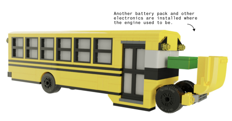
For Bloomberg, Zahra Hirji and Denise Lu on the electrification of the national school bus fleet:
Most school buses today run on diesel. The climate footprint of a diesel school bus is about 3.3 pounds of carbon dioxide equivalent (CO2e) per mile, more than double the per-mile footprint (roughly 1.5 pounds of CO2e) for a bus powered on the average US electric grid, according to Argonne National Laboratory. If a large share of the American school bus fleet — the largest mass transportation system in the country — electrifies, that would translate to a significant emissions cut.
They used a LEGO school bus to show how a diesel school bus is retrofitted as an electric one, which is a plus in my book.
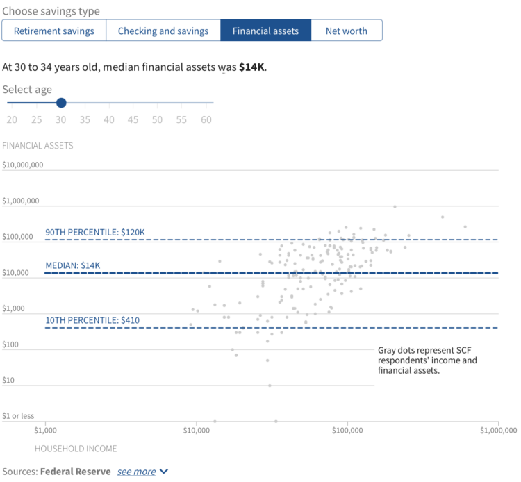
Saving for retirement is a slow process with an end goal that can seem far away, especially if you’re young. So we put it off until later. Then time sneaks up on us, for many it seems, and we’re stuck having to work longer and rely heavily on Social Security. Over at USAFacts, we looked at how much Americans save and show how your savings compare.
Disney began more layoffs, and data-centric FiveThirtyEight, which is owned by Disney, was part of the round. Nate Silver, founder and editor-in-chief of the site, also announced he is likely to be leaving soon:
Disney layoffs have substantially impacted FiveThirtyEight. I am sad and disappointed to a degree that’s kind of hard to express right now. We’ve been at Disney almost 10 years. My contract is up soon and I expect that I’ll be leaving at the end of it.
I had been worried about an outcome like this and so have had some great initial conversations about opportunities elsewhere. Don’t hesitate to get in touch. I am so proud of the work of FiveThirtyEight staff. It has never been easy. I’m so sorry to the people impacted by this.
Feels like a shift in data and stories.
 Visualize This: The FlowingData Guide to Design, Visualization, and Statistics (2nd Edition)
New tools, refined process.