Where We Find Meaning in the Everyday
The American Time Use Survey asks people to log their activities for a day, and in the most recent release, people also rated the meaningfulness of the activities on a scale from 0 (not meaningful) to 6 (very meaningful). Here’s how activity categories rated, sorted by most meaningful to least meaningful. Bar height represents how relatively common it was for people to engage in an activity.

NOT MEANINGFUL
VERY MEANINGFUL
0
1
2
3
4
5
6
Caring for and Helping Non−Household Children
Religious or Spiritual Practices
Caring for and Helping Household Children
Helping Non−Household Adults
Interior Maintenance, Repair, and Decoration
Travel Related to Religious or Spiritual Activities
Socializing and Communicating
Medical and Care Services
Participating in Sports, Exercise, or Recreation
Animals and Pets
Phone Calls
Lawn, Garden, and Houseplants
Travel Related to Socializing, Relaxing, and Leisure
Eating and Drinking
Food and Drink Preparation,
Presentation, and Clean−up
Shopping
Travel Related to Caring for and Helping Household Members
Travel Related to Eating and Drinking
Household Management
Working
Travel Related to Sports, Exercise, and Recreation
Unable to Code
Exterior Maintenance, Repair, and Decoration
Travel Related to Using Professional and Personal Care Services
Housework
Travel Related to Caring for and Helping Non−Household Members
Traveling, Miscellaneous
Research or Homework
Travel Related to Consumer Purchases
Travel Related to Work
Travel Related to Household Activities
Relaxing and Leisure
Health−Related Self Care
0%
20%
40%
60%
80%
100%
SOURCE: American Time Use Survey; IPUMS

NOT MEANINGFUL
VERY MEANINGFUL
0
1
2
3
4
5
6
Caring for and Helping Non−Household Children
Religious or Spiritual Practices
Caring for and Helping Household Children
Helping Non−Household Adults
Interior Maintenance, Repair, and Decoration
Travel Related to Religious or Spiritual Activities
Socializing and Communicating
Medical and Care Services
Participating in Sports, Exercise, or Recreation
Animals and Pets
Phone Calls
Lawn, Garden, and Houseplants
Travel Related to Socializing, Relaxing, and Leisure
Eating and Drinking
Food and Drink Preparation, Presentation, and Clean−up
Shopping
Travel Related to Caring for and Helping Household Members
Travel Related to Eating and Drinking
Household Management
Working
Travel Related to Sports, Exercise, and Recreation
Unable to Code
Exterior Maintenance, Repair, and Decoration
Travel Related to Using Professional and Personal Care Services
Housework
Travel Related to Caring for and Helping Non−Household Members
Traveling, Miscellaneous
Research or Homework
Travel Related to Consumer Purchases
Travel Related to Work
Travel Related to Household Activities
Relaxing and Leisure
Health−Related Self Care
0%
20%
40%
60%
80%
100%
SOURCE: American Time Use Survey; IPUMS
Caring for and spending time with others rated highest, whereas relaxing and leisure rated lowest. Work was around the middle in the list.
Health-related self care more commonly rated as not meaningful, which seems unintuitive at first. I think it represents those with health conditions who would rather be doing something else other than tending to said condition. I’m just guessing though.
I’m most curious about relaxing and leisure showing at the bottom. This seems to make sense, because this category includes activities like watching television and thinking. At the same time, it seems like we do other things so that we can relax and leisure at the end of the day.
Notes
The estimates come from the 2021 American Time Use Survey, which included a well-being module. I downloaded the data via IPUMS. Only activities that were reported at least 50 times in the sample are included. I made the chart in R and Adobe Illustrator.
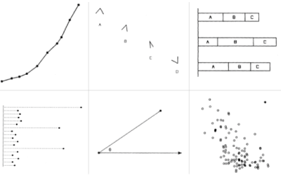
Chart Type Used

Become a member. Support an independent site. Get extra visualization goodness.
See What You Get