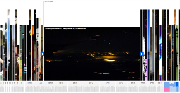
Remember our short contest a while back with immigration rates to the United States? The New York Times digs deeper with their Immigration Explorer. It’s an interactive map that lets you browse immigration rates since 1880. Counties are colored by the largest foreign-born group according to percent of population. You can also explore by number of residents.

Scroll the top bar left and right for decade; zoom and pan the map to focus on a state; mouse over counties for foreign-born population vs total population; change bubble size as you look at immigration counts; or select a specific country for a different view. It really does let you explore the data, which by the way you can find most of at Social Explorer.
You’ll notice a large portion of immigrants are from Europe and Russia in the earlier decades, but as you come closer to the present the country appears to diversify as well as an increase in counties with large Asian and Latin American populations. Of course, this is exactly what we should expect. It’s what we saw in all the stacked plots, bar graphs, time series plots, and maps from our contest.
[Thanks, Scott]


 Our 10k giveaway is now complete. Congratulations to all the winners, and a big thank you to all of you who participated. I thoroughly enjoyed some of the entries, especially the


 Visualize This: The FlowingData Guide to Design, Visualization, and Statistics (2nd Edition)


