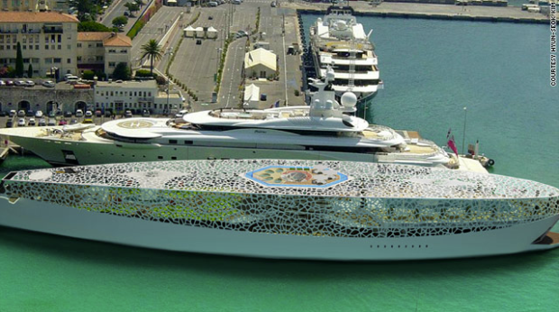
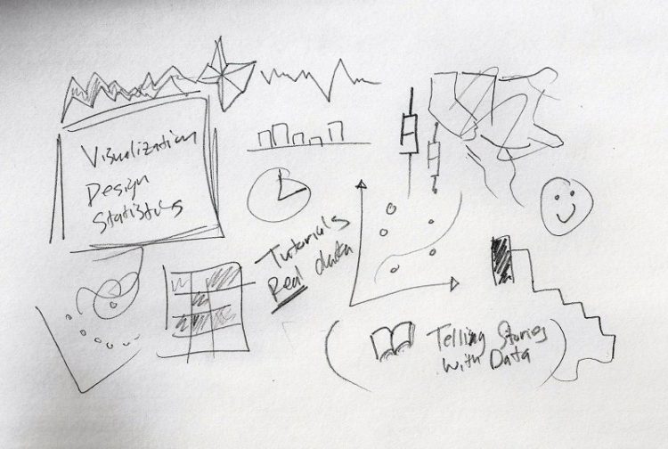
Visualize This: The FlowingData Guide to Design, Visualization, and Statistics

Learn to data.

  • I stumbled across a data table from the Social Security Administration that shows the probability of death. It’s an actuarial life table estimating the probability that you will die within one year given your age.
    Read More

  • Jonathan Harris and Sep Kamvar collaborated again in their featured piece at New York Museum of Modern Art’s Design of the Elastic Mind exhibit. Similar in flavor to their previous work, I Want You to Want Me explores the search for love and for self in the online dating world i.e. data collected from various online dating sites every few hours.
    Read More

  • David forwarded me his graphic on the modern two party system in the United States senate which essentially shows the senate’s bipartisanship over time. It made me happy to see someone in political science using R, playing around with data, and taking a stab at creating a useful graphic.

    Improving the Graphic

    While the graphic is indeed useful, I think there are some things that could make it even better. Here are thoughts that I sent to David.

    • I wasn’t immediately sure what each visual cue represented e.g. size of state abbrev. until I reached the bottom. It might be worth making the annotation more prominent either by position, size, or color or all three.
    • To me, the congress numbers don’t matter so much, but that just might be I don’t have a lot of learning on the history of American government.
    • I’m wondering if there’s some way to make the labeling of the years more concise? If you just labeled with the first year of the two-year term, would it be obvious that you’re describing a two-year term? What if you took away the alternating gray background and just made it all white and then had a bar timeline-type thing on top (and bottom)?
    • What if you tried to use a color scheme? I mean, you have the red and blue for the reps and dems (which I think is right), but the gradient for the senate counts turns very bright pink and purple which doesn’t go too well. Then there’s the cyan, yellow, and green which doesn’t seem to have any specific significance other than each color represents something. What I mean is… is there a reason you chose those colors?
    • It might be worth making the annotations bigger so that you don’t have to “zoom in” to read.
    • I think I would make the median lines a bit more prominent, but that’s just me.
    • There’s a lot of cool stuff getting represented here, and I wonder if anything might benefit as a separate graph. Would this benefit at all as a series of graphs instead of one large graphic?

    Now It’s Your Turn

    So that’s my opinion. What do you think? Judging from our FlowingData Facebook group (which I’m happy to see is growing), we have a very diverse bunch from design, statistics, computer science, and some other areas, so I’m eager to hear what the rest of you think about this visualization.

  • Visitorville screenshotFor a while now, I’ve been interested in how we can apply interaction principles of video games to visualization and exploratory data analysis (although admittedly, gaming is still a very foreign concept to me). Visitorville is an example of how the fun of video games can be applied to analytics. It looks a lot like the awesome classic SimCity (whose source code was recently released, by the way).

    VisitorVille applies video game principles to help you easily visualize and better understand your web site traffic statistics.

    It’s easy: each building represents a web page; each bus a search engine; and each animated character a real visitor to your site.

    Just paste our tracking code into your web pages, then launch VisitorVille for Windows to analyze your stats, watch your traffic in real time, provide Live Help, track your PPC campaigns in real time — and more.

    Using our unique Virtual VCR, you can even play back traffic from any day or time, at any speed.

    Learning From Video Games

    We certainly have a lot to learn from video games — interaction, user engagement, graphics, and fun. Seriously, statistical visualization could stand to have a little bit ‘o fun tossed in. At least that’s what I tell my wife when I try to convince her to buy me an Xbox 360.

    Somewhat related note — there was an interesting talk at Journalism 3G on using video games to tell stories, which I’ll be discussing some time in the near future once I get all my notes together.

    [via Water Cooler Games | Thanks, Iman]

  • Everyone knows that The New York Times produces great graphics. I bet you’re interested in how those graphics get made. What’s the process of making a graphic? What makes a good visual journalist? What’s a day in the life of a New York Times graphics editor? Now you can find out.

    From February 25 (um, yesterday) until this Friday, you can talk to The New York Times graphics director, Steve Duenes. Go ahead. I know you want to.

    Looking very dashing in that picture there, Steve.

  • Congratulations to two of my most favorite visualization / design groups – IBM Visual Communications Lab and Stamen Design – who officially now have their work featured at the Museum of Modern Art in New York. Really incredible and well deserved.

    From this past Sunday to May 12, VCL’s History Flow and Thinking Machine and Stamen’s Cabspotting are featured in Design and the Elastic Mind.

    Design and the Elastic Mind

    The exhibition will highlight examples of successful translation of disruptive innovation, examples based on ongoing research, as well as reflections on the future responsibilities of design. Of particular interest will be the exploration of the relationship between design and science and the approach to scale. The exhibition will include objects, projects, and concepts offered by teams of designers, scientists, and engineers from all over the world, ranging from the nanoscale to the cosmological scale. The objects range from nanodevices to vehicles, from appliances to interfaces, and from pragmatic solutions for everyday use to provocative ideas meant to influence our future choices.

    Read More

  • Welcome, Boing Boing readers. If you’re new to FlowingData, you might want to read the about page to find out what FlowingData is all about. Essentially, I like to cover how people from different fields — statistics, computer science, design, etc — are using data to explore ourselves and the environment around us, mainly with data visualization.

    Oftentimes, data (or information) just gets overlooked or misinterpreted. We should work on changing that, and I think that data visualization is the way to make people see.

    Feel free to take a look at the archive or some of the more popular posts listed on the sidebar, and of course, if you like what you see, you can stay updated by subscribing to the feed.

    Thanks to Boing Boing for linking here and to Mike for making the suggestion!

  • This graphic from The New York Times kind of caught me off guard. I guess we’re starting to gain a bit more faith in the public’s ability to understand visualization (yay). The graphic was created by the usual suspects — Matthew Bloch, Shan Carter and Amanda Cox — and as usual, great work.
    Read More

  • Weekend Treats

    A Tale of Two Types of Visualization and Much Confusion – Depending on who you talk to, data visualization can have very different meanings.

    It’s Official. People Love Online Videos. Billions Of ‘Em. – 141 million unique viewers watched 10,156,199,000 videos this past December.

    Global Poverty Maps – Explores the political economy of aid, examining the contributions made by developed country governments and their role in development.

    My Trails Network – Inventing new ways to manage your digital life.

  • Computation+JournalismBy now, if everything has gone to plan, I should have gone on my short 2-hour flight and be at Georgia Tech in Atlanta listening to the welcoming address at Journalism 3G: The Future of Technology in the Field. All 230 seats were sold out, so it should be pretty interesting. If you’re not at the event and would like to listen in (and watch), lucky for you the talks will be webcast live (that is, if all the tech works, which we all know never seems to go exactly as planned).

    UPDATE: Things did not go according to plan. Security took an abnormally long time, and I missed my flight by 5 minutes. My only option was to rebook for an extra $1,000 (thieves!). That flight would have gotten me into Atlanta around midnight, which just wasn’t worth it. So I’m going to miss the symposium. So disappointed. At least I can still watch the webcast.

  • I don’t think I’ve seen a single Rambo all the way through nor do I remember the premise of any of the movies, but I still found these kill counts amusing. Notice the near doubling of deaths each sequel. Yo, Adrian!!! Yeah, I know, wrong movie, but come on, is there really a difference?

    Here’s a graph showing kill counts (mostly for my own entertainment):

    Rambo Kill Counts Graph

    Mr. Rambo may have gotten more violent in the latest installment, but it looks like he also grew more modest.

    [via Geekstir]

  • BreathingEarth is an animated map that represents death rate data from September 2005 and birth rate data from August 2006 compiled by the World Factbook and 2002 carbon dioxide emission rates from the United Nations. The frying sound is kind of a nice touch.

    Pretty But Not Very Useful

    I think that BreathingEarth, like many maps before it, communicates an important point (in this case, CO2 emissions), but doesn’t particularly do a good job of showing it. I watched BreathingEarth for a few minutes, but I didn’t get much of a sense of what country had more deaths, had more births, or created more CO2 emissions. It’s one those projects when a statistician could have lent a useful hand.

    So to answer the question – What Impact Does Our Country Have on Climate Change? – I’m not sure. It is a pretty map though.

  • FacebookI just created a FlowingData Facebook group where (I hope) readers can discuss and post interesting goodies about data visualization and statistics. Honestly, I’m only half-expecting like two people to join, but hey, it’s a start. I’m a Facebook addict, so I’ll be checking it regularly whether anyone joins or not. Please do join though :). I’d like to know who’s reading and what fun things you all are up to.

    P.S. On a completely unrelated note, on Hadley’s request, you can now subscribe to the FlowingData comment feed.

  • Statistical graphics are kind of stuck in a static funk where you create a plot in R, Excel, or whatever, and you can’t really interact with it. If you want another graphic, you manually create it. Hence, Jeffrey Heer and George G. Robertson investigated the benefits of using animation in statistical graphics. Read More

  • StatCrunch and Covariable aim to put statistical analysis on the Web via a graphical user interface (GUI). The former is meant for students in an introduction to statistics course while the latter wants to be a little more; however, both have a lot in common. Here are my thoughts.

    Trying to Simplify Analysis With Toolbox

    ToolboxThrough undergrad and graduate school, I’ve always used R for analysis, so performing analyses through a GUI has always seemed a little strange to me. Although I suppose I don’t really have any good reason to feel that way.

    I think the main difference between programmatic and clickety analysis is that when you’re doing something programmatically, you need to know what method or tool you want to use before you actually use it.

    With a GUI, you tend to have a list of methods (e.g. ANOVA, multiple linear regression) in a menu and you just click on the one you want to use. It’s kind of like a big toolbox of statistical tools that should make analysis easier (since it allows you to avoid all code), but I’m still a bit skeptical.
    Read More

  • My grandma, Jane Yau, passed away a couple of weeks ago, and I attended her funeral this past weekend. It was tough at first seeing her laying there lifeless, because the last time I saw her was about 8 months ago, healthy and smiling. I had to walk away with eyes full of tears. I wondered how in the world I was going to deliver her eulogy.

    I went up again though and just looked at her for a long time. She was peaceful, almost like she was sleeping, and I felt this calm cover over me. My heart beat slowed and the sadness left. That was the effect my grandma always had on me.

    I’ll miss you, grandma. I hope I can make you proud.

  • Box-and-Whisker Plot LessonThe box-and-whisker plot is an exploratory graphic, created by John W. Tukey, used to show the distribution of a dataset (at a glance). Think of the type of data you might use a histogram with, and the box-and-whisker (or box plot, for short) could probably be useful.

    The box plot, although very useful, seems to get lost in areas outside of Statistics, but I’m not sure why. It could be that people don’t know about it or maybe are clueless on how to interpret it. In any case, here’s how you read a box plot.
    Read More

  • Manhattan Timeformations looks like a series of interactive schematics from a video game, but really it’s a computer model that allows you to look at the relationships between the developments of the lower Manhattan skyline and other urban factors like farms, urban renewal, subways, and commercial zones. The visualization provides different views in the form of the traditional 2-dimensional map views as well as rotations, fly-throughs, and layers.

    It’s nice to step out of that Google mashup look every once in a while.

  • Spamology, by Irad Lee, was one of favorite projects at the Visualizar Workshop, and it’s now available online for others to play with. I talked about Spamology a little bit when the showcase was officially opened in Madrid, but the piece wasn’t online yet.
    Read More

  • Computation+JournalismI’m headed to Journalism 3G: The Future of Technology in the Field February 22-23.

    The spreadsheet, word processor, web browser, digital audio and video, blogs–each an example of the vaunted killer software application–have all become valuable, some would say essential, tools of journalism. Now Web 2.0 has forever altered the nature of software innovation, while at the very same time the news industry undergoes historic change. Those two points taken together mean one thing: Time lags which used to buffer innovations in computation from their inevitable impacts on newsrooms are poised to disappear. Who’s ready for this? We plan to see.

    Some of the participating organizations include Digg, The New York Times, and Reuters with some really interesting-looking panels over the two days:

    • Advances in News Gathering
    • Improving Journalism Workflow: Automation & Productivity
    • Social Computing and Journalism
    • Ubiquitous Journalism
    • Participant Journalism & Journalism Participation: Authoring and Interacting in New Media
    • Sensemaking & Visualization
    • Information Mashups: Aggregation, Syndication, and Web Services
    • 21st Century Editor in Chief

    Naturally, I’m most excited about Sensemaking & Visualization. Is anyone else planning on going?