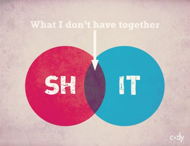
A good one from someone named Cody. I couldn’t figure out where this is actually from though.
What you need to get together
1 Comment
Second Edition
 Visualize This: The FlowingData Guide to Design, Visualization, and Statistics (2nd Edition)
 Visualize This: The FlowingData Guide to Design, Visualization, and Statistics (2nd Edition)
New tools, refined process.
ilovecharts.com via Cody Welter?