Real estate site Trulia made a great move when they acquired mapping outfit Movity late last year to help users make informed decisions in home buying. A month ago, they launched a price reductions map to let you see how housing prices were changing. Now you can see what crime is like in that area you’re thinking about living in with Crime Map.
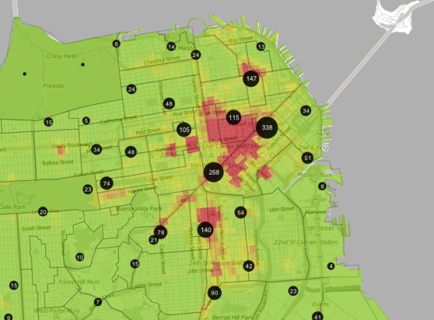
Drawing from three data sources, CrimeReports, EveryBlock, and SpotCrime, Crime Map starts with a national view (as shown below) for cities with available data, and then zooms into specific areas. The above, for example, is a view of San Francisco. As you’d guess, the darker red areas and larger circles indicate more incidents, whereas green areas and smaller circles represent the opposite. Click on regions or the scaled circles to see details on individual crimes during the past year.

This is good stuff already, but there are a few things that take Crime Map to the next level. The first is that Polymaps, a JavaScript library for vector maps, was used. I don’t have anything against Flash, but it’s cool to see how well the alternative does. The differences between Flash and JavaScript-based maps are barely discernable nowadays.
And then there’s the little things like permalinks for locations, filtering by crime type, quick zooms to locations with the most crime, and discussion pages. It’s that little bit of awesome sauce that makes for an extra informative application.
[Crime Map via @shashashasha]
 Visualize This: The FlowingData Guide to Design, Visualization, and Statistics (2nd Edition)
This maps is a complete failure. It’s more of a map of “where people are”. They need more of a retail activity /residential density vs crime map.
Calling this, a beta product, a complete failure is a stretch. There are improvements to be made for sure, but what was done with the data available (and data availability is key), this is solid work.
The audience should also be considered. Trulia is a real estate site whose users are looking for places to live. When you’re house-hunting, you’re going to start with prices and listings, and then find out more about the area. So in this case, when a user goes into a specific area, the numbers will be useful. Regardless of the per population rate, you’re not going to want to live on a block where there have been three homicides in the past year.
1) I don’t see where this is labelled Beta
2) I don’t know where you were told Beta forgives all sins. That’s Alpha or proof of concept. Beta means core functionality has been stabilized and secondary functionality is drilling being developed. If I’m seeing it, I can criticize it as it stands.
3) this is bottom bucket data analysis.
I live in Baltimore, where the high crime areas are the stuff of national imagination, and the Trulia crime map is certifiably a complete failure in my city. It shows the entire downtown as bright red (because lots of people live there. Duh!) and fails to highlight the actual high crime areas.
If you don’t scale a map such as this by population, you will succeed only in demonstrating that crime happens where people are.
I agree with Jon. Furthermore, different crimes need different denominators. Car theft needs to be per parked car hour, etc.
Free knowledge like this doesn’t just help, it promote demcaocry. Thank you.
Not having NYC fail.
I also agree with Jon.
I’m a little surprised at the negative comments here. In the strictest sense, perhaps this doesn’t use the most robust data analysis – but I don’t think it matters.
The audience is people looking for homes. As a long-time San Francisco and Berkeley resident, these maps feels right. If somebody asked me “in the context of safety, where should I live in the bay area?”, I’d provide the same answer as this interface. And isn’t that the goal? Retail/residiential and denominator adjustments make sense for cops and statisticians, but as a home buyer, I just want to know that that cheap house in the tenderloin is probably not such a good deal afterall…
I’d call this the opposite of a fail…
I’m not sure how this map’s analysis of SF/Berkeley matching up with your personal experience of the Bay Area makes it the opposite of a fail.
As a home buyer/human, I am interested in my safety in a neighborhood where violent crimes committed against individuals seem to be better measured on a per capita basis than a per square mile one. And while I think domestic violence is a huge problem in society, for assessing my personal safety in a neighborhood I would like to be able to filter out those crimes.
This map is a fail because it doesn’t acknowledge its serious flaws AND it presents itself as a tool for making informed decisions (rather than an interactive distraction for the nerdy set).
I agree with PR and Nathan. This is far from a fail. I can’t wait to use it more when I move next spring.
This map DOES fail completely for my city (Charlotte). It makes it look as if downtown is far and away the most dangerous place, when in fact its statistically one of the safest. The heat map only works off of reported incidents, so its obviously going to show any retail and population center as red.
Certain neighborhoods with large amounts of gang activity here, but presumably fewer reported crimes, show as green. I’d hate to be someone actually using this as a tool for finding a place to move!
One issue with the map is that the heat scale is not consistent city to city. When trying to compare the east bay to SF certain areas look equivalent until you realize that the East Bay’s red is 160+ and San Francisco’s is 115+. It also does not update the heat map scale until you click on that city.
Although Truila acknowledges in their known issues that: “Certain areas that have crime are displayed as green” they should remove the areas where no data is available from their heatmap surface. Tucson Police Department is the only agency sharing their data in the Tucson region and it appears to be the only area with crime…it is very misleading.
Maps seems fair enough to me, though the crime ‘level’ should change throughout the time of the day, as in the iphone app “besafe”