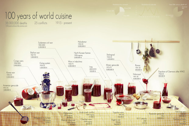
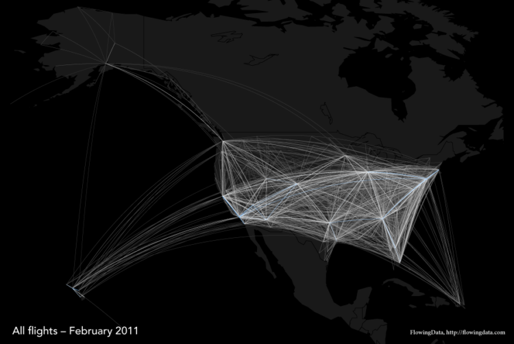
Visualize This: The FlowingData Guide to Design, Visualization, and Statistics

Learn to data.

  • Google ResearchIn its continued efforts for absolute power over all information ever created in the world, Google will be hosting open-source scientific datasets at its research section. Here are the presentation slides from Google’s Jon Trowbridge.
    Read More

  • There’s a nice real-time (?) map on (suit)men Entertainment. Click the black rectangle on the bottom left-hand corner to see the entire map. Supposedly the map is powered by Google, so I want to say it’s showing search data or something of that sort. To be honest though, I have no clue.

    Whenever a number pops up, there’s a line that connects some country to Japan (the site’s origin), so I’m guessing they’re mapping something like accesses to the (suit)men site from whatever country. Oh well, no matter. Look how pretty. It’s entertainment, and it managed to entertain me for a good few minutes (which says alot with my short attention span :). Does anyone know what they’re showing?

    [via Simple Complexity]

  • Iraq Body CountIraq Body Count keeps track of civilian deaths by cross checking media reports and hospital, morgue, and NGO figures. Along with a widget counter that you can post on your blog or site, IBC also makes their database available for download.

    Systematically extracted details about deadly incidents and the individuals killed in them are stored with every entry in the database. The minimum details always extracted are the number killed, where, and when.

    The data comes in two sets — incident reports and individuals who have lost their lives — in the form of CSV files.

    Albeit, the data is a little depressing, but still very necessary.

  • FlowingData LogoYou’ve probably already noticed (unless you’re subscribed to the feed), but FlowingData now has a brand new look and feel. It started with a tweak, and then I just got carried away. I think it took a turn for the best though. Some of the changes include a new logo, featured articles, and more focus on visualization. Read More

  • Jeffrey Heer et al. writes in Design Considerations for Collaborative Visual Analytics about a couple of models for social visualization — information visualization reference model and the sensemaking model. The former is a simpler, more straightforward model starting with raw data -> processed data -> visual structures -> actual visualization; while the latter is a bit more complicated with similar stages but with feedback loops. My main reflections weren’t so much with the ideas proposed by the paper. Rather, I’m more interested in what was not mentioned — not only in this paper but in other social data analysis papers.

    Read More

  • On We Make Money Not Art is a summary of Jose-Luis’s talk on some of the history of visualizing data and some more modern pieces.

    It begins with Charles Joseph Minard’s march of Napoleon and then onto John Snow’s cholera map, both of which were made ever so popular by Tufte. By now, if you’ve cracked open an infovis book, you’ve seen both.

    Moving on to more modern stuff, there’s The Dumpster, 10×10, Listening Post among some other interesting pieces. If you’re new to visualization, it’s a good “intro to vis” post. If you’ve been around for a while, you’ve probably seen most of the examples, but there might be a couple you haven’t.

    On a semi-related note, there’s also an interview with Miguel on WMMNA discussing our humanflows project. Thanks, Regine!

  • This graphic is from The New York Times graphics department. It matches the FlowingData colors. That is all. Oh, and it’s excellent, but that’s a given, right? Note the use of each bar’s two dimensions.

  • Data360 is a social data site similar to Swivel and Many Eyes but without any of the bells and whistles. It markets itself as a site designed for

    • organizational reporting
    • intelligence databases, and
    • collaborative analysis

    Unfortunately, Data360 fails in the above three categories, and here are my 8 reasons why. Read More

  • I’m not a music downloading monster like some, so I personally haven’t had any problems organizing and finding my music. However, for those who are downloading music every day (legally, I hope), I can imagine your music collection is getting quite out of hand. You probably can’t even remember what songs and albums you’ve downloaded over the past two years. What’s that High School Musical album doing there?

    That’s why this tool is in development. I haven’t tried it out, but from the screenshots, it looks like there is potential. Although it looks like the screen can get cluttered very quickly, and with too many songs, you might just end up with a big bubble cloud. If that actually is a problem, it kind of defeats the tool’s purpose since I don’t really care about visualizing only 20 songs. But like I said, I haven’t tried it.

  • In the usual fashion that we’ve come to expect from Stamen Design, Digg Pics shows us what pictures are being dugg as well as provides an opportunity to discover new pictures. As with its Digg Labs siblings, Digg Pics offers three streams — popular, newly submitted, and all activity.

    I always like to read posts that discuss the experimental phases and how a viz came to whatever it is; it’s kind of like when you know the history of a piece of art, you can appreciate it more. Eric goes into the design process at the Stamen blog. There’s screenshots of Stamen’s experimental layouts, and from what I see on Digg, I’d say everything came together quite nicely.

    The picture streams are split up into Digg categories where the number of times a picture is repeated represents the number of times the picture was recently dugg. The display is clean and smooth, and of course the interaction is quite nice (and useful).

    Another good one, Stamen!

  • Andrew Vande Moere writes in his 2005 paper Form Follows Data:

    [W]e can perceive a current trend in portable input and output devices that trace, store and make users aware of a rich set of informational sources. So-called ubiquitous computing is moving into the direction of location-based information awareness, enabling users to both access and author dynamic datasets based upon a geographical context through electronic communication media.

    With this growing trend of streaming data in mind, Andrew goes on to say

    Building automation services enable spaces to react to dynamic, physical conditions or external data sources in real time. Currently, these interactions are programmed by engineers, and imply simple action-reaction rules, such as the control of lights, security or climate control: what would be possible if these tools are offered to designers, concerned with the emotional experience of people?

    If you’re an engineer, you might be wondering, “Hey! Why can’t I design ambient systems? I care about emotional experience too. Somewhat. Sort of.” As someone who majored in electrical engineering and computer science and still works with a lot of engineer types, I will tell you why. Engineers are generally not very good at the visual display of data. To engineers, the most beautiful part of a data visualization installation might be the hardware, elegant code, or the hours spent tweaking the system’s logic. Engineers are fascinated with the guts of the system.

    Read More

  • I love to look at how the current week’s movies are doing at the box office. I’m not really sure what it is. I think it’s kind of like a gauge for what good movies are out; or maybe I’m just constantly amazed by the millions of dollars that movies make; or I think it could be my addiction to numbers?

    Something that always strikes me as interesting is how movies are always breaking records at the box office. So and so movie just broke the record for most money made over a single weekend or a month or a long holiday weekend or for a Thursday when there was at least 2 inches of rain and a dog skateboarded two miles.

    I took a look at the 25 highest grossing American films, adjusted for inflation. I’m so tired of hearing statistics for money comparisons over time that don’t adjust for inflation. Wow, gasoline prices are at an all time high. Well guess what — so are milk, bread, burgers, televisions, light bulbs, paper, cars, and everything else on the planet. Sorry, slight tangent.

    Download the Wallpaper

    As an early birthday gift to you, here are my results in wallpaper form:

    Grossing Films Wallpaper 1024 x 7681024 x 768

    1280 x 1024

    1440 x 900

    The movie titles are color coded for genre and the higher grossing films are in a larger font. Drama and action/adventure clearly dominate — The hills are alive. Luke, I am your father. Phone home. I’ll never go hungry again.

    Surprisingly (at least to me), only 7 of the top 25 films won the Oscar for best picture and of the top 50, only 9 won best picture.

  • John TukeyWith the start of a new year, it only seems right to open with John Tukey and his work with interactive graphics. In 1972, when computers were giant and screens were green, John Tukey came up with PRIM-9, the first program to use interactive dynamic graphics to explore multivariate data. PRIM-9 allowed picturing, rotation, isolation, and masking. In other words, PRIM-9 allowed users to see multivariate data from different angles and identify structures in a dataset that might otherwise have gone undiscovered (kind of like the more recent GGobi).

    To fully appreciate the revolutionary nature of PRIM-9 one has to view it against the backdrop of its time. When Statistics was widely taken to be synonymous with inference and hypotheses testing, PRIM-9 was a purely descriptive instrument designed for data exploration. When statistics research meant research in statistical theory, employing the tools of mathematics, the research content of PRIM-9 was in the area of computer-human interfaces, drawing on tools from computer science. When the product of statistical research was theorems published in journals, PRIM-9 was a program documented in a movie.

    John W. Tukey’s Work on Interactive Graphics. The Annals of Statistics, Vol. 30 No. 6. 2002.

    Luckily, you can appreciate Tukey’s work here at the ASA video library. It’s even more amazing when you consider where computers and technology were at back then. Who knows where Statistics would be if it weren’t for Tukey and his brilliance and creativity. I can’t imagine, or maybe I just don’t want to.

    Tukey was someone who truly understood data — structure, patterns, and what to look for — and because of that, he was able to create something amazing.

  • It’s been a little over six months since I put up my first FlowingData post about creating effective visualization. Going through the archive, I’m amazed by how much this blog has developed and more importantly, by the people I’ve found who have many of the same academic interests that I do. For that, I’m extremely grateful.

    I’m also pretty impressed with how consistent I’ve been with the posts, because to be honest, I wasn’t sure if I’d be able to keep it up when I first started. Had I known about all of the interesting data visualization work and research going on, I wouldn’t have had such sour thoughts. Now I know better, and I hope others are benefiting.

    So here we are — the top 10 most viewed posts for 2007:

    1. Three Designers, a Statistician, and Migration Inflows Data
    2. What is the Best Way to Learn Flash/Actionscript for Data Visualization?
    3. News Flowing Through Moveable Type at The New York Times Building
    4. Visualizar Showcase Officially Opened at Medialab
    5. Yahoo Charts Control Library Now Available
    6. Sharing Personal Data to Push Social Data Analysis
    7. Netflix Prize Dataset Visualization
    8. 100 Reasons You Should Be Interested in, Want to Share, and Get Excited About Data
    9. Bars as an Alternative to Bubble Charts
    10. Use Flare Visualization Toolkit to Build Interactive Viz for the Web

    Happy new year! See you in 2008.

  • Zachary Pousman et al. write in their paper Casual Information Visualization: Depictions of Data in Everyday Life

    Information visualization has often focused on providing deep insight for expert user populations and on techniques for amplifying cognition through complicated interactive visual models. This paper proposes a new subdomain for infovis research that complements the focus on analytic tasks and expert use. Instead of work-related and analytically driven infovis, we propose Casual Information Visualization (or Casual Infovis) as a complement to more traditional infovis domains. Traditional infovis systems, techniques, and methods do not easily lend themselves to the broad range of user populations, from expert to novices, or from work tasks to more everyday situations.

    Read More

  • I stumbled across this article about Aili Malm, a GIS specialist (I think) who uses social network analysis to find the most probably locations of organized crime.

    “I look at where organized crime groups are located and I study how these groups are linked to one another,” she explained. “I can chart their cell phone use or e-mail communication or with whom they co-offend. Based on these connections, I try to isolate the important players. Then I take the social and make it spatial. I look at individuals important to the criminal network and map where they live and where they commit their crimes.”

    It’s just like that show Numb3rs on CBS. Albeit, math and statistics is a bit glorified on the show, but hey, at least it’s loosely based on reality.

  • It’s a Wonderful LifeMerry Christmas Bedford Falls! Merry Christmas you old Savings and Loan! Merry Christmas Mr. Potter! Merry Christmas! Gosh, I love that movie. I watch it every year, and it never gets old. That scene where he comes home so happy to be alive, his children are hanging off of him, and he’s embracing his wife… wonderful.

    On that note, posts here on FlowingData will be sparse through January 1 as I buckle down and focus on relaxing and having fun. I can’t wait to see what Santa brings me. I am going to make sure I leave him extra cookies and a big glass of milk. I suggest you do the same. Santa wasn’t so nice last year. He gave me a pair of used socks, a half-eaten candy cane, and a note that asked, “Where are my cookies and milk?” I am sorry Santa. It will never happen again.

    Merry Christmas and have a happy new year!

  • Baseball (or all sports for that matter) statistics are all over the place. You can easily find data for pretty much whatever sport and for whichever player you want at any given time. The problem is that if you want to download all of the data at once, you usually have to write a script and do some parsing. Who wants to do that? I don’t.
    Read More

  • Jonathan Corum and Farhana Hossain created a network visualization that shows readers who has spoken about who in presidential debates. Scroll over each candidate name to isolate the connections; important/interesting points are highlighted. Candidates are colored blue and red for their respective political parties.

    There are three main things that this thing shows — who has spoken about who (lines), who has been talking the most (circle segments), and finally, attention by party (red and blue). In usual fashion, The New York Times churns out another beautiful graphic. Not only is the visualization attractive, but unlike so many network diagrams before it, this graphic is also useful and informative.

  • Noah Kalina took a picture of himself every day for six years (and still going); above is all of the pictures put together into a time lapse. Now that’s diligence.

    When I was collecting my own step data with a pedometer, I would constantly forget, and eventually, I just got bored with it. I think my interest faded because collecting one number per day wasn’t satisfying enough. This on the other hand, seems more personal, it takes a little less effort, and it only takes a second to take a picture, and like they say, a picture is worth a thousand words. String them together and you get a story.
    Read More