Kevin Quealy and Jeremy White report for The New York Times on the rise and fall of housing prices with an interactive time series chart:
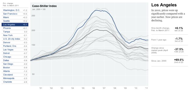
The Standard & Poor’s Case-Shiller Home Price Index for 20 major metropolitan areas is one of the most closely watched gauges of the housing market. The figures for March, released May 31, showed prices at their lowest point since the downturn began.
It’s similar to the home run count graphic from last year, although there’s a key difference. It’s not in Flash. It works equally well though.
Either click a city of interest on the left, or interact with the graph directly for more information. Not surprisingly, Detroit have been falling longer than any of the other 19 selected cities, whereas prices in Washington, D.C. have risen the most since February.
 Visualize This: The FlowingData Guide to Design, Visualization, and Statistics (2nd Edition)
So what set of tools do you think created this graphic?
A quick look at the source indicates a use of the Raphaël JavaScript Library: http://raphaeljs.com/