
xkcd pokes fun at correlation and causation again. Funny every time.
xkcd pokes fun at correlation and causation again. Funny every time.
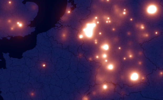
A few months ago there was a lot of hoopla around the iPhone and the recording of your location. Crowdflow wants to take advantage of this opportunity to build an open database of location traces that people can use for research. Using their existing data so far, from 880 phones, Michael Kreil of Crowdflow mapped people moving around in Europe (in Germany for the most part). The results are beautiful.
Read More
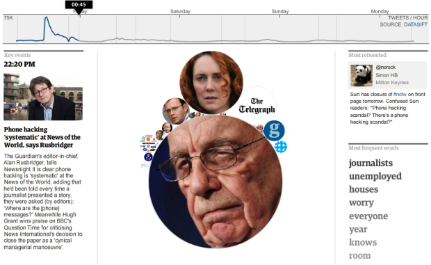
All kinds of crazy with News of the World went down this past week, and of course Twitter was abuzz with each development. Taking a page from the Stamen book, the Guardian looked at half a million tweets with the #notw hashtag and show you how the news unfolded.
The best part of the interactive is that there’s plenty of context to help you follow along as bubbles shrink and explode. On the bottom left are Guardian articles covering important events, the top right is the most retweeted tweet, and then you have the most frequently used words on the bottom right.
So if you weren’t following the story that closely, the graphic helps you understand in a hurry. At any given time, you know who’s involved, what happened, and what others were talking about.
[The Guardian | Thanks, Alastair]
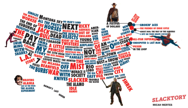
If you have Netflix, you know that there’s a section for local favorites, and it can change quite a bit depending on where you live. After moving a few times in the past couple of years, I’ve definitely seen local favorites that seem to reflect the culture or majority demographic in a city. Slacktory used this simple idea and looked up favorites in each state. The map above is the result.
There are quite a few amusing stereotypes in there, although I’m not sure what’s going on with a few of them. Beverly Hills Chi Hua Hua in Mississippi… Kindergarten Cop… A Little Princess?
What’s a Netflix favorite in your area?
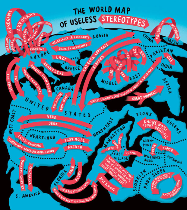
We saw Europe in the eyes of different countries a while back. Christoph Niemann, for The New York Times, runs with the idea and made this handy world map of stereotypes. My favorite is the arrogant arrows in Europe. True?
A while back we saw the history of the world according to Wikipedia. Erik Zachte, a data analyst
at the Wikimedia Foundation, takes it from the angle of those who are actually editing Wikipedia. The animated map shows edits from a single day (May 10, 2011, to be exact) when there were nearly 370,000 edits from around the world.
Read More
![]() If you’re like me, you’ve probably used Wikipedia at least once in the past week (or day… or hour). It’s had a huge impact on how we find information and keep history up-to-date. The online encyclopedia turned 10 this year, and to celebrate, WikiSym and the Wikimedia foundation recently launched a challenge: WikiViz 2011.
If you’re like me, you’ve probably used Wikipedia at least once in the past week (or day… or hour). It’s had a huge impact on how we find information and keep history up-to-date. The online encyclopedia turned 10 this year, and to celebrate, WikiSym and the Wikimedia foundation recently launched a challenge: WikiViz 2011.
WikiViz 2011 is about visualizing the impact of Wikipedia. We want to see the most effective, compelling and creative data-driven visualizations of how Wikipedia impacted the world with its content, culture and open collaboration model. Potential topics include: the imprint of Wikipedia on knowledge sharing and access to information; its impact on literacy and education, journalism and research; on the functioning of scientific and cultural organizations and businesses, as well as the daily life of individuals around the world.
There are lots of small datasets within Wikipedia articles, but Wikipedia itself is also one giant (open) dataset. For example, we’ve seen the history of the world according to tagged events as well as back and forth discussions for deletion.
Can you find something good? Judged by Moritz Stefaner, Andrew Vande Moere, and Kim Rees, among others, winners get to attend WikiSym on the house and of course get a mention or two.
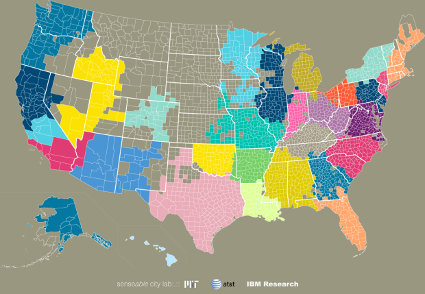
We often think of communities in the framework of government-set boundaries, but relationships can exist across states and counties. In a collaboration between researchers from AT&T Labs Research, IBM Research, and MIT SENSEable City Laboratory, these relationships are revealed through an analysis of SMS and call data.
Read More

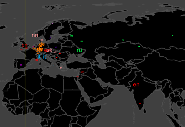
For all the maps by Eric Fischer I’ve posted, it’s amazing how little I actually know about him, but in his most recent series, See Something or Say Something, he places geocoded tweets and Flickr photos on the same map. Blue dots represent tweets with location and orange dots are Flickr photos. White dots are locations with both.
Read More
There are lots of tools that have come out in the past couple…
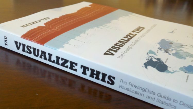
Right now, at this very moment, I have an actual physical book on my desk, with my name on it, that says Visualize This: The FlowingData Guide to Design, Visualization, and Statistics. It’s a great feeling. Thank you again to all of you for making this possible and for sharing with me your love of data. Simply put, this book doesn’t exist without you, and I’m super grateful for all of your support. I hope Visualize This finds its way onto many others’ desks everywhere.
Read More
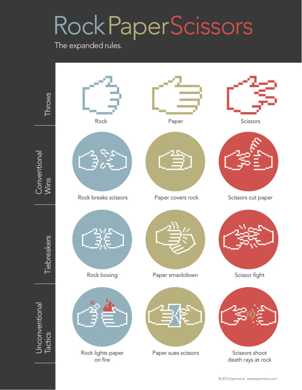
We already learned how to win Roshambo every time, but there’s actually more to it. Eyemotive provides the expanded rules, namely tiebreakers and unconventional tactics. I hate it when someone lights my paper on fire. It hurts every time.
After attending the Eyeo Festival, Zach Gemignani of Juice Analytics noticed a difference in the approach of artists and his own practices with business-related data:
The artists are looking for an emotional “wow” moment; our goal is the “ah ha” moment when a user learns something that can lead to productive action. The question that we so often ask: “what can you do about it?” wasn’t a top priority within the Eyeo crowd.
One group is telling a specific story and the other is searching for one. That’s not to say that one way or the other is bad, however. Each group can benefit from the other:
Ultimately this art vs. practice dichotomy is natural and healthy. In our work, we are inspired by the fun and energy expressed in artistic visualizations. Data visualization is a tool that can and should be used differently depending on the purpose and the audience. The skill in using the tool can be appreciated equally across these different contexts.
There’d be a lot less ruffled feathers if we could all remember that.
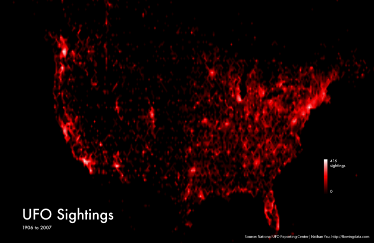
I came across some UFO sightings data on Infochimps, from the National UFO Reporting Center, and it seemed like a good excuse to mess around in R. I was just playing around, but the globular result was kind of fun to look at, so here it is.
Read More
We’re already more than halfway through the year. Time…moving…too…fast. Is there a pause button somewhere? In case you missed them, here are the most popular post from the last month:
As usual, thanks for sharing, tweeting, and liking. Every little bit helps FlowingData reach a wider audience.
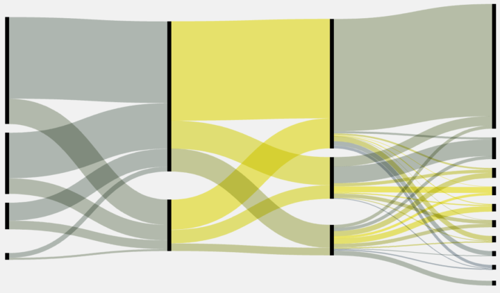
Whenever I post a Sankey diagram (for example, here, here, and here), someone always asks how they can make their own. I’m always surprised that so many people have data where the chart type applies, but in any case, I’ve never had a good answer other than open up Illustrator and do it by hand. DensityDesign tries to make Sankey diagram creation easier with Fineo.
Read More
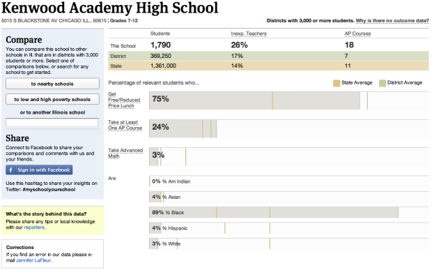
If you’re a parent, most likely you want your children to go to the best schools available, but what if you found out that the school that they attend didn’t measure up to the school a couple miles away? Using previously unreleased federal education data, ProPublica helps you compare.
Read More
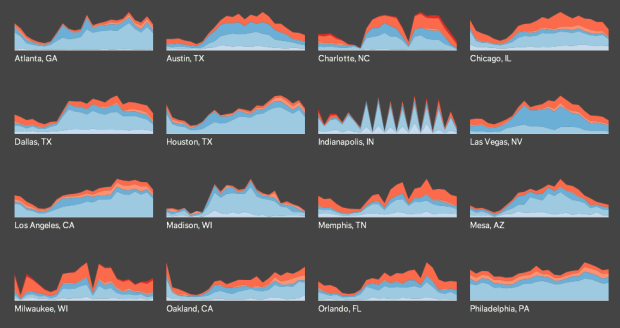
Does more crime happen during the late hours of the night or in the middle of the afternoon? Trulia Insights uses small multiples to look at crime by hour in major cities, or rather, when it is reported, according to SpotCrime. There appears to be a dip during the 3 a.m. to 7 a.m. hours for all crime types, across all cities. Well, except for Indianapolis, which seems to report incidents with rounded off hours.
Read More
 Visualize This: The FlowingData Guide to Design, Visualization, and Statistics (2nd Edition)
New tools, refined process.


