Whenever I post a Sankey diagram (for example, here, here, and here), someone always asks how they can make their own. I’m always surprised that so many people have data where the chart type applies, but in any case, I’ve never had a good answer other than open up Illustrator and do it by hand. DensityDesign tries to make Sankey diagram creation easier with Fineo.
There’s some good news and bad news though. The good news is that Fineo is easy to use. Upload a CSV data file, choose the order you want the columns, and you’ve got your diagram.
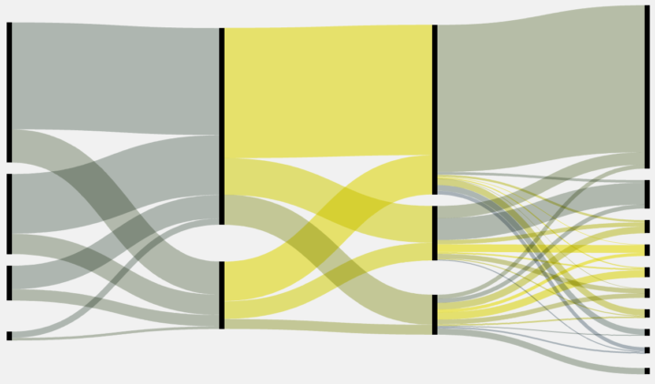
The bad news is it’s not really a Sankey diagram. In the examples I linked above, you might have noticed a certain flow where you start with a single population, and at each segment there is a split or decay. Fineo, on the other hand, takes a column-by-column data structure and splits by categories on each column, which is actually much more like Parallel Sets, by Robert Kosara and Caroline Ziemkiewicz, but with curves (as Robert pointed out).

In any case, like I said, Fineo is easy to use and makes it easy to create something like the top diagram. Although, you might want to give Parallel Sets a try if Fineo doesn’t do it for you.
As for actual Sankey diagrams? I’m afraid my best answer is still do it by hand in Illustrator. Any other suggestions are welcome.


 Visualize This: The FlowingData Guide to Design, Visualization, and Statistics (2nd Edition)
Awesome. I had used e!Sankey (http://www.e-sankey.com/en/) to diagram movements of customers and products across time, and found that they added clarity to a confusing business process. However I had also realized parallel lines with adjusting the widths of the line and having a bottom bucket for ‘waste/loss/etc’ basically did what a Sankey could do. And if you color the bottom bucket white or transparent, then you can make the losses disappear in effect.
Here is mentioned few tools: http://www.sankey-diagrams.com/sankey-diagram-software/
This blog has a link to an open source Sankey generator written in Processing – http://sjbrenner.com/2010/sankey-diagram-generator-code/
Though it’s not exactly easy, it’s certainly possible with Protovis (http://mbostock.github.com/protovis/ex/napoleon.html) and thus, probably, D3, though I have yet to have the time to play around with that.
I have done something similar with OmniGraffle, which I have to imagine is easier than trying to do it in Illustrator. Here is the mailing list topic where I describe it: http://www.omnigroup.com/mailman/archive/omnigraffle-users/2009/004989.html
Fineo and ParSets some notes about them tinyurl.com/fineo-notes