Government data technology has felt behind the times the past few years with outdated Java applets and such, which makes it tedious to look at all the data that is offerred. For example, if anyone understands the makeup of the United States, it’s gotta be the people at the Census Bureau, but the tools for public access are rough around the edges.
Luckily, we have the New York Times to move things along. Matthew Bloch, Shan Carter and Alan McLean apply their cartography skills to US Census data and let you explore a variety of demographics. It’s like a demographic buffet. There are multiple maps across four topics: race and ethnicity, income, education, and housing and families.
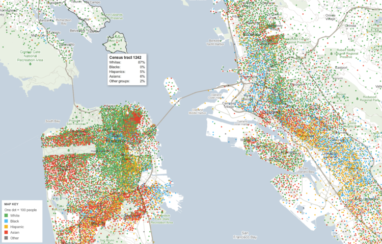
The map for racial and and ethnic groups is particularly interesting, as it’s inspired by Bill Rankin’s dot method. Each dot represents 2,500 people, and they are color coded by race and ethnicity. Eric Fischer put together a whole series with the method, but this interactive version lets you zoom in on any location you want. Roll over Census tracts for breakdowns. You can also use the search bar to jump right to your city or zipcode.
Here is the map for change in median household income in San Francisco:

And like just about all the interactive maps by the New York Times these days, when you zoom in, you get more details. In this case, you get information at the tract level.

Finally, if you find something interesting, you can link to it directly to that view (like I did with the above screenshot) and share it on Twitter or Facebook. Nice touch.
[New York Times | Thanks, Jan Willem]

 Visualize This: The FlowingData Guide to Design, Visualization, and Statistics (2nd Edition)
What I am struggling with when trying to reproduce these kind of maps is where to set the dots (of 20 or 2,500 people). In my own data set I have the GPS coordinates for all cases so plotting them individually is easy. However, how do I calculate the right coordinate for the “aggregate” dot? How do I create these small clusters of X households in the first place? When I simply calculate the average latitude and longitude it sometimes happens that the point ends up in the wrong district.
Any hints from someone with more experience?
You don’t try to place each dot. Rather, most GIS packages like ArcMap have a dot-map display choice that will randomly scatter the dots within the boundaries of each area (tract, city, et al.) that you are displaying. This can be misleading; if you have a county with 2,500 people sparsely spread the lone dot won’t reflect the reality. But it works well on a macro level. In your case, you want to group your cases by area (tract or ZIP or whatever) and use those aggregates.
Thanks for your helpful feedback. It makes sense that the dots are randomly placed within areas. As I was using Stata and R instead of an actual GIS package I wasn’t aware of that function (and its pitfalls).
This is really cool and as always Matt Bloch blows me away with how much data he’s able to map using Flash. The colored dot density maps have already proven themselves interesting, so it’s nice to see it for any and every city.
However, as Steve noted above dot density maps can be misleading for the way they evenly distribute dots over an entire unit. Definitely check out Kirk Goldsberry’s reaction to these maps: https://www.msu.edu/~kg/nytimes_dotdensity.htm (as he eloquently tweeted, “more like, ‘every city, really shitty'”).
Oops, my brain is jumping around a bit – the misleading thing I mentioned is not the same as what Steve was saying, but they’re both problems.
Funny…I came her to complain about the dots and I saw your link
I was going to provide an example zip code (60613) which looks to be exactly what is shown at the top of the page in your link.
On the bottom right corner of Kirk’s image, you see a big swath of empty space (this being a large public park and harbor). Since this is using block level data, it looks fine…population density is accurate and people aren’t living in the park.
If you plug 60613 into the NY times and look at the same area around the hook-shaped peninsula, it looks like the census tracts next to the lake are more sparsely populated than the suburbs (when in reality there are many high rises on the shore so the density should be higher)
The Times mapping site is indeed impressive, especially the fact that they turned it around the same day the data were released (the American Community Survey data for 2005-09 were released to everyone on Tuesday, as far as we know no one received an advanced version).
But there are major drawbacks to the Times’s approach that undermine the powerful visual effect. One is the flawed implementation of the dot density approach. Kirk Goldsberry, a geography professor from Michigan State, lays it out well at https://www.msu.edu/~kg/nytimes_dotdensity.htm (found via @kelsosCorner http://twitter.com/#!/kelsosCorner/statuses/15262233676218368). He points out that by using Census tracts without masking areas within tracts that have no population, the dots appear to cover areas in many places where there just aren’t people. It’s a simple technique to mask out these areas (even on a nationwide basis), but the Times apparently didn’t do it.
Also, using tracts is very different from the maps by Bill Rankin that likely inspired the Times’s choice of dot density (http://www.radicalcartography.net/index.html?chicagodots). Rankin (and Eric Fisher after him) used Census blocks, which more accurately show where people live. Of course, the ACS data isn’t available by block (we’ll have to wait for the 2010 decennial data). But although the tract-level maps looks nice, dots randomly placed within tracts present a confusing picture in many places.
Second, the data quality is a major concern, in a couple of ways. This is an issue more with the choropleth maps at the Times’s site rather than the dot density maps. The ACS data is based on a smaller sample size than the decennial Census, so the Census Bureau now publishes “margins of error” with each individual bit of data in the ACS. In some cases — especially for small areas like tracts, and for data that’s been cross-tabulated several times such as “elementary students in private schools” one of the Times examples — the margins of error can be high and make the data suspect. Even the Census Bureau itself on their county-level maps (see http://www.census.gov/acs/www/data_documentation/2009_acs_maps/) includes a disclaimer that “The values for counties shown in different classes may not be statistically different. A statistical test is needed to make such a determination.”
And that’s for counties! At the tract level, the question of statistical significance is a greater concern. So we don’t really know if a darker color for one tract represents a “real” difference in population characteristic with the neighboring tract of a lighter shade.
The statistical significance issue is even more worrisome when comparing across time. Several Times maps purport to show change between 2000 and the 2005-09 period. But the Census Bureau doesn’t publish the margins of error for data from the 2000 decennial Census. (They can be calculated, but it’s complicated even if you can follow the Census Bureau’s multi-step instructions.) So we don’t know if a tract-level value of X in 2000 is really different from a value of Y in 2005-09. It might *seem* like the numbers are different, but the reality on the ground may not be different at all. So again, the maps are visually striking, but at best they may not be telling us much, and at worst they may be completely wrong.
Finally, several of the indicators that the Times mapped, such as income, home values, rents, and mortgages, likely changed dramatically even for small areas during the 2005-09 period — when the nation’s economy was all over the map. The 5-year ACS data presents an average value for that period, masking any trends or variations during that time. It’s one thing to map change from 2000 to the present when we don’t have data for the intervening years. But the beauty of the ACS is that it also presents 1-year estimates that we can evaluate to see the trends. So — aside from not knowing if the change is statistically valid or not (my point above) — the “change” from 2000 to 2005-09 may be an artifact of taking the average. We won’t really know until we start seeing better 5-year estimates that the Bureau will start releasing at the end of 2011 (covering the 2006-10 period and based on the 2010 decennial population counts).
All of these issues have been widely discussed by data analysts, journalism blogs and listservs, and by the Census Bureau itself during several presentations in advance of the ACS data release this week. It’s surprising that the Times published their maps using flawed techniques and not even mentioning the data quality issues. The American Community Survey is a powerful, relatively new approach by the Census Bureau to collect and publish data about the country inbetween decennial Censuses. But because it’s new, it has issues; the Bureau is still working out the kinks. Until they do, it’s up to respected researchers and media outlets to help educate the public about the ACS and its value. Knowingly publishing pretty maps that are perhaps wrong or misleading doesn’t help that effort.
I beleive they also segregate by county on the zoom levels. If you look at the DC metro there are sharp delineations in dot density for say Prince George’s vs Charles County. That makes sense if they are evenly distributing the dots in each county (instead of keeping the relevant area at the tract level). It makes for a less informative map. Hopefully they will fix these problems when the real data comes out.
2 questions: how did they get the google map “white background” and I am assuming they are using xml to load the data? Does anyone have any input on the xml(examples if possible)?