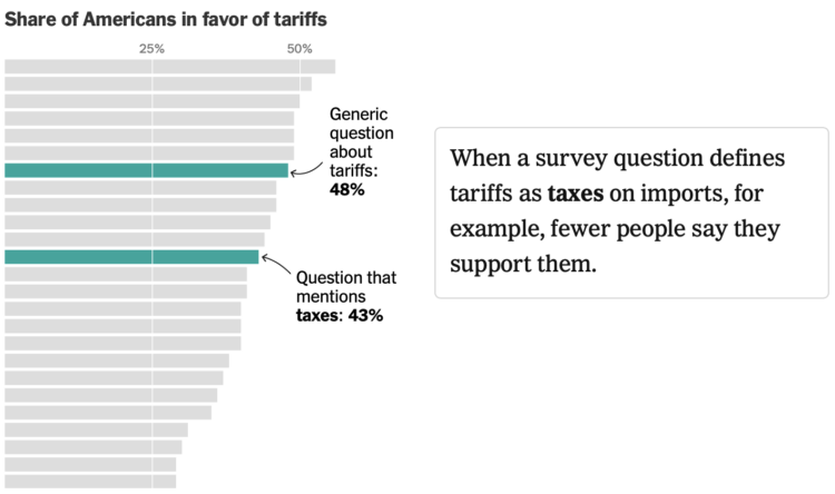
• The second edition of Visualize This is published. The book made its way out this past week for those who pre-ordered (thank you!), but you can get a copy right away now.

    This is a different book from the original. There is new software, new examples, and new methods that stem from a decade and a half more of visualizing and analyzing data, a polished process, and an evolving visualization field.

    The end goal is still to get you making charts right away.

    Learn how to ask questions about data, make any chart, and design around insights.

    Changing Visualization

    I wrote the first edition of Visualize This in 2010. At the time, visualization was more narrow in what it could and should be. If a chart didn’t tick certain boxes off a list, many dismissed it as garbage. Not very nice.

    I wanted a nicer, more approachable book to help develop a reader’s curiosity in visualization and data through fun examples and step-by-step tutorials. Apply the analysis process, code, and design ideas in your work in a concrete way.

    It seemed to succeed? Over the years, people whose work I enjoy and shared on FlowingData sent notes to tell me Visualize This was their introduction to visualization. And now it’s their career? Just, wow.

    As data grew more common, visualization developed past the bar chart (still a go-to though). New visual forms and uses bubbled up. Data can move. You can interact with it. A beeswarm chart was barely a thing, and now it’s commonplace.

    People have small computers in their pockets now. How do we show more on smaller screens? Instead of more pixels or to turn people’s phones and laptops into bricks of fire, you analyze the data, ask questions, and highlight insights. Focus.

    Visualize This (2nd ed.) focuses more on this part of the process — making sense of data — which is the main reason FlowingData still exists. (Thanks for sticking with me.) Novelty in visualization will only get you so far.

    Better Tools

    Of course the visualization tools changed too. The upside of a book that uses current tools with step-by-step examples is that you can easily follow along on your computer. You can see the same thing on your screen as you do in the book.

    The downside is when the tools fade or better tools come along to replace the dated ones. The first edition used almost a full chapter on Flash and ActionScript, which were killed off years ago. There was a section that used JavaScript, but it was with the Protovis library, which was the predecessor to the more current D3 library.

    My own toolset also grew, which you see in this second edition. Again, I’m not trying to push you towards a specific tool. My goal is to help you decide which tool or subset of tools works best for you.

    Visualize This (2nd ed.) covers point-and-click tools, such as Datawrapper, RAWGraphs, and the more general Adobe Illustrator, and also gets you started with R, Python, and HTML/CSS/JavaScript. In between the code and steps is the thought process and reasoning, which you can apply to your own tools and datasets. My thanks to Jan Willem Tulp for jumping on as technical editor to make sure all the software examples worked and made sense.

    A Shifted Perspective

    When I wrote the first edition, FlowingData was only three years old. I was still in school and had a ton of learning ahead of me.

    FlowingData is going to be seventeen this year. I finished my PhD, worked with more data, made many more charts, and refined my process. FlowingData became my full-time job.

    Along the way, I got married, had kids, saw new things, grew more white hairs, and well, I got older and experienced more.

    Visualize This (2nd ed.) reflects how I work now and what I would teach a beginner now. If you want to better understand data, make charts that communicate to people, and produce nice things with real data, then Visualize This (2nd ed.) should help you get there now. Start at the beginning by working with raw datasets and analyzing for insights. Then follow through with finished data graphics.

    Get the Book

  • Last week, a Singapore Airlines flight experienced turbulence that led to one person dying of a heart attack. Reuters explains what happened on the flight and more generally, what happens during turbulence.

    Turbulence or pockets of disturbed air can have many causes, most obviously the unstable weather patterns that trigger storms, according to an industry briefing by European planemaker Airbus.

    The resulting water particles can be detected by weather radar. Crews plan ahead by studying turbulence and other weather forecasts, which have improved over the years, loading extra fuel when needed and monitoring weather radar during flight.

    Maybe make people buckle up at all times when seated?

  • YouGov surveyed 2,000 adults asking them when was the best and worst decades for things like movies, fashion, and the economy. For the Washington Post’s Department of Data, Andrew Van Dam noted that there wasn’t so much a strong lean towards a certain decade as there was a tendency towards people’s age.

    I think people just want to go back to a time when there was less to worry about and more freedom, which was late childhood and early teens for most.

  • In case you need a large dataset to train your chatbot — and who doesn’t these days amirite — WildChat might prove helpful.

    The WildChat Dataset is a corpus of 1 million real-world user-ChatGPT interactions, characterized by a wide range of languages and a diversity of user prompts. It was constructed by offering free access to ChatGPT and GPT-4 in exchange for consensual chat history collection. Using this dataset, we finetuned Meta’s Llama-2 and created WildLlama-7b-user-assistant, a chatbot which is able to predict both user prompts and assistant responses.

    Beats ripping off Scarlett Johansson dialogue.

  • To keep track of performance, Matt Stiles made the Dodgers Data Bot, which provides a dashboard view of various baseball metrics sourced by Baseball Reference.

    This repository — a growing work in progress — feeds Dodgers Data Bot, a statistical dashboard about the LA Dodgers’ performance.

    The code executes an automated workflow to fetch, process and store the team’s current standings along with historical game-by-game records dating back to 1958. It also collects batting and pitching data, among other statistics, for the same period. These records are processed and used to bake out the site using the Jekyll static site generator, in concert with Github Pages, and D3.js for charts.

    Thumbs up for personal projects. You can find the code on GitHub.

  • Members Only

    Reading the words of my younger self and revisiting that guy’s process was… educational.

  • The recent solar storms brought pretty lights to the night sky in some parts of the country, but they can also bring challenges to the power grid. For Bloomberg, Hayley Warren, Denise Lu, and Naureen Malik look at the surges through the lens of data collected by Whisker Labs Inc.

    While no significant failures were reported, there is potential for these surges to cause major damage. The last time a storm this strong struck Earth, there were power outages in Sweden and damaged transformers in South Africa, according to the US Space Weather Prediction Center. Strong solar storms can also affect radio signals, global navigation systems, satellites and even pipelines. SpaceX’s Starlink unit said on its website that it experienced “degraded service” that its team was investigating.

  • I don’t know about you, but where I live, the housing prices keep going up, and they just seems way too high. Is it like this everywhere? For The Washington Post, Kevin Schaul and Rachel Lerman made maps that show the increase or decrease, but mostly increase, in house prices by ZIP Code.

  • Visualize This is a real book now! The official publication date is May 29, but you might get it early if you order now, depending on where and when you order it.

    The publication process is interesting, because you write and write and make lots of charts over many months. There’s editing and revision. It’s on your mind constantly. Then there’s a gap when your part is done and your publisher (for me, Wiley) takes over. All of a sudden, the book is printed, you hold it in your hands, and it’s satisfying.

    Get a copy today: AmazonWileyBookshop.org

  • Wilson Lin used an abstract map to visualize 40 million posts and comments from Hacker News. He calls it the Hackerverse. Lin described the full process of scraping, using text embeddings to map words to locations, and making an interface that worked with thousands of points:

    What can we do with the 30 million comments? Two things I wanted to try to analyze at scale were popularity and sentiment. Could I see how HN feels about something over time, and the impact that major events has on the sentiment? Can I track the growth and fall of various interests and topics, and how they compare against their competition?

  • Assuming you were still alive flying into a black hole, NASA’s Goddard Space Flight Center visualized what the views might look like.
    Read More

  • There are a lot of tools to visualize data. Some are visualization-specific. Some are tools that let you make charts but are focused on other data things. New apps come out with new features that promise new things. This can make it tricky to find the best visualization tool.

    Also, the “best” depends on what you want to visualize and how you want to do it. A data dashboard on a projected screen carries different requirements than an exploratory tool on a laptop, which carries different requirements than a data story that scrolls on your phone. Look for the tools that are best for you.

    Read More

  • To capture solar energy for use in the evening, batteries have grown in popularity over the last few years, especially in California. For the New York Times, Brad Plumer and Nadja Popovich show the shift with a pair of stacked area charts.

    Five years ago, these pair of charts would have been a single animated one.

  • Members Only

    When you analyze data, there are times when a trend, pattern, or outlier jumps out and smacks you in the face. Or, you might calculate results that seem surprising. Maybe they’re real, but maybe not.

  • Imagine that you try to do something and there’s a 20% chance of success. If you try to do the thing six times, what is the probability that you succeed at least once?

  • Based on data from NASA’s Stratospheric Observatory For Infrared Astronomy (SOFIA), Villanova University researchers developed a map of the magnetic fields in the Milky Way.

    For Strange Maps, Frank Jacobs:

    The colors show the interaction between warmer dust clouds (pink), cooler ones (blue), and magnetic fields, indicated by radio filaments (yellow) — mysterious tendrils up to 150 light-years long. By revealing variations in the orientation of magnetic fields across dust clouds (some with fanciful names like The Brick and Three Little Pigs), this map offers a first glimpse at the complex arrangements of dust and magnetism in the CMZ.

  • PerThirtySix made a communal plot that asks for your opinion via scatterplot and you can see how you compare against the aggregates. A new poll goes up every day.

    The inspiration for this comes from a whiteboard in an office I used to work at. Every so often, a new pair of questions would be posted and people would contribute their answers by marking where on the scatterplot they belonged. It was fun seeing how my answers compared to others, and guessing who might have answered where. I hope this tool brings you some of that fun!

  • From the oldie-but-goodie department, this fun program uses a genetic algorithm to drive car thingies across a bumpy terrain. Change parameters. Watch the cars go. See how far the winner travels before crashing.

    The code is available on GitHub.

    In case you’re unfamiliar, a genetic algorithm creates mutations in a population of objects or systems. Those that perform better move on to the next generation. The algorithm keeps going until you get an optimized point. In this case, the algorithm tries to optimize travel distance.

    See also evolving floor plans and an optimized brewery road trip. [via kottke]

  • For Reuters, Mariano Zafra, Anurag Rao, and Jon McClure describe how bird flu can pass between mammals, but, while not impossible, transmission to humans is still unlikely.

    Because of the heavy viral load in milk and mammary glands, scientists suspect the virus can spread between cattle during the milking process, either through contact with infected equipment or with virus that becomes aerosolised during cleaning procedures.

    One in five commercial milk samples tested in a nationwide survey contained particles of the H5N1 virus, according to the FDA. The agency said, though, there is no reason to believe the virus found in milk poses a risk to human health and that pasteurisation effectively killed the virus.

  • We get 24 hours in a day. How do we spend this time? How does our time use change as we get older and priorities shift?

    Here is the percentage breakdown in our teens, 20s, and 30s, through to our 80s.