
I haven’t reviewed a year on FlowingData since 2020, which seems like a serious oversight in the system (me). I need to get this annual review out before my boss (also me) finds out. To my credit, I pushed out the picks for best data visualization projects of the year, but I guess it’s time to push the attention inwards.
Let’s see here…
The first quarter of 2024 was focused on completing the second edition of Visualize This. I hope it helps more people visualize and understand data.
The passage of time felt more real this year, and because the projects on FlowingData are an extension of my curiosities and introverted brain, the feeling is easy to see through the datasets I analyzed.
The most popular things I made this year share a common theme. See if you can spot it:
- See Who is Older and Younger than You
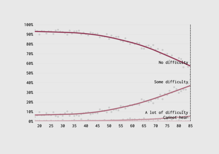
- When Your Vision and Hearing Decline with Age
- Common Age Differences, Married Couples
- Where the Time Goes with Age
- Ages of the People We Marry
- Retirement Ages by Country
- College Admission Rates for U.S. Schools Compared (not age-centric, although motivated by hearing about young family members’ admission challenges and then comparing to when I applied)
- Sleep Hours and Feeling Rested (no age!)
- How Much We Work (categorized by age group)
- When Working Gets Harder With Age
I’m obsessed with age, clearly. These are just the more popular ones. There were others. I have a running theory that any demographic dataset can be made more relatable when you pass it through the lens of age.
Sitting firmly in midlife gets you thinking about what’s next. I felt steady for a long time, but then fellow midlife friends and family ran into health, financial, and relationship challenges. Abstract concepts suddenly felt very real and possible. When I looked at age in previous years (or decades), the ideas were in a distant future that was too far to appreciate. Now the future seems a lot closer to the present.
That said, as anyone who is older than you will say: enjoy these younger years while they last. I should probably branch out data-wise.
Membership
Speaking of age, FlowingData has been supported by members for the past 12 years. Thank you to all who keep this site going. I appreciate it.
Up until a few months ago, I used the same member management software all this time. That software was getting rickety, and after a streak of too many fails, I migrated to a different system that makes it easy for members and me to keep track of things.
It took a lot of work in the background, but there were surprisingly few blips when migration day arrived. The switch seems to be a good choice so far.
If you are able, please consider supporting FlowingData with a membership. Sign-ups are not as robust as they were in 2012, and while that’s fine for now, my goal is long-term and to do this until I am way older and it’s just us against AI. (There’s that age obsession again.)
Anyway, this is getting too personal for an annual review, and my boss hates that.
Next year
At the end of 2023, as certain social media entities were crumbling, I told myself that I would learn how visualization existed in social media that was not crumbling. You have to “meet the audience where they are” I am told.
Charts are not treated equally across platforms. Methodology and tips do better on LinkedIn, traditional charts with off-center data do better on Reddit, one-liners do better on Instagram, and Bluesky is still figuring itself out. For visualization, I could not wrap my head around Mastodon. X is, well, you know.
However, all the platforms reward quantity, probably more than quality. Even when something is popular, the information cycle spins so quickly that the popular thing falls to the back in a few hours. At best, you get a couple days.
Next year is about quality in analysis, design, and depth — work worth keeping around.
On to 2025.
 Visualize This: The FlowingData Guide to Design, Visualization, and Statistics (2nd Edition)